After a heuristic evaluation of Audits, we saw an opportunity for overall redesign of this feature.
We want to hear your suggestions for improvement! We are wondering if we are displaying all needed information, if we show information in the right order and if there are any more filters needed.
The design introduces features such as:
List view - so more information can be floated to the top
Export to CSV
Please watch the video recording, we would love to hear your feedback!
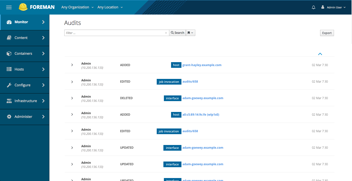
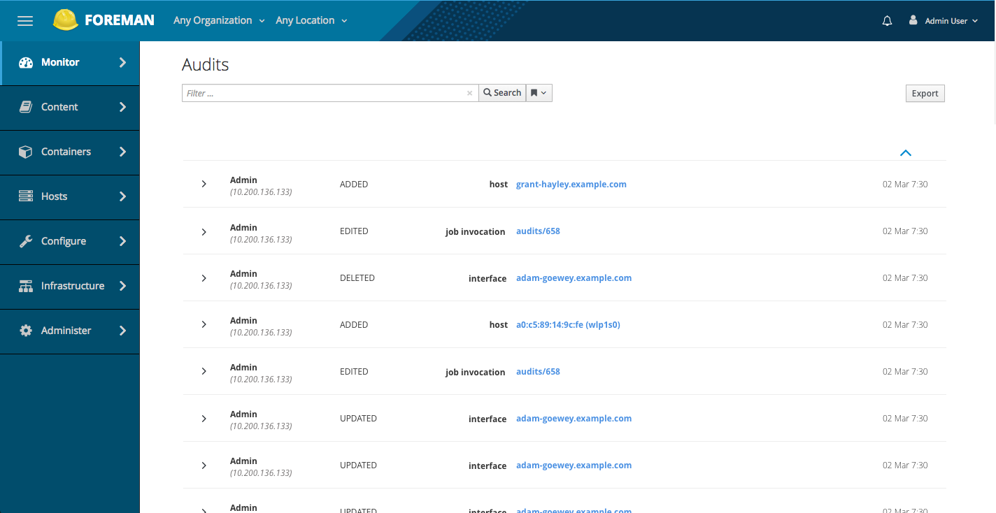
Nice, the column widths are little bit weird, hostnames can be much longer than “tereza-novotna.example.com”. I’d make 2nd column narrower giving more space to 4th column. I know these can be dynamic, so just make sure that once needed the columns starts to resize properly.
there seems to be a lot of whitespace between the search filter and listview, not sure if thats intentional or not.
should we consider adding icons/avatars (for users and objects (e.g. hosts, templates etc)?
once viewing an audit entry, does it make sense to add icons to host details / revert?
should we display effect org/loc as part of the minimized list view?
does it make sense to use some css to highlight the added/edited/deleted? maybe in a similar fashion to tagging (or if we end up exposing them as listview filters)
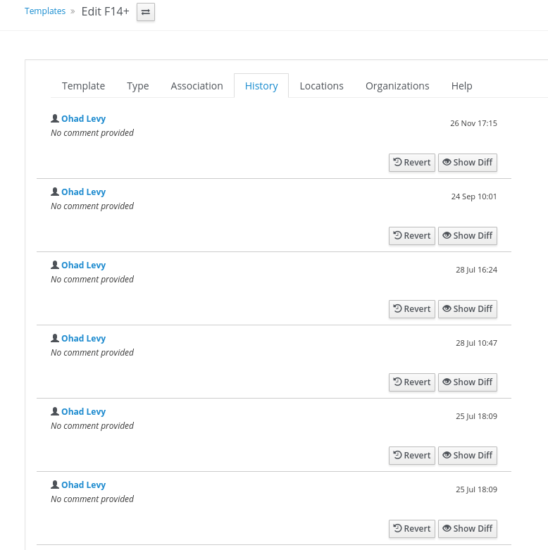
what about object specific audits ? for example, templates have their own audit list (see screenshot)
I think I like it in general.
I think the page could be improved with icons for every object (e.g. a host icon for a host). Right now the view looks a little bit boring in my opinion, patternfly has a nice list view that allows icons.
The only thing I see missing is reverse ordering by date. I can not see sorting on object, user, etc. But… show me earliest to latest seems like it would be ncie.
Icons for Host Details/Revert are great idea. There is 30-40 types, and we do not have all needed icons available, so they would have to be created. It’s either use it for all the elements or not at all.
For org/loc, is it helpful for the user to see these two on the surface?
For object specific audits, could we paste the same list view UI here? We probably want to make it consistent.
Hah, we don’t want to have boring screen @TimoGoebel! We are making sure it is easy to read and we have to find the right balance.
Good point with reverse ordering by date @Bryan_Kearney!
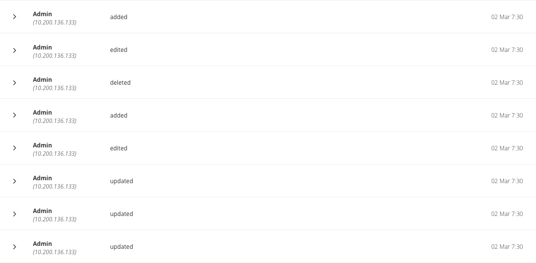
I played with some typeface and chip variations for the added/edited/deleted and type. @Marek_Hulan and I agreed that we both like Version 1 - looks readable, organized and clean.
I like elements from various versions. I mostly like version 2 but I think the caps added/edited/deleted is shouting. Does patternfly have icons we could use for the action?
I like one as well. Does it make sense to change the Added, Edited or Deleted text so an icon or add some color to them? I think that would help to faster figure out what kind of event happened.
I would prefer icons for actions (ADDED/DELETED etc) - can anyone confirm we only have CRUD actions?
I find the blue labels (aligned to the right) a bit too “loud” I’m not sure if we can be a bit more color nutral (e.g. grey) or just find a different way to represent them (e.g. an icon?)
I find the sorting arrow(above the date) strange, maybe its size, or just the fact that its alone and outside of content, can we use the sorting widget ?
I think it’s worth of trying colorizing action words or appending an icon (or both). I like text only so user is not distracted with too much eyecandy. I agree color helps with quick distinguish but does not work for color-blind people. Also we shouldn’t use red for delete, red is recommended to be used for very dangerous operations. So I’m not sure how the color schema would look like. Perhaps light red, like the one suggested for background for removed attributes?
For audit we only have crud operations, create, delete, update and atm added, removed which are imho variant of create and delete.
Today we don’t support sorting in audits either so I don’t think we need to add it right now. In fact I’d prefer (and @terezanovotna agreed) to raise this to patternfly, list view component does not seem to have sorting capability defined yet.