Why this distinction and why is the first expecting a report every 5 minutes?
I noticed that the segments in the pie charts are no longer links for a few releases. In the past these were links like they are on the left panel. Was this a concious decision or is this an accidental regression?
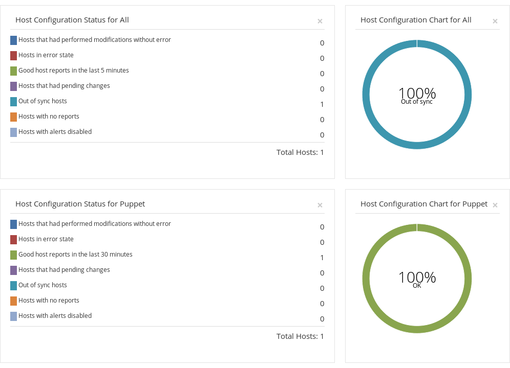
The search is last_report < "5 minutes ago" and that results in a host with a report that’s 26 minutes old. Note that last_report > "5 minutes ago" has no results. Was this always the syntax or is this a regression?
If you remove enough widgets to not need a scroll bar the navigation is stuck in expanded mode on the Monitor panel. It’s still functional and you can go to other panels, but if it loses focus it reverts to Monitor in expanded mode.
Please let me know if I should be creating redmine issues.
Why this distinction and why is the first expecting a report every 5 minutes?
See community demo for reasoning, that should answer the first part of the question and provide some context.
5 minutes is most likely a left over from previous meaning of the out of sync setting, we used to take puppet interval (30 minutes by default) and out of sync (5 minutes by default) and considered host out of sync if we didn’t get report in 35 minutes. Now puppet (and other origins) have their intervals, this one remained for generic use. It could perhaps be changed to some more meaningful value. Or it should take into consideration all origins configurations. Mind to open RFE? (cc @bastilian)
I noticed that the segments in the pie charts are no longer links for a few releases. In the past these were links like they are on the left panel. Was this a concious decision or is this an accidental regression?
I don’t even recall when it was clickable I guess that happened when charts were migrated, probably not intentional.
The search is last_report < “5 minutes ago” and that results in a host with a report that’s 26 minutes old. Note that last_report > “5 minutes ago” has no results. Was this always the syntax or is this a regression?
yes, think of < operator as happened before, 26 minutes ago happened before 5 minutes ago, see our manual, scroll down to “Date-time search query syntax”
If you remove enough widgets to not need a scroll bar the navigation is stuck in expanded mode on the Monitor panel. It’s still functional and you can go to other panels, but if it loses focus it reverts to Monitor in expanded mode.
I tend to agree the current dashboard is overwhelming, probably we need the help of @Roxanne_Hoover to identify how can we make it a bit more consumable.
IMHO the fact that now you need to scroll at least 3 pages down makes the dashboard unfriendly, would a short term solution would be to group the widgets into tabs? so you’ll have a ansible/puppet/subscription manager /discovery dashboards? or perhaps just have a per topic dashboard and stop having one big one?
I’m not convinced out-of-sync makes sense in an ansible context. The model of Ansible is typically not a cron-like setup as Puppet has. To me it feels like we’re trying to replicate Puppet reporting, but they’re not 1-to-1 replacements. Many Ansible users I’ve talked to do not see the benefit of a cron-like setup (and a major downside of Puppet).
Before I create a RFE I think we should discuss a bit more about what we want to achieve.
It has been a while since I used Foreman as a regular user.
Clicking on charts is probably the first thing that you do when you watched the original dashboard, for example, you want to see which hosts are in error state.
I don’t think tabs are particularly helpful because it defeats the purpose of a dashboard which should be upfront easily consumable info.
To me, the best course of action would be doing a little research here, perhaps a survey to better understand top used widgets, most important information in any particular widget, etc. Once we identify this we create a default dashboard state and still allow customizability for those in odd use cases.
I think in combination of disabling the out of sync charts are still useful for ansible use cases you describe. Also I know about users who prefer to schedule repeated runs, just the interval is different, e.g. once a week. That should be addressed by separate interval setting for ansible origin.
I do agree that the default out of sync interval set to 5 minutes is not too useful now. I think it should be changed to 30 to keep similar behavior for traditional cfgmgmt systems like salt/chef until their plugins will start using these new settings.

 I guess that happened when charts were migrated, probably not intentional.