Apply table PF4 classname and use PF4 pagination

Not sure if you are going to love it or hate it,
I opened a PR to use the “pf-c-table” on our rails .erb tables and make them look like it’s the PF4 component which is a one-liner change: Fixes #33669 - apply PF4 classname to all tables by Ron-Lavi · Pull Request #8828 · theforeman/foreman · GitHub

and on the same PR as the second commit, I use the PF4 Pagination component as our default,
and in case someone wants to use the old one they can pass the prop isPF4: false

Try it out and let me know what do you think about this change :slight_smile:

New ones:

Bookmarks

Architectures

Hosts

EDIT: after the discussion here:

before the discussion as a POC:

3 Likes

All that padding feels excessive. Is that really how PF4 expects things to look? For example on the hosts page I could fit 35ish rows without having to scroll. After applying this change, I can see first 14, for the rest I have to scroll.

2 Likes

Good eye! there is that pf-m-compact class we can add to make it in compact mode,
here are all of the table types: PatternFly 4 • Table

@MariSvirik should we use compact mode on all pages?

it was due to mixture of old bootstrap classes and not using the compact class,
this is how it looks atm:

New ones:

Bookmarks

Architectures

Hosts

1 Like

Update:

For a striped table, we can add a CSS rule like:

tr:nth-child(even) {
  background-color: color;
}

When removing Foreman’s center-align class name from the table rows and removing hard-coded width size to each col,
the hosts’ table looks much better:

1 Like

The column widths are now very weird. The checkbox and power columns are way too wide.

Overall I think PF4 looks worse and I’m :-1: on this proposal.

well, there is an option to adjust the columns the same way we do now with bootstrap, this is how it looks atm:

      <th class="ca" width="40px"><%= check_box_tag "check_all", "", false, { :onchange => "tfm.hosts.table.toggleCheck()", :'check-title' => _("Select all items on this page"), :'uncheck-title'=> _("items selected. Uncheck to Clear") } %></th>
      <% if power_status_visible? %>
        <th class="ca" width="80px"><%= _('Power') %></th>
      <% end %>

so that’s not a big issue.

here is a comparison of the two tables with widths adjusted,
IMO the PF4 feels better, more modern.

what do you think looks worse?
adding @MariSvirik so she can pass thoughts to improve on PF4 side

All the content in the table looks the same and it kind of blends together. There are no visual hints to distinguish lines as clearly as before. Previously there was a very clear table and I miss that in PF4.

Also the clear per page selector is now hidden. It’s probably behind the item selector but that’s not very obvious.

I’ll also note that in general I dislike “modern” UIs. Just because it’s newer doesn’t make it better.

I believe the design is always very subjective and I’d like to ask everyone to keep that in mind before quick judgement of what’s better or worse. Another point for keeping the general discussion healthy and productive, I’d like to avoid comments like it’s better because it’s modern or it’s better because this is how it always used to be.

Last but not least, I think we started the PF4 adoption already and some components are already using PF4 patterns. There’s very little value in not adopting only some PF4 patterns, because that would result in one page combining non-PF and PF4 styles. That’s probably not the state we want to end up with, since it does not look consistent. Adopting the PF4 is the current direction. While we can always rethink if that’s good or bad direction, it’s a separate conversation. I would prefer to avoid discussing general PF4 direction on every separate PF4 component. Let’s start a new thread on dropping PF4 if someone thinks that would be better.

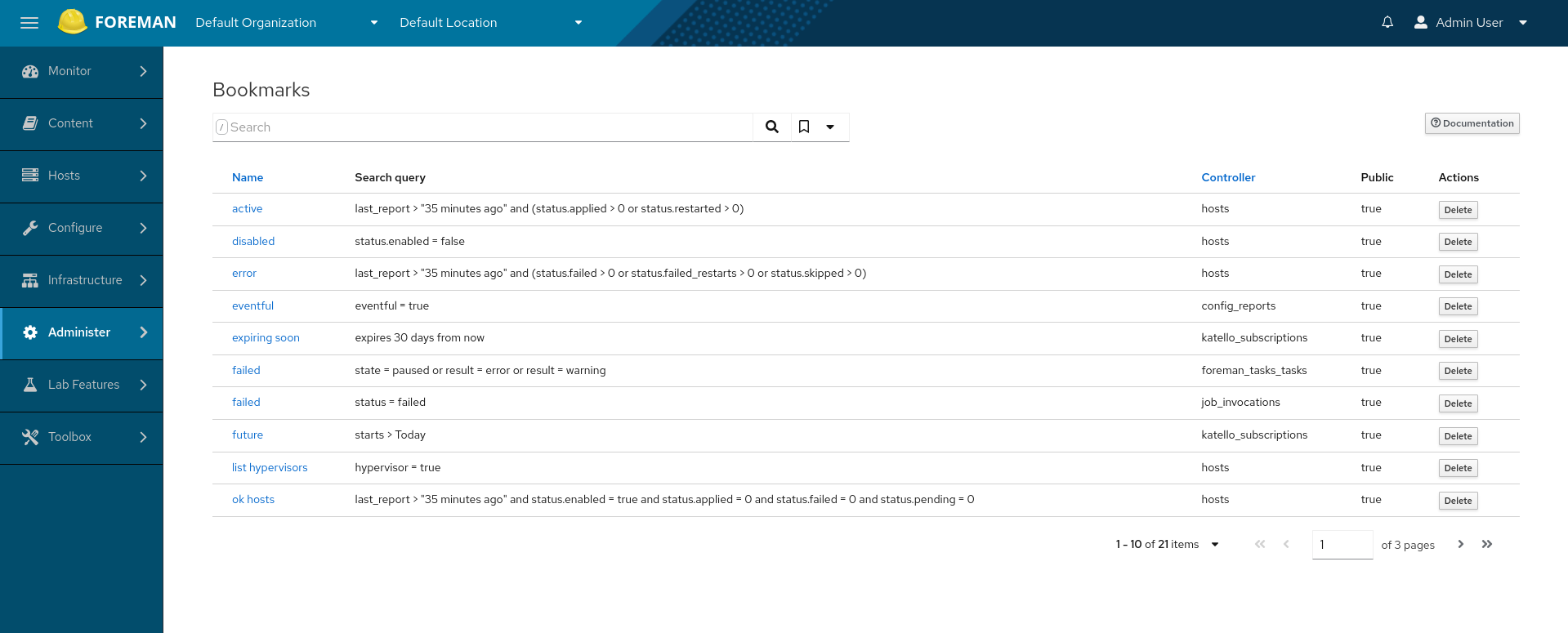
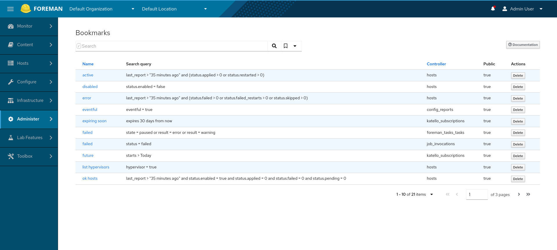
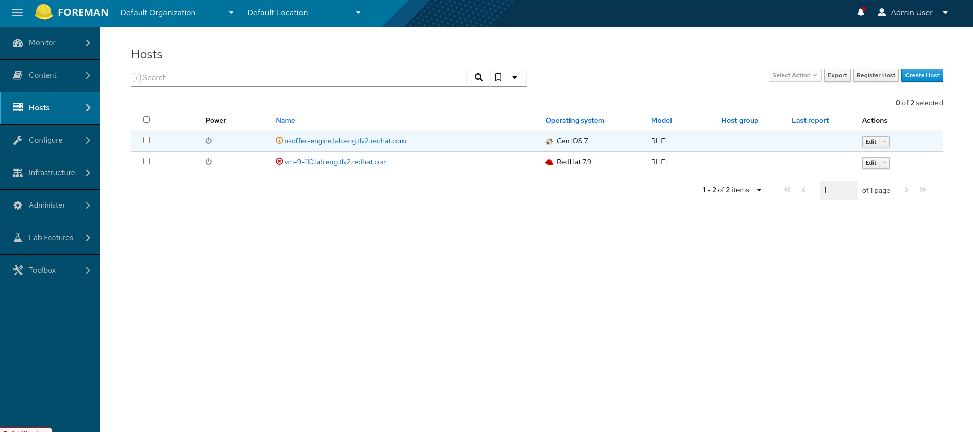
Now specifically for the tables presented in this thread. I didn’t like the first screenshots because of the spacing, however the compact version looked as a good improvement to me. The thing that catched my eye was the spacing around checkbox and power status. That was improved in the next screenshot. I’d prefer to make the checkbox column as thin as possible but I guess that’s just a bit more of css tweaking. And then I saw the last version and bam, that’s really nice. I like the final screenshot more than the existing table. For the pagination, I actually like the fact, all pagination logic is on one place. The caret felt natural to me.

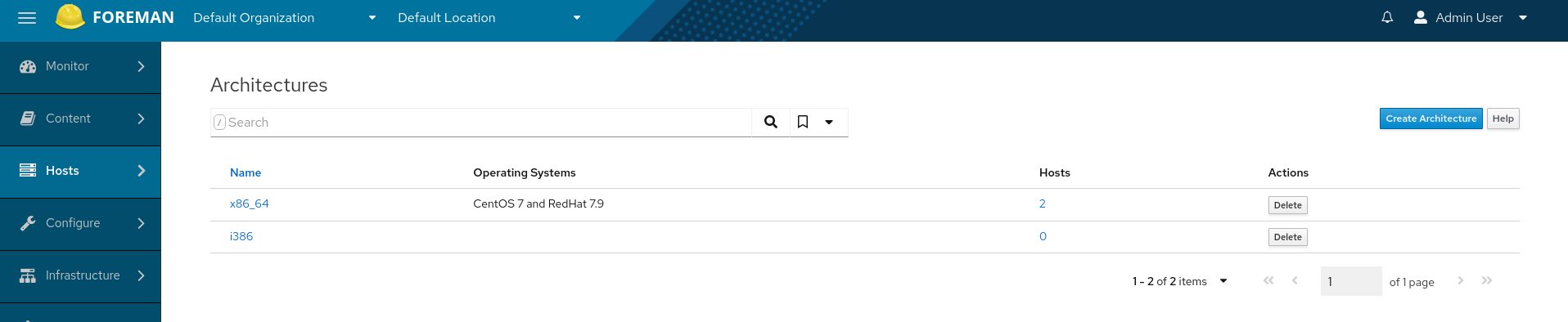
The existing tables are distracting due to many color changing. In the new one, I quickly see the structure. The values are far enough from each other so I can easily distinguish one from the other. It may be also thanks to the tables on the screenshots are different (recommendation column, resolution). On the old table, the fact we use the same background color for header, even row and the footer makes the last row kind of blurred with the footer. The new style does not suffer from that. This whole paragraph is meant as my personal subjective feeling so that we can fine tune the CSS further, but also to illustrate how initial concerns can change if we continue the discussion with an open mind, pointing out weaknesses and suggesting improvements. As far as I understand, all tweaks done in here have nothing to do with the PF4 itself. It was CSS classes or bugs caused by the mix with bootstrap that made the initial look weird.

In my opinion, the actual experience matters the most, just looking at screenshots can be misleading. I’d recommend everyone commenting on the design changes, toactually apply the patch and work with it for some time. Then switch it back and compare how it feels. I learned my lesson back in the days we converted big rounded bootstrap buttons to smaller rectangular ones with pf3. I thought back then how hard it would be to click these new buttons, well now I wouldn’t like to see screens like this anymore It does not really matter if they are rounder or sharp, smaller or bigger, it was the change itself that made me feel uncomfortable. It turned out quickly it’s not a big deal.

Back to the proposed change, I think there are still some tweaks to be made, but I like the overall experience. Adding few more screenshots for comparison. Things I found:

  • hovering the row does not highlight it anymore, that is quite important with compact tables, but I hope it’s trivial to add, I’m surprised I didn’t find it at https://www.patternfly.org/v4/components/table, I’d really miss that
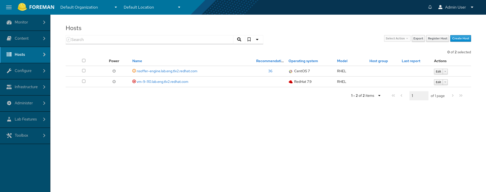
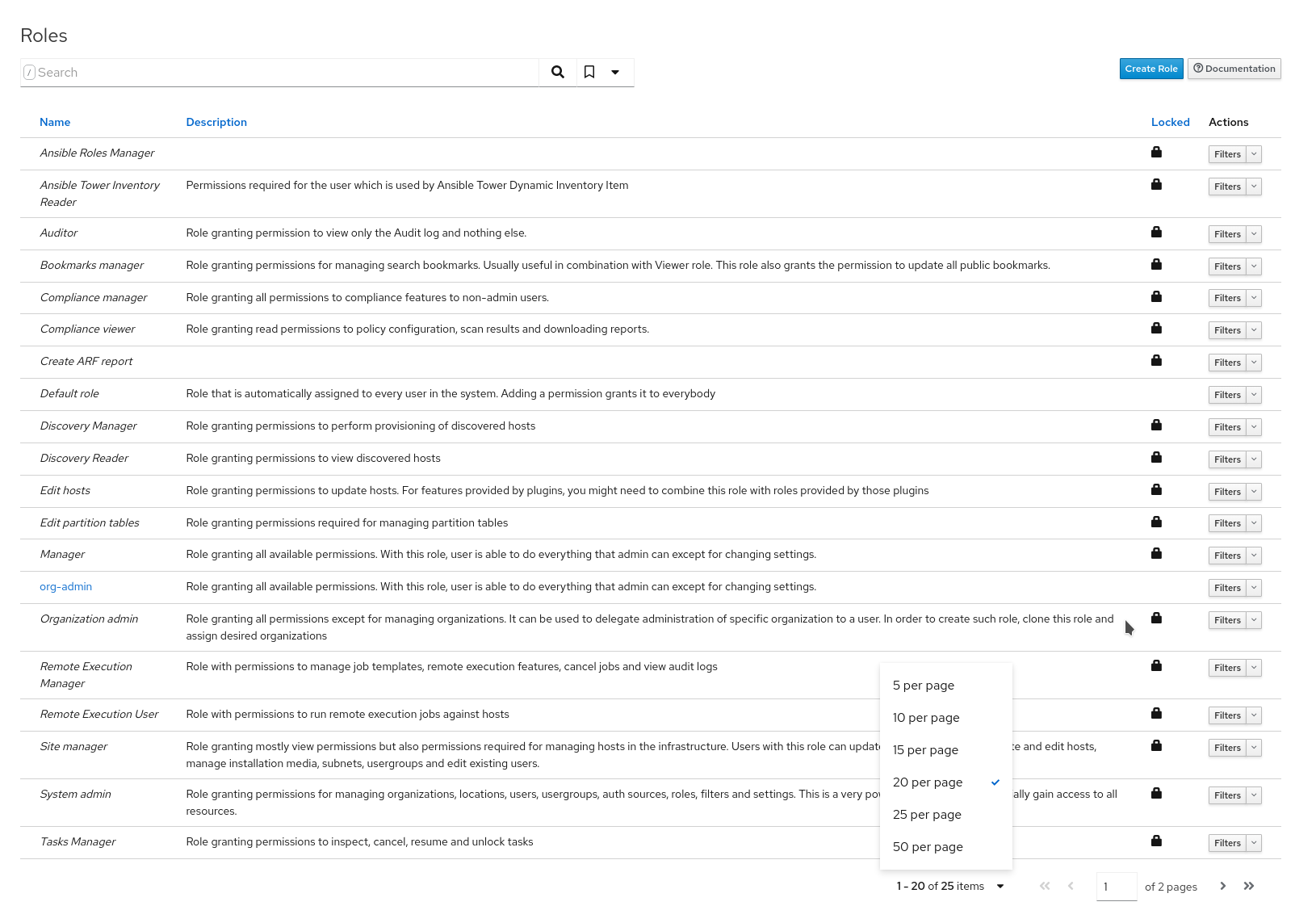
  • check the tooltip on Hosts index above the top checkbox, that seems broken
  • the power icon or lock icon on screenshots is aligned to the left side, having it centered would feel more natural to me (in case it’s really just an icon and nothing else)
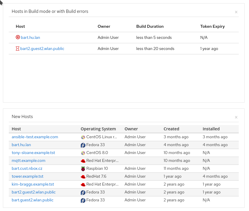
  • one dashboard widget still uses old styles, I took a picture of that because IMHO it also shows the difference in the visualization and over-distraction by colors, OTOH I admit it’s not completely fair as tables display different amount of data

Overall I feel an improvement especially with tables having a lot of data. :+1: from me.

1 Like

To be clear, my :-1: was on mostly on the specific PR that was linked in the opening post. That stated to apply classes to existing tables. I think that is a bad idea (and @tbrisker phrased that much better than I did in https://github.com/theforeman/foreman/pull/8828#pullrequestreview-779462389).

If we want to proceed with PF4, it needs to be a serious effort.

To me the striping and hovering that PF4 is currently missing is very important. That’s a discussion that should be taken up with the PF4 people.

Another is that every page that’s modified needs to be reviewed. There can be fallout, for example when plugins are used. Column widths are also important, as well as line wrapping / truncation.

Yesterday I also raised your concerns in the UX Interest Group Meeting 18/10/21
and we decided that it will be better to invest in the index page template for a better UX.

The idea was to make the UI more consistent and to touch those old pages and update them a bit.
but for a better experience, e.g: using React router and avoiding full page reloads it will be better to use the template.

Overall I am happy this discussion happened and I will pass your inputs to the PF4 team.

We decided that after the index page template will get in, if there will still be some leftover tables then we can apply those styles to them.

1 Like

Thank you. I’m pleased with that outcome. The index page templates effort sounds like the right way forward and it’s better to start the discussion with the PF4 team sooner rather than later.

Just to be clear, what inputs will be shared to PF4 team? Could you please share the list somewhere so we have the right expectations? I think the restyling will be again on the table once we start using the index template, because we want to have the tables consistent everywhere.

1 Like

great idea, I met with @MariSvirik and updated her with this thread,
she found that there is an active discussion about table hovering: https://github.com/patternfly/patternfly-design/issues/923

I opened an issue for table-striped: https://github.com/patternfly/patternfly-design/issues/1102

as for the other suggestions, when using a react component of PF4 table, I believe they will get resolved as currently, the table styles are very adjusted to the bootstrap tables and we just need to use the PF styles

text truncating with tooltip is also possible via the React component easily: PatternFly 4 • Table

hope I didn’t miss anything, any other recommendations to pass to Patternfly?

2 Likes

I think you got it all covered, thanks!

from this it looks like pf won’t be supporting hovering, only stripes.
@ekohl will it be enough for readability?

I attended a PF4 meeting and it seems that based on requests from other teams, they will bring back some kind of striped tables NEXT YEAR. There is no more information about the format/ design yet, neither is there a more precise timeline.
But then we would need to think about consistency and either use it everywhere or not use it at all. Let’s wait for that component and maybe by that time gather some user feedback on this topic.

I think that stripes are a very useful feature. If the patternfly team doesn’t get to this until next year (which to be fair can be just 2 months away, depending on when in the year) we should consider the option of implementing this ourselves. That said, I’d like to avoid changing this too often. So if we go from current situation → intermediate → PF4 in 3 or 4 releases that’s not great either.

I’d personally be missing the row highlighting, I commented in the linked issue, thanks for linking! I suppose it wouldn’t be too hard to implement on our side even if patternfly doesn’t have a pattern for that. But of course I’d like to hear from others before we implement it, whether that’s something they would miss as I would.

2 Likes