TheForeman
Creating a New Redux/React Editor
Development
ui
gilad215
October 31, 2018, 2:44pm
7
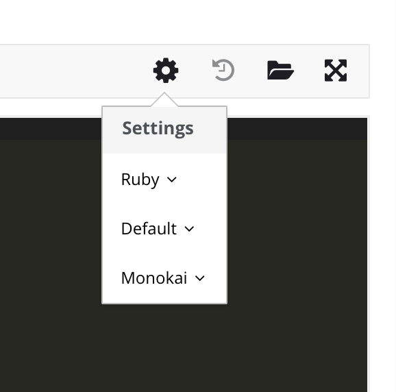
How about this
01
578×572 12.6 KB
1 Like
Foreman UX newsletter - January 2019
show post in topic