
Now that Foreman 3.16 has a release candidate, this is the place to provide your feedback. Whether it’s (possible) bugs, thoughts, the interface, or workflow. If you’re sure it’s a bug, a new Redmine issue can also be used.
1 Like
Great new pre-release ![]()
Here are some notes:
- the documentation link on the Jobs page links into a 404 (link)
- on the create job page, 2 of buttons don’t follow the styling of the others:

- the “Container Image Tags” view might need a renaming, as it’s now also showing the OCI Flatpak tags
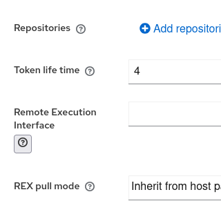
- The helper tooltip for the REX interface on the Register Host page seems different than the others:
- feedback for recurring logic and job detail page are on the individual threads

Hope you don’t mind to add Katello related things here too:
- I think as the new host overview page is the default now, it might be time to remove the Content Hosts page
But overall nothing really major to mention!
Still thinking about creating issues/looking for once if they already exist (or if time allows fixing right away) ![]()
Cheers, Lukas
I ran into an issue with package upgrades from 3.15:
Error: Transaction test error:
  file /usr/bin/uuid from install of nodejs-uuid-3.4.0-1.el9.noarch conflicts with file from package uuid-1.6.2-55.el9.x86_64
I have potentially unusual situation in having a self-subscribed foreman, and also katello running on the server.
Is there are manual step to upgrade postgresql relating to the UUID question?
Where did you get the nodejs-uuid package from, not aware of any EL9 repo hosting that ![]()
Indeed, not. It’s in the foreman repo: https://yum.theforeman.org/releases/3.16/el9/x86_64/nodejs-uuid-3.4.0-1.el9.noarch.rpm
Interesting!
That’s not getting installed when I’m upgrading on my system.
uuid-1.6.2-55.el9.x86_64 is what is already installed on there. (aka the same version as yours)
Could you give us a list how your setup looks?
I can’t replicate the problem now (I spent a while “recovering” the system, trying to downgrade it to 3.15, failing, manually futzing with things…
Conceptually though, anything in the foreman repo (or plugins) that tries to pull that package in seems like it might cause the conflict, right?
1 Like
Yes that’s right, that said though, I see the same package also already in the last 3 versions, and this issue never occured up to now ![]()
This is a packaging issue. I’ll take a look tomorrow on the fix.
1 Like
The nodejs packages are usually not needed because they’re build time dependencies. That’s likely why we haven’t seen this before.
1 Like
This package https://yum.theforeman.org/releases/3.16/el9/x86_64/nodejs-uuid-3.4.0-2.el9.noarch.rpm will fix the upgrade issue. dnf update should do the trick now.
2 Likes
It should fix it, but also: you shouldn’t have any of the nodejs packages installed on a production system. The are only needed to build UI assets.
2 Likes
I’m really sorry I didn’t have time to feedback on the 3.16 release, I didn’t really follow much of it’s development and only really had a chance to look at it this weekend.
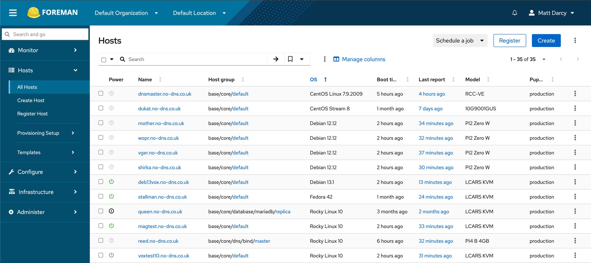
One thing that stands out to me, and I"ve said this on earlier releases too, is the change to the global hosts interface in the new releases (it now defaults to the new page even if you where using legacy) is a really bad user experience.
the whole page looks like it’s the output of hammer piped into awk, compared with the rich content feel, tidy layout, clear graphics, clear icons etc, this looks like a step backward Its been this way for a long time, and each release I have a look and click back to legacy UI, but it doesn’t feel like it’s moving forward or developing, and it feels to me a weaker user experience.
If I’m in the minority than I’ll drop this feedback, and it’s not meant to be negative on the work done, but as a user experience for your global summary of your managed resources:
I cannot see how
is a step forward or improvement over

1 Like
Is it about the OS icon?
no, I don’t think so, although I admit I do like that,
but look how formatted and aligned the text is, it’s a clear separator - maybe the lack of boarders makes it appear less formatted than it actually is, the alignment of the power indicator (and colour) the left align on it, makes it appear seperate from the resource, where as the centre alignment next to a left aligned resouce name is clearly a ‘status’ of that resource.
Also the puppet run status, the green/amber/red indicator next to the resource name (doesn’t have to be in the same column) but at a glance I can see the status of that resource.
I do like the more modern feel to the buttons, eg: the 3 dot buttons rather than the clunky edit button,
it feels less useful information, and the information that is there is not presented as neatly, clearly, or as ‘naturally’ than the legacy UI.
I actually think this is a great starting point, which is why I’ve been following it each release, and why I’m a little personally disappointed it’s not matured/progressed - this page is your front door to foreman, it should be really useful and really well presented, I’m being a little over the top saying it looks like it’s hammer output to a sed and awk based table, but compared to what was there before, that’s how it feels.
1 Like
From my side this may be complaining about the same thing over and over again,
for me it comes down to the lost list density, having hopes in this PR to fix that, but maybe there is even more to it.
Maybe it’s also just about getting used to it, “getting blind to flaws”.
1 Like
Feedback is how these things progress. This is the first time I’ve heard of any issues with the new power status column. I agree we should center it.
Please continue raising specific feedback - here, as Redmine issues, or even as PRs, whatever you’re comfortable with - so that we can continue to improve. If we don’t hear anything, we assume everything is fine.
Created 38749 for the power status
1 Like