
Hi all,
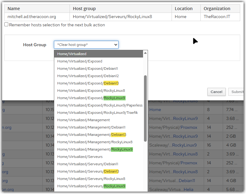
I may add that the new “Change association / Host group” list has a huge regression as it only show the last level of the hostgroup name.
When you heavily rely on hostgroups to organize your hosts and take benefits from settings inheritance, that’s not really usable.
For example, I have a first level for the smartproxy/location, one for physical/virtual hosts and one for the OS. I may have sometime other sub-levels to group hosts by purpose. Each level come with its set of parameters, OS configuration, Ansible roles, etc…
With the old dialog, the whole name of the host groups was clearly presented:
Unfortunately, the new UI is way less usable:
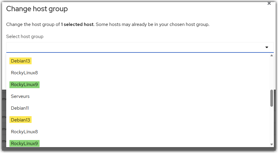
It is not be possible to clearly identify the right hostgroup easily and may lead to errors as the host may not inherit the right network configuration/parameters/activation keys/…
Also, as @ikonia already pointed, logos for different OS distribution were very usefull when dealing with multiple OSes (RedHat, Fedora, RockyLinux, OracleLinux, Debian, Ubuntu, …) to spot them quickly.

And the status of recent jobs results/configuration compliance was also a way to quickly identify hosts with issues, being stale or needing reboot/restarts:
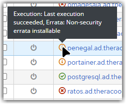
Also, I noticed that the power status of the hosts has a timeout that is suitable at all to get a correct status:

3 seconds is way too short !
I’m using the FOG Proxmox plugin on local network and it rarely show the real status (one VM, sometime). I didn’t find any way to increase this timeout by the way.
Hope it’ll help figure out what users are really doing with their instance(s) and enhance the overall experience 
Feel free to ask for more detailed use cases if needed !
Nicolas.