Just wondering: is anyone else thinking that showing scheduled tasks first on the Tasks page by default is not really ideal?
If I go to that page I usually do because I want to see what’s running or what has failed. The scheduled tasks are most of the time the least of my interest. They are there, always, I know that by now. So usually I have to scroll down or change pages to see the information I am interested it.
I think, by default scheduled tasks should be hidden. That would be much more useful to me…
I can agree with that, especially when you have too many scheduled tasks,
would it be a good idea to add a menu item that on click displays scheduled tasks in a modal?
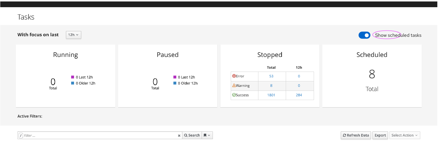
cc @MariaAga@MariSvirik
Are we talking about the task page itself or the task tab on the host detail page?
@Ron_Lavi what do you mean by menu item? Should it be an action hidden inside the kebab or a button or smth inside navigation? I guess I need more context for that.
Now this is an interesting topic. Originally, the tasks scheduled for the future were shown at the bottom of the table. We even got some issues filed that they should be on top [1]. When we reworked the tasks index with the dashboard on top, we also changed the ordering, so now scheduled tasks are shown first, which brings us to this thread (and [2]).
To me the way it is now (scheduled first) is technically correct. By default the table is sorted by when the tasks started in descending order so the ones which will start in the future are shown first. I’m not arguing that it might not be what you want to see when you go to the page.
I already talked with @MariSvirik about this some time ago, if I recall correctly her suggestions were:
add a checkbox to toggle showing scheduled tasks
change the default sort to running-stopped-scheduled
add more “easy filters” (buttons in toolbar and so on)
Are we talking about the task page itself or the task tab on the host detail page?
about the tasks page
what do you mean by menu item? Should it be an action hidden inside the kebab or a button or smth inside navigation? I guess I need more context for that.
IMO we could add a button above the table so it’s visible,
and when clicking on it the user could view all scheduled tasks in one place, and we could free some space from the table which will become more of a view of tasks history.
For me, it would be O.K. if the default view wouldn’t show any scheduled tasks. It’s basically a fixed, static list to me and not really of so much interest. I don’t need the switch there, for me it would be enough if I click on the number of scheduled tasks (i.e. the “8 total” in the screenshot above) to get a list of scheduled tasks. I cannot really think of any scenario where I would need the scheduled tasks and the task history in a single list like it is now.
What might be useful occasionally would be if the task history list would show some indicator whether this task was started by a scheduled task or not, i.e. I could see which tasks in the history were started automatically and which manually… But I am not sure on that.
Either way, task history and task schedule is something completely different to me. I would need it in one view.
What the list of scheduled tasks should show, though, would be the time when the scheduled task will run the next time. Showing “N/A” in the “Started At” column is useless…
Option 1: If we want to keep the “Scheduled” card, there has to be the same interaction as other cards have - filtering the table. That means we need to keep the list of all tasks together inside the table. The solution here would be to bring the scheduled tasks to the end of the table (so the users won’t see them right away) and keep filtering via search input and card.
Option 2: switcher as it’s displayed in my previous post
Option 3: Get rid of the Scheduled card. Just show a link that would open a modal with the list of scheduled tasks.
Personally, I’m not sure if these filtering cards are displaying the most important information correctly. E.g. from the visual point of view, it seems that the scheduled tasks card seems to be a more important filter than tasks that ended up with errors. (But I’m aware that this page was redesigned just a few years ago)