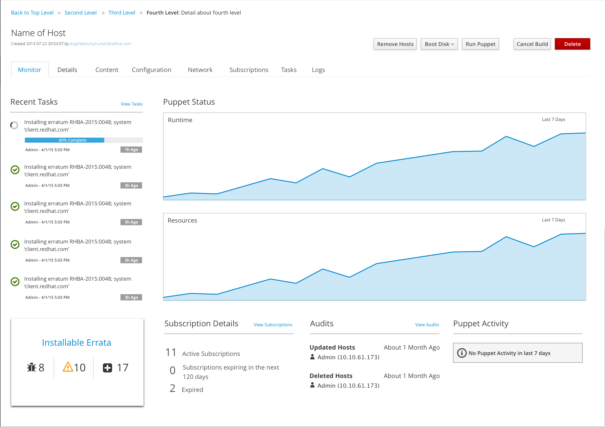
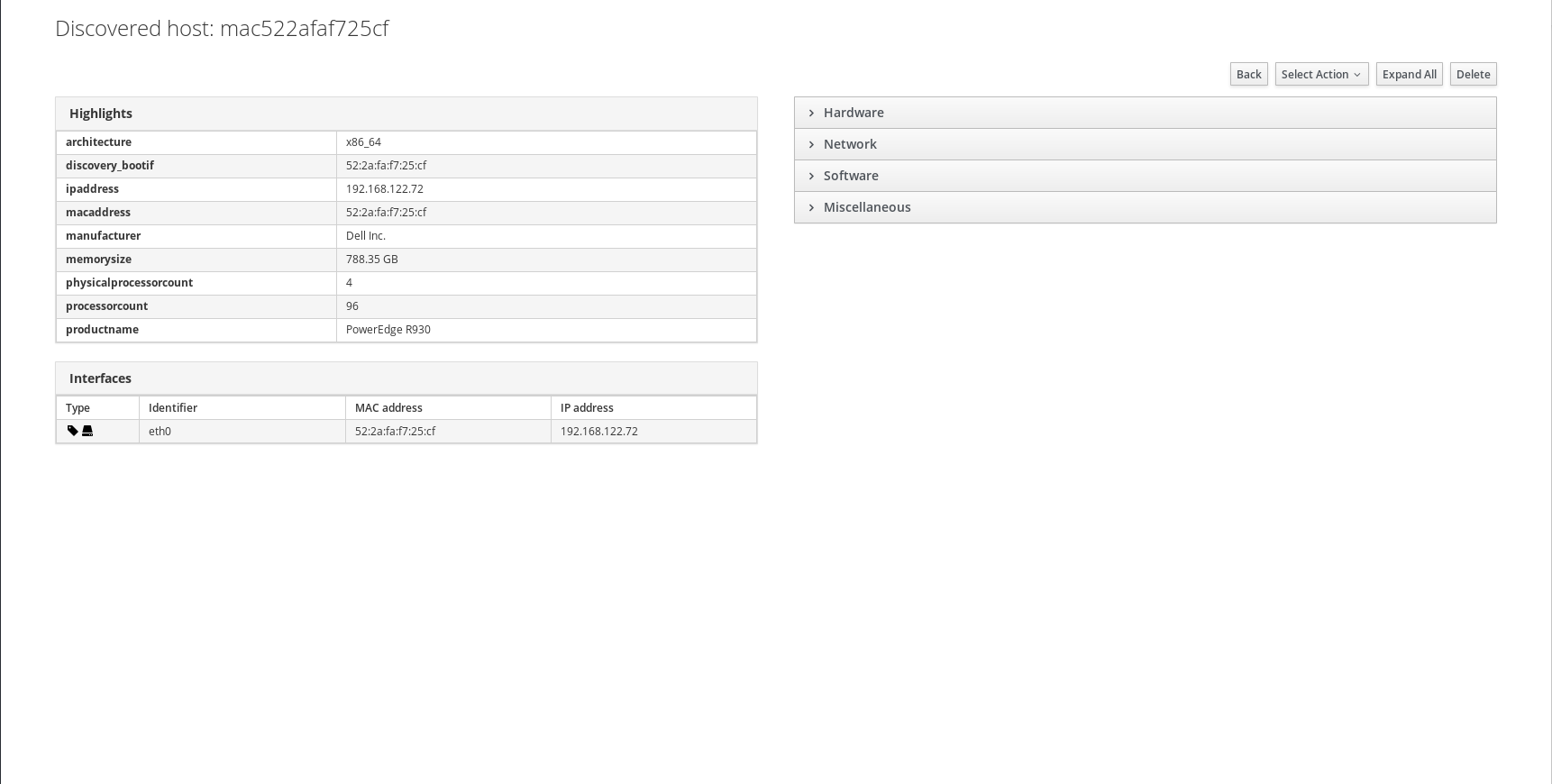
Currently the host discovery plugins contains an accordion for the host details, while current Host details in foreman uses tabs instead, and easier to get around.
I’m not against, but I suggest you first talk to @Roxanne_Hoover who already had some thoughts about host page redesign. Perhaps there are some wireframes already. Since this is one of most important page in Foreman, we should agree on final layout first, as there might be more changes desired.
@lzap, it’s not that it’s bad, but I think that the interface should be closer to how host looks, because It’s actually the same information, but from different source.
I think, and I might be wrong here, that if the interface is the same (in how stuff looks like), the easier it is for the users to find how to use the interface.
That’s why I think patternfly for example invented by RH, to provide the same UI language for products, so if a user know one product, they can see the same language on another product, even when the interface itself solving different things.
I think that’s well understood and consistency would be a win. But I think we also wanted to redesign host page itself, so if we could make the change with this in mind a redesign both together, I think that would be better.
As others have stated there is some talk and design work that was done on a combined host page.
See the preliminary design here (it’s just a draft):
I’m not against a consistent approach as you’ve outlined, but my personal opinion is, if we’re going to put in the work to bridge the gap between the two pages, we should just go the extra mile and complete the Host Merge initiative.
I also think that it’s not good time for redoing discovery page, we should wait until host merge initiative is finished, we should be part of that discussion making sure that discovery is aligned properly.
Roxanne, if you’re going to work further on the host page, please let me know. While it looks great on first look, it would be good to consider also setups without Katello/Puppet data, the Monitor page seems to rely on it quite heavily. Also we should keep it mind that it should be extendable from other plugins. I’d be happy to provide several examples of what data on the page are “optional” and what else is being added from other plugins.
Sure. Then, frankly IMHO discovered host has nothing much common with managed host. I mean, it’s very special state - discovered hosts are all the same, they have NICs and facts and you can perform few actions. I think it makes more sense to take advantage and present for example NICs in a nice way (e.g. with larger icons) or figure out something else.

 This one is nice actually.