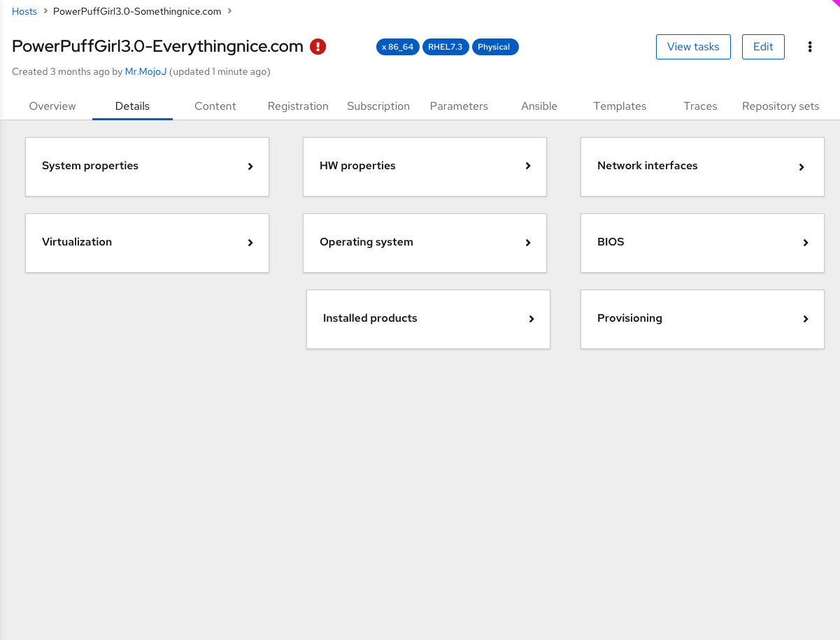
In the new host page, the overview tab brings a high-level summary for the host, but due to the amount of data a host can have (combining core and plugins) and for achieving a more organized user interface, we have designed an additional “details” tab.
In this tab, users can observe deeper information regarding the system, OS, NICS, content, registration, virtualization, and more.
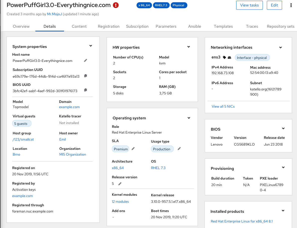
The design is similar to the overview tab, registered cards from core, and plugins which can be re-order by specific weights. However, in this case, more content and cards are significantly expected, therefore we have added a collapse / expand mechanism to each and every card, so users can be focused only on what they care about and to allow a more responsive grid looks.
Thanks @amirfefer, I really like the more informal tab and the layout looks good
Can you also share screenshots of a few collapsed and expanded cards on the same page? does the layout still look good?
+1 for the main toggle button and a to “remember”/store the last state of collapse cards
I would like to start with all expanded, so it is a “collapse what I am not interested”. As others perhaps will like it the other way round a global button would be good. And remembering this for a session (or even over a re-login) would than remove some clicks, so also bonus points for this!
I’m definitely for the remembering the state of collapsed & expanded cards for the session, or maybe for the account so it will be remembered after the logout.