Hey all, happy Friday. Here is some feedback I got, below. Each block is from a different persons opinion. Hope it helps.
AI Summary:
Hosts Overview Page
Pros
- Cleaner look, less like an Excel spreadsheet
- Easier on the eye for some
- Redundant elements like big OS icons removed (some users like this)
Cons
- Too spaced out, wastes screen space
- Lines sometimes wrap to two rows per host depending on window width
- Missing OS icons make it harder for quick recognition (for those who relied on them)
- Redundant columns (e.g., Owner always the same) = wasted space
- Needs a compact view toggle to fit more data at once
Host Details Page
Pros
- Modernized “dashboard-like” style
- Potential flexibility if cards could be customized, rearranged, or user-defined
Cons
- Information too scattered across multiple boxes/tabs
- Key data (IP, facts, jobs, audits, status) not front and center
- Forces scrolling to find basics that used to be grouped in one place
- Legacy UI is considered more practical
- Some blocks (like big status or IP boxes) feel like wasted space
Jobs Page
Pros
- Huge improvement over old design
- Dropdowns show job results/output without needing extra clicks
- Smaller status icons take up less space but remain clear
- Copy button without line numbers is appreciated
- Schedule Job button is more direct (fewer clicks)
- Cleaner and clearer layout overall
Cons
- Still a bit too spaced out (could fit more data per screen)
- Copy output would be even better with option to toggle/remove line numbers partially
 Summary:
- Jobs page = big win
- Hosts overview = cleaner but needs compact view option
- Host details = too scattered, old UI still more efficient
Individual Opinions:
Personally, I am not a fan of any of the new pages except for the Jobs page. I find that one much easier to read. For the hosts overview I find it too spaced out, not compact enough and hard to read without columns/rows. For the Host Details page, I find the information I need the most to not be front and center, and it looks a bit scattered. I love the new jobs page. Not having to click on each host/job to see the status is super helpful. Having a copy button to copy output without the line numbers is awesome. Just wish I could copy parts of the output without line numbers. Maybe an option to toggle line numbers on and off would be nice.
I was going to prepare a ‘like/dislike’ list for each of the three examples of the new UI, however, ultimately, for each of the pages it boils down to what information can I see at a glance and how easy is it to read. The information is still there, just that there may be different ways to view it but it is all still accessible. I basically came to exactly the same conclusion as you; the spacing is too wide. I would like to see as much data as I can at a time.
For the ‘hosts’ page there is a lot of wasted space because it can jump to two lines per host depending on how wide your window is and even if you can get it to one line per host those lines are too spread out. The headers are modified and the selection buttons are different, but they still provide the same functionality. The icons next to the OS are gone which is a very minor detail, but at a quick glance it was easier to identify the OS type by sight. Not enough of a difference to really complain about but I don’t see why it was eliminated.
The ‘hosts detail’ page I also think is too spread out and so much more information could be on a single screen than what is provided. I don’t need a large window box that tells me nothing more that the hosts status, or a single window box with just the IP’s. Why not have that all in a single block of information - basically as it is already. It all seems very similar to the ‘new UI’ in vmware vCenter where they did the same thing; reorganized the data into window boxes and spread it all out. It may look “cleaner”, but it’s not practical to have to scroll through the page to get the bulk of information I need which could easily be provided all in one place.
The ‘Jobs’ page does look more appealing but again the lines are too wide and much more information could be fit on to a screen than is allowed.
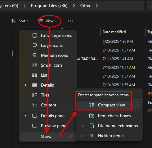
Similar to the latest Windows ‘file explorer’; they also spaced out the lines by default, but there is an option to have a ‘compact view’ which compacts the lines closer together which to me is much more desirable. They should at least provide that as a view option. I can understand some may like a ‘cleaner’, less cluttered look, but my preference is to have more information on a page just to make it practical rather than having it ‘look pretty’ (which is in the eye of the beholder).
eg;
For me the hosts page is a lot easier on the eye than the original. Not so much like reading an excel spreadsheet. The removal of the icons next to the OS cleans it up and makes it feel less busy.
Jobs page, I like the drop downs. I’ve always hated having to click into each minion to see the output. Reducing the size of the status circle is great. It doesn’t need to be as big as it is. Overall I like this page, it’s clear and adds functionality.
I agree on the host details page that the information is too scattered. I find it easier looking down the list than looking all over a dashboard to find the information I need.
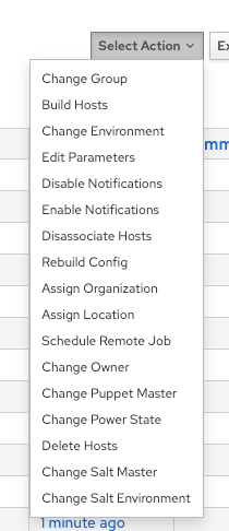
I like that the “schedule a job” is more direct instead of going to “select action” and then choosing a job but what happened to the rest of the options there? Will that make doing other things harder (not that we use those features often but still it was easier to do certain things in bulk)
The hosts page is a lot cleaner, although unlike Ben I do prefer having the OS icons as I find them easier to recognise at a glance. Big ask obviously would be to be able to add facts to the manage columns option.
Jobs page is a big improvement, drop downs are a big QOL improvement. Can’t think of anything bad for that page.
Host details page however is far too disorganized. If they gave you the option to be able to edit the page, move cards around or add your own I can see why you’d go down this route, but as is the legacy UI is superior. Especially bad that the facts are missing from front and center on the host details page.
I agree that less clicks for scheduling jobs is an improvement. Hosts page changes are more cosmetic and I dont really lean towards new layouts unless its adding some useful functionality or faster.
Hosts overview is cleaner but too spaced out, reductant columns example owner is always the same(wasted space).A compact view toggle would help.Host details info is scattered and requires too may clicks across tabs. Key data like IP, Jobs, audits, status should be grouped together in one summary view.Job page great improvement, drop downs and schedule button are great.