
Processing: Hardware Models.mp4…
Thanks @MariaAga for enabling the discussion, overall I really liked it, though there are few things that we need to adjust in my opinion, here are my 2 cents:
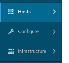
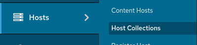
I like the older menu’s width which was smaller 200px vs 250px, and I kinda liked the arrow that used to be there though I can live without it ![]()
new:
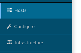
old:
another thing which might need a bit fixing is the margin / padding of the secondary-nav headers,
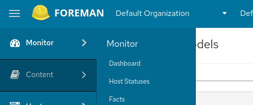
new one: 16+8+8 = 32px
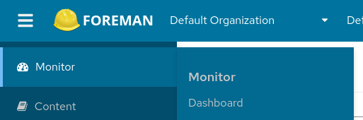
old one: 18px
look at the secondary menu padding above “Monitor”:
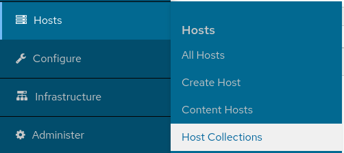
new:
old:
Hovering items background, personally I prefer the dark one so it doesn’t mix with the page content.
Before, we used a dark background when hovering items:
In the new version we use a white light background
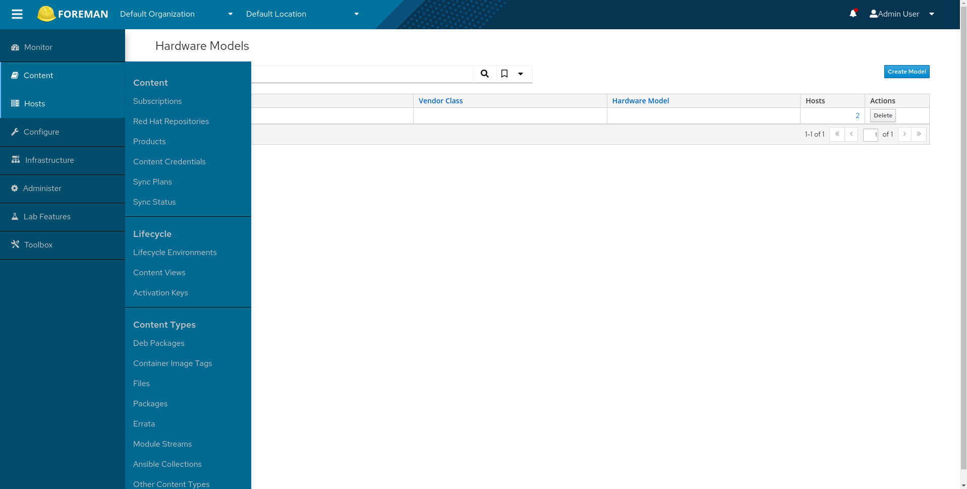
The last thing, on my laptop screen the “Content” menu which is quite long, makes a scrollbar appear and it looks like you can never reach its ends, in the older version there’s no need for a scrollbar and the page didn’t “jump”.Maybe when fixing the padding there will be more space, or maybe we need to split this menu into more categories.
new:
old:
