In my experience with these kind of menus it’s always most important how it behaves around the edges. How easy is it to accidentally close the menu by hovering just outside of it.
Thinking back, I think we used to have non-full height flyouts. They made it easy to go just a bit too high with your mouse (say top right) and accidentally close it. The current menu is full height which deals with it.
You can’t really see these things on screenshots. I think it’s @amirfefer who often records a short video of the interaction as well (which I greatly appreciate). Can we have the same thing here?
So you can open it by hovering but only close it by clicking? That sounds inconsistent. I wonder if it’s possible to have a static HTML page somewhere (outside of a Foreman installation, without authentication) so we can easily interact with it since a video probably doesn’t cover the nuances in feel.
I just quickly clicked through the menu, and I have some notes / suggestions / questions:
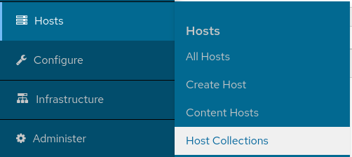
I really like that clicking on 1. level items doesn’t reload page anymore!
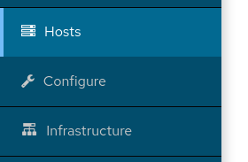
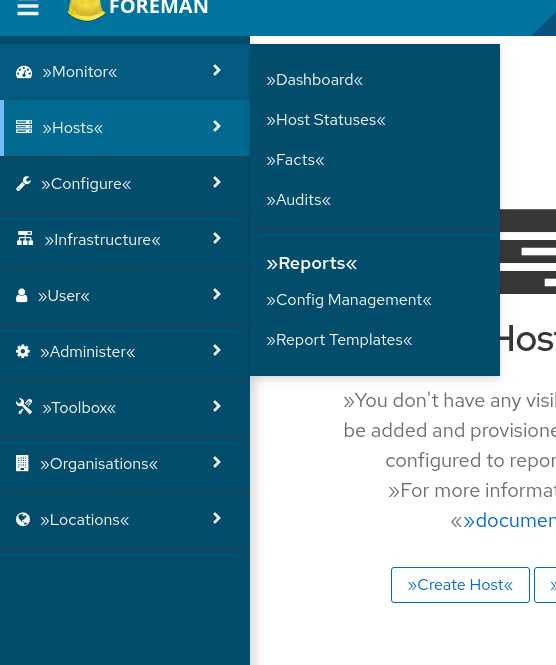
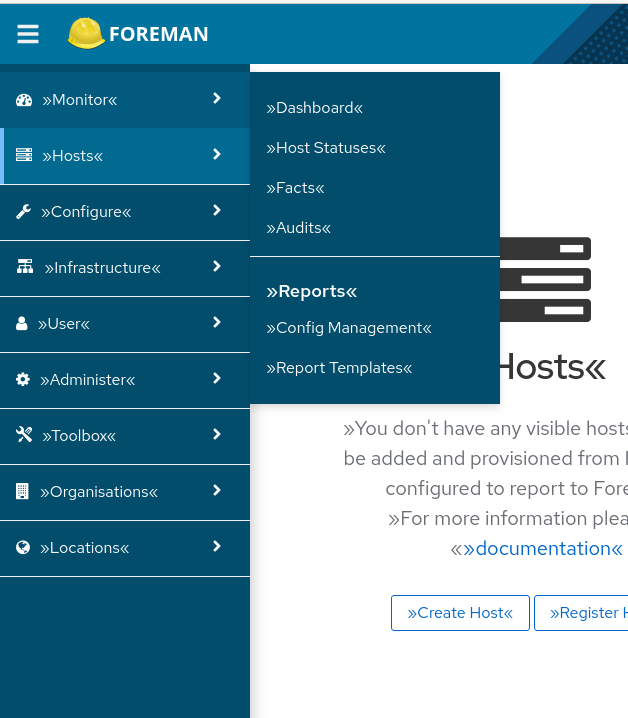
Headline in 2. level looks almost same as text of links, bigger difference in contrast / size would be nice
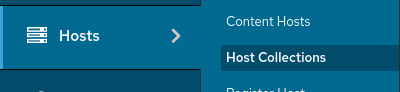
To headlines above, do we actually need them? I mean if I click on “Hosts”, I don’t need additional headline “Hosts” in 2. level, right?
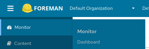
If I’m at “Infrastructure > Smart proxies” page, only “Infrastructure” item in 1. menu is highlighted, could we highlight “Smart Proxies” too?
Clicking on 1. level link is only closing the 2. level, but not reopening. If I want to reopen the 2. level, I have to move the mouse. People on tablets will cry
Infrastructure is not aligned with the icon
Clicking on 2. level menu is closing the menu, is this intentional? For example if I miss the “all hosts” link and I click on "Host"s headline instead, 2. level menu will close. That makes me angry.
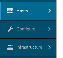
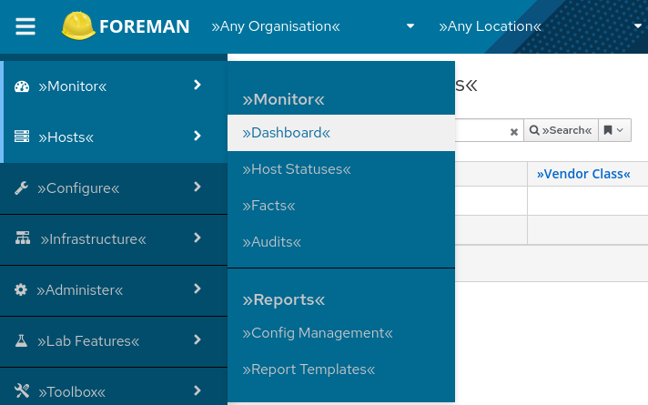
Why are there >> << braces around everything? Is that intentional?
Also, my apologies, clearly I am not well versed in the material and need more context to understand what it is I am even looking at: What is PF4 Navigation, and what is the difference compared to what we have now?
I have “mark_translated” set to true, so it wraps every string in >> <<
Currently we use an old version of Patternfly (3) for navigatoin, and we want to move to the new version (Patternfly 4).
This is a code change and a look change.
As we are editing the code the navigation behaves and looks a bit different, so I’m asking for feedback on what changes to keep and what changes should be different.
@MariaAga thanks for the changes u made here.
But I still have a couple of suggestions
If the first level item is just hovered (not selected), you currently visually display it the same way as a selected item. You need to remove the blue stripe on the left.
Hovered state should have a bit darker background than a selected one.
Text color shouldn’t change (it does right now). I would opt for regular white as I’m having trouble reading the grey text on the blue background
Change the color of the lines between items. Use rather greyish color as shown on the examples in PF4
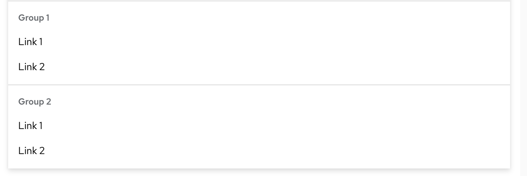
As lstejskal mentioned, I would also recommend removing group names in the second level if there is just one group e.g. Administer.
Thanks, it looks better. I agree that it’s a bit confusing from which first-level item stems the second-level menu but I was told that the interaction is clearer in a clickable prototype and not in a static screenshot. (@ekohl )
I contacted the designer that works on the nav design, she also suggested the usage of blue lines (the same color as a hovered state). So I’m playing now in the sandbox to see if that’s the solution.
Here the group name is 14 px, item name 16 px, and a bit different color so the group name doesn’t look more prominent than items.
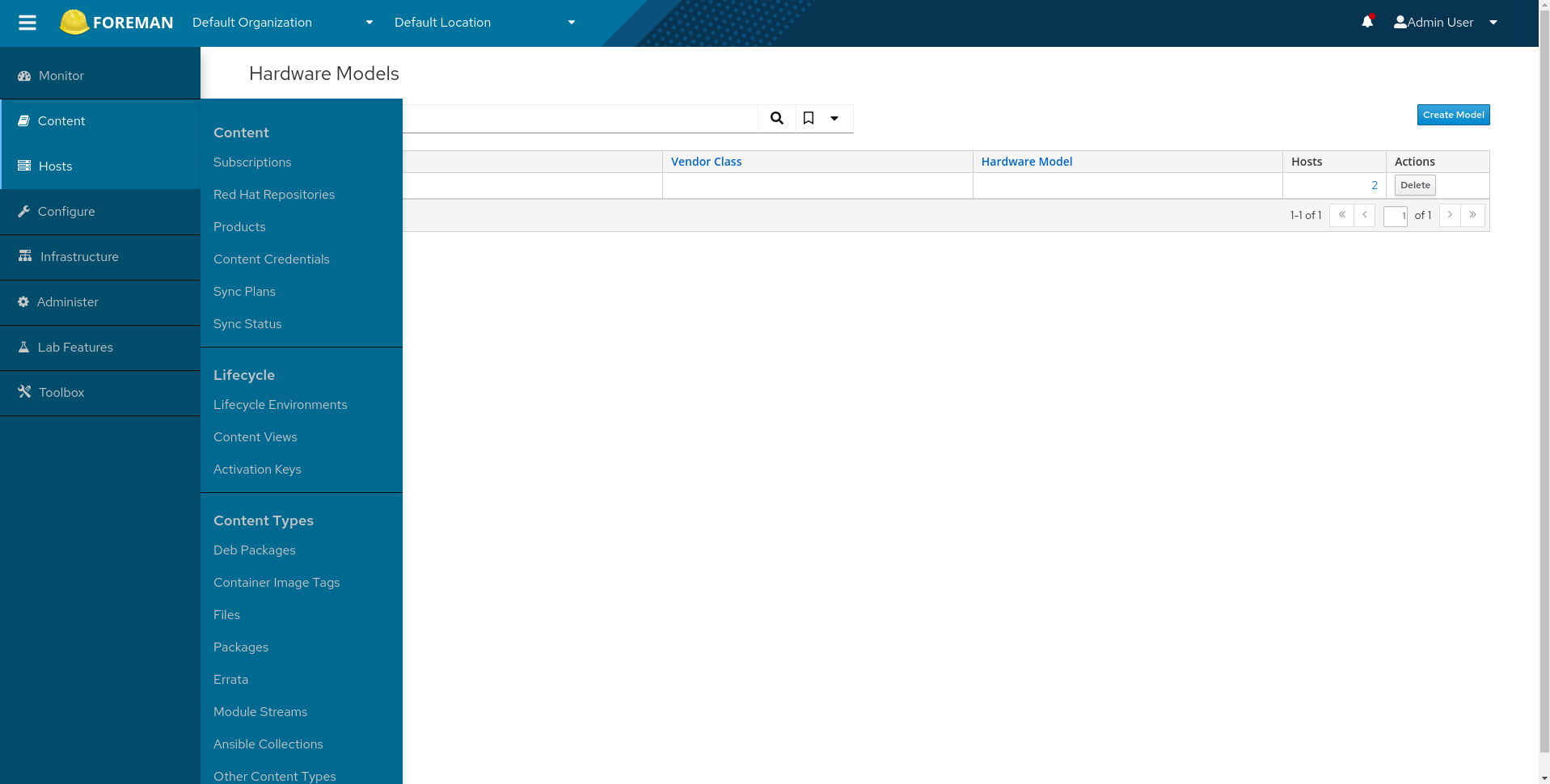
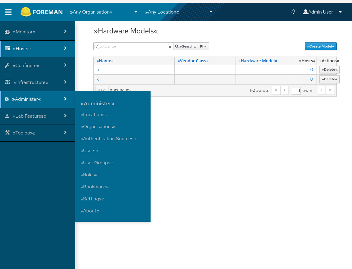
Processing: Hardware Models.mp4…
Thanks @MariaAga for enabling the discussion, overall I really liked it, though there are few things that we need to adjust in my opinion, here are my 2 cents:
I like the older menu’s width which was smaller 200px vs 250px, and I kinda liked the arrow that used to be there though I can live without it
new:
old:
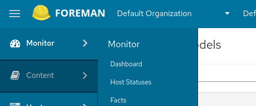
another thing which might need a bit fixing is the margin / padding of the secondary-nav headers,
new one: 16+8+8 = 32px
old one: 18px
look at the secondary menu padding above “Monitor”:
new:
old:
Hovering items background, personally I prefer the dark one so it doesn’t mix with the page content.
Before, we used a dark background when hovering items:
In the new version we use a white light background
The last thing, on my laptop screen the “Content” menu which is quite long, makes a scrollbar appear and it looks like you can never reach its ends, in the older version there’s no need for a scrollbar and the page didn’t “jump”.Maybe when fixing the padding there will be more space, or maybe we need to split this menu into more categories.
Hi, some of the parts you are referring to are out of date, can you look at the new screenshots in this thread? Also the arrow should appear after “npm i”.
And the scroll is broken currently.
Just adding my comment from Gchat, so we won’t lose it.
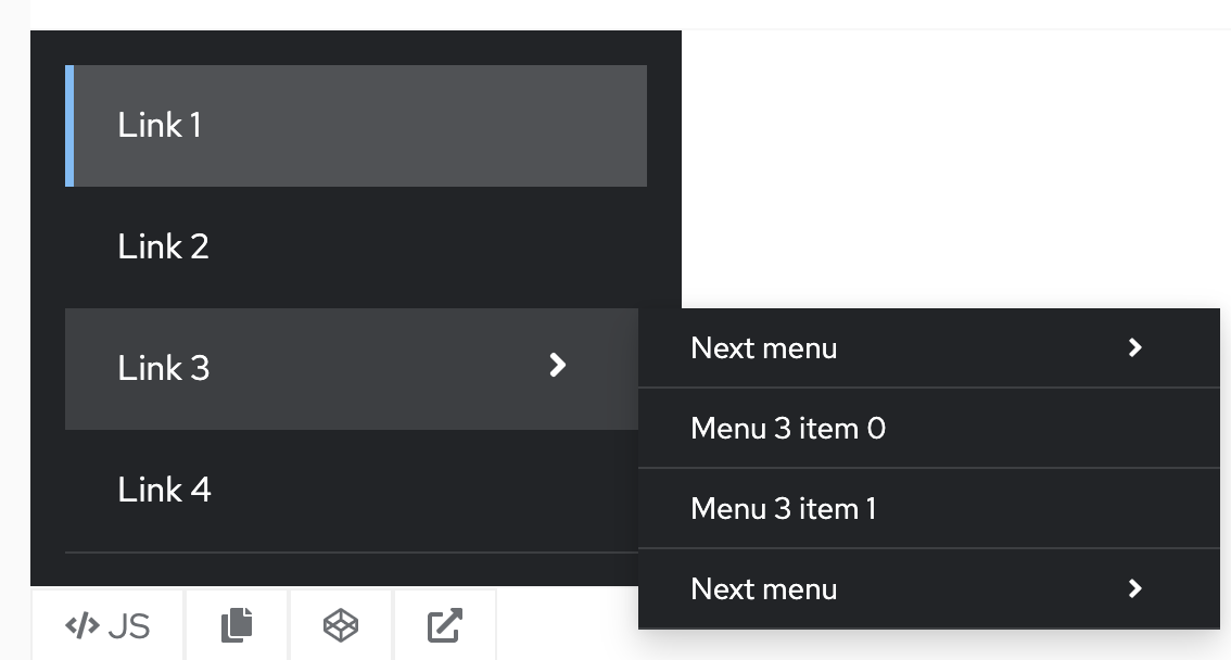
So I met with other designers and described our issues in the nav. They pushed rather for tertiary nav than overriding PF4 patterns.
So e.g. the host nav would look like this:
There are content issues in the nav which we could address in the next release and make it better. (based on next year research in initiatives) Also there were voices for implementing menu search.
Hosts
  Hosts
    All Hosts
    Create Host
    Register Host
  Provisioning Setup
    Architectures
    Hardware Models
    Installation Media
    Operating Systems
  Templates
    Partition Tables
    Provisioning Templates
Would I need to expand the second level as well? That feels like a step back in usability. Is there any reasoning provided why a tertiary level would be better?

