
Yes so a user will have to expand Hosts, and then expend Templates to get to “Provisioning Templates”.
This was the solution that was suggested by PF4 to address the “long menu” issue Ron described, where in the new design some of the menus will need scroll as their height only starts in the middle of the page.
Sorry, I haven’t noticed incorrect formatting. Here it is:
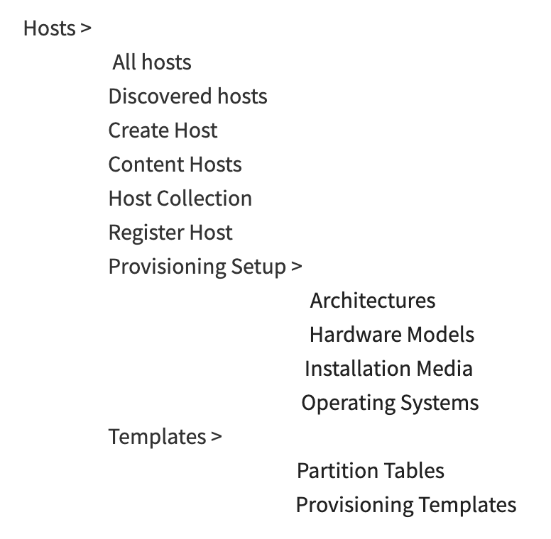
The point was to have the entire Host section in a second level (better discoverability) and the rest in the third level. Maria is correct about reasoning.
In 7.1. we should address navigation content, which needs some UX love (based on some previous research), but for now, let’s just implement the PF4 pattern.
It’s a flyout so there is not much time lost in hovering on the secondary item to see tertiary content.
I still miss the reasoning that we need to change the current menu. Other than that it isn’t PF4, what’s wrong with it?
The reasons are:
- We want to stop using pf3 as its not supported anymore.
- We want to maybe use a new design that will be easier for a user to use.
That still doesn’t describe any problems with the current menu. If you’re talking about easier to use, there must be specific areas that you think can improve.
Maybe it’s just a trauma that I have with fly-out menus. A long time ago Foreman had a fly-out menu that frequently annoyed me. Mostly when it lost focus if I moved my mouse to the wrong place. It was replaced with the current menu and that has always felt good to me. It’s been clear and predictable in its behavior.
Lets differentiate between two issues here:
- The current menu uses components from Patternfly 3 which is no longer supported and is technical debt we should get rid of. I’m not sure what part exactly of the menu (both behaviour and design wise) we get from the Patternfly 3 component and what we implement ourselves, and if it is different with regards to the PF4 components. We could decide to either switch the components to Patternfly 4 components, or build our own. This decision, imho, should depend heavily on how much we get from the PF4 components and how much we need to implement on our own.
- Patternfly 4 contains some recommended patterns and designs that have undergone user testing and research. However, in this case it seems that the designs they propose do not give a good enough solution for our usecase. We can decide to either continue the discussion with the PF team and reach a better solution, or decide to ignore their proposed designs (or part of it) and override some of the styling to better fit our use cases.
Additionally, we might be able to reduce some of the issues by reorganizing the actual menu tree - something we’ve discussed several times in the past but never actually done.
I don’t like how “Content Hosts” are under Hosts and not under “Content”. But I am sure others will prefer it the way it is. ![]()
AFAIK the idea is that the new host detail page will merge it all to “hosts”. Eventually we should end up with a single host overview and a single host detail page. Some hosts just happen to have content and the pages will reflect this.
2 Likes
That will be nice, when we get to this “eventually” land! 
Wanted to also mention here that in this new design there won’t be a “compact nav” option like we have with the icon navigation:

1 Like
It’s better to think about Content Hosts more as “Hosts which consume Content”. Then it sits better under the Hosts menu.
But as others have said, this should eventually be solved when the grand unification of Hosts pages happens. (Can’t come soon enough in my book).
That’d be a shame, I really like the compact mode as it wastes less screen for me on my laptop. 