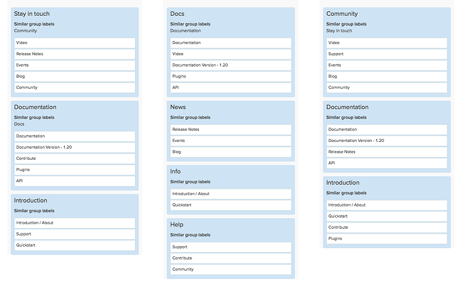
Here is a card sorting exercise. that should help us understand the information architecture of the site. This will 7 minutes to fill out. I used existing items in the Foreman navigation, but if you come up with any that we should add/remove, let me know! The card sorting site is collecting the results, but feel free to share your results and thoughts here as well. Excited to see the results! More info about the redesign is here.
I’ve got three responses so far, and I am already seeing helpful patterns.


