
Agree on icon, especially as in the mockups a yellow bell is used for changed and a black one for notice.
From the four mentioned I would opt for sync as it looks best for its own, but not sure how it look will next to two other round but filled icons.
3 Likes
@lzap @Dirk
Good catch, I’ve overlooked the icons on the detail page (there are months between those two designs) ![]() .
.
Here is a quick overview of the icons picked by Lukas and put in the context:
pficon-on-running
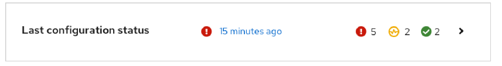
pf-sync (fa-sync-alt)
2 Likes
Still not sure which one I would prefer as the other two look more solid, leaning to the first one now, but would be fine with both.
I like the sync option more, I also think that yellow color is kinda okay. It pulls attention, maybe too much tho. I would be okay if the sync icon was black and white too. But I am okay with yellow to, we need to finish the design after all. Ten people, ten preferences. 
While I have no strong opinion on the icon, just yet, other than I’m not quite sure on the current options. And maybe the community could look at: pf-icon-automation, pf-icon-in-progress, pf-icon-migration, pf-icon-pending, pf-icon-process-automation, … — none jump out the right answer(s). Most are hard to “see” at smaller sizes, which may rule them out of contention, if they need to pass a clarity / intent test at these smaller sizes.
Main Point: I would say, blue is a better colour for in-progress / running status IMHO.
Justification: As to most people, I think, yellow/orange would be viewed as warning colour, and red an error. So a colour for “we don’t need your full attention yet” might be useful. Before others point this out, one could argue reasonably that, something in this new colour for extended period of time, might deserve a yellow/orange colouring.
Just my 2 cents worth.
1 Like
This is why I prefer yellow here, changes in configuration management are something to be reviewed if not expected in my opinion.
2 Likes
First of all: I quite like the new design! I think, it’s impossible to make it 100% perfect for every use case, but as far as I can tell, I would be happy to work with the shown design.
Regarding the “changed” color: I think it depends on the type. Puppet knows about corrective and intentional changes. Puppet Enterprise uses blue (intentional) and yellow (corrective). As we (Foreman) doesn’t differentiate between those types, I would also lean towards yellow as the more dominant color.
4 Likes
First of all, I want to thank you all again for this great discussion and your involvement.
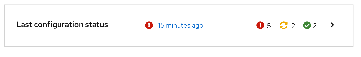
I discussed the icon issue with the design team and we came up with the final decision to use the fa-sync-alt icon as its meaning is well established (as change) also outside the PF4.
Here it is:
I am aware that decisions like these are never going to be liked by everyone, but I hope it will nevertheless improve your experience just a bit.
Thank you
7 Likes