Puppet tab in Host details page - Proposal

Hi, community!
As you all know UXD team has been redesigning the host detail page for a while now. Here is the newest proposed addition to the page -The puppet tab.
It comprises sub-tabs: Reports (basic puppet details, puppet reports, resource chart), Assigned puppet classes, and Smart class parameters.
I’m looking for your feedback. Is there anything missing? Have you spotted major problems? Illogical flow? Please, be candid and let us know!

See full design here - not pixel perfect and contains dummy data :wink:
(Note: on the right side of the mockup there are notes)

Reports:

Assigned classes:

Smart class parameters:

Here are some problems we have been dealing with:

Puppet reports

  1. Should there be sub-tab Reports (with Puppet reports) if we are going to have a first-level tab Reports that would consist of reports from Puppet, Ansible, etc.?

  2. Should Puppet details inside the card be always expanded? (environment, smart proxy, ENC preview, maybe also a link to view assigned classes/executed classes) Should there be any other details?

  3. Do you want to see the configuration status here? Is it of any value to you?

Puppet smart class parameters

  1. Is ok to use Name as a column header instead of Key (currently used term in smart class parameter detail page)?

  2. Do you want to have the ability to reset the value back to the default one?

4 Likes

IMHO yes. In the Puppet details I would expect to see which Smart Proxy is the Puppetserver (as a a link) and the reported Puppetserver URL. The same for the Puppetserver CA. We don’t have those today so I can’t really link you to it. However, the host edit page has a Puppetserver (still called Puppet master) and Puppetserver CA.

Additionally, we know the environment it’s in so that’s another detail I’d expect to see. I wouldn’t expect a link to the assigned classes since that’s already on the top.

IMHO: no. You already see the recent reports and that’s sufficient. Perhaps others have a different opinion.

I’d say that’s better than Key.

As for assigned classes: I’d stay away from “executed classes”. To me the current view (which is complete) is much better. Today it’s possible to have classes assigned via a host group and then it’s impossible to remove (which is good! you don’t want to accidentally modify the host group). Do you disable the actions on it?

For both assigned classes and parameters: do we even need actions in the beginning? Can’t we start simpler and leave all actions out of the initial design?

The Source attribute label confused me. Would Assigned via or Declared in be better? Related to that: what if both a host group and a config group assign the same class. What do you show?

That’s deleting the override, right?

As for the reports:

  • The Pending status is not something I’d expect. AFAIK we either have a report or we don’t.
  • IMHO passed should be blue, not green. It’s informational, not a success. If a host is applying changes every single run, that’s not normal. Making it green does give that impression. No change is the desired state so that should be green.
  • Similarly, we should not group No change and Passed into one field in the summary. I’d say we have No change, Active and Failed. I can’t really think of other states.
  • For summary: I think the totals are not giving a complete picture. I’d need to know what the timeframe is where those reports came in. Is it the last day? week? all time?
  • Does clicking on Summary chart quickly give you only the eventful runs? While not the default, it’s something I find the most interesting and the UI should make it easy to find.
1 Like

Nearly total agree to Ewoud.

  • Pending status is fine as not the report is pending, but one or more resources. You get this with a noop run or if a resource is set to noop.
  • I also see Active as better than Passed, but would say make it a warning color (yellow?).
  • I rarely need to see reports that are not eventful (except of the last), so would a default filter make sense a user than could deactivate instead of the other way round?

Mostly agree to Dirk’s amendments to Ewoud’s observations.

  • I do not like “passed” at all. This is not a puppet-native term. “Active” or “Changed” or “Succeeded” perhaps might be better terms.
  • I do like being able to see reports that are not eventful, but this does not have to be the default view. In general seeing empty reports can be extremely valuable in triaging a flapping resource (one that is changing frequently), which can be a common situation if tools other than puppet are managing the environment.
  • There should be special handling for noop runs, which would have done something but could not because noop was true for that run.
  • I like the links to details and the summary chart, and the summary data is good.
  • It ls not clear what the boxes under Puppet reports represent. Do the numbers for Passed/Failed/Pending/Other represent reports or resources? And if every report has resources in every status, how does that information help me in general?
  • I like the Configuration Status card - it’s good to know current status. It feels odd to call it an “execution” though - “run” feels more natural/normal.
  • I love having assigned classes and smart class parameter tabs. I’d recommend capitalizing YAML
1 Like

Just to put this into context, we are working on a new plugin named Foreman Host Reports which completely changes how config reports are stored. It is optimized for efficiency, Maria is designing the new pages according to the new data structures.

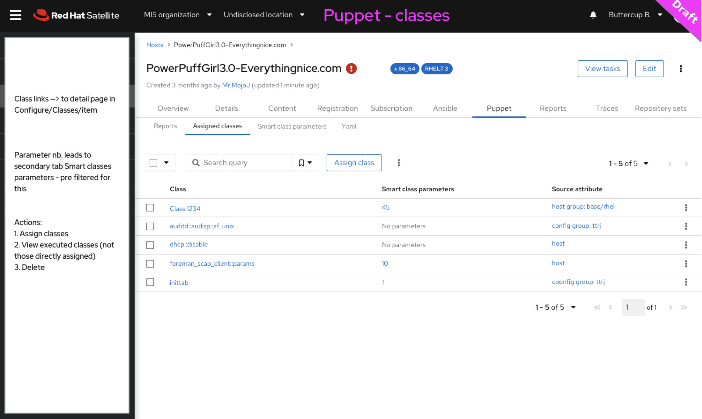
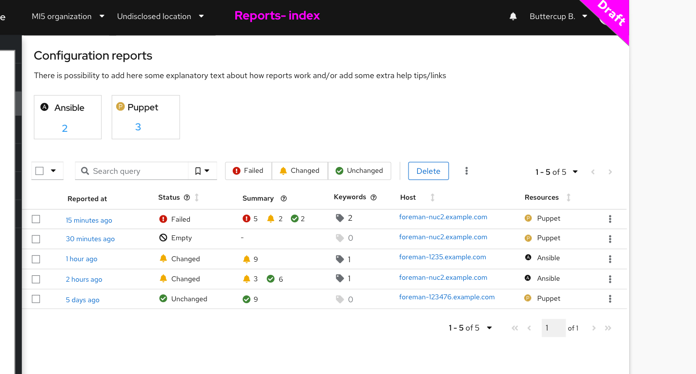
In short, reports are stored as JSON in text column, reach report has a date, proxy that reported it, host and most importantly four summary fields: applied, failed, pending, other. The idea behind this is to narrow down amount of states, Puppet is way too verbose and can overwhelm the user. Another reason is to keep the reports table as small as possible (minimum columns with indices). Reports can also have “flags” (called keywords), think about them as “tags”: pretty much any string that will be created during report upload.

Typical report will have keywords like “HasChange” indicating there was an eventful change, or “PuppetFailed://resource/name.pp” when a resource fails. The keywords are there so users can search for arbitrary things. After reading this thread tho, I think we should probably promote “changed” to a summary field.

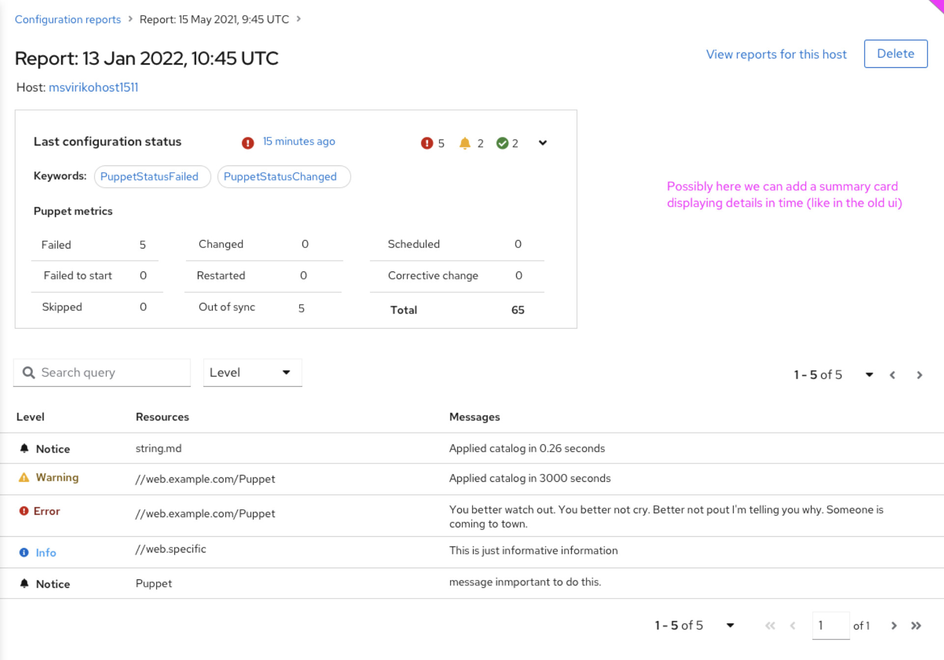
The mapping is currently (looking for more feedback):

Puppet

  • changed → applied
  • corrective_change → applied
  • failed → failed
  • failed_to_restart → failed
  • scheduled → pending
  • restarted → other
  • skipped → other
  • out_of_sync - ?
  • total - ?

When a puppet report is eventful, the plan is to set HasChange keyword, but I struggled to figure out this. This needs to be done.

Ansible

  • applied → applied
  • failed → failed
  • skipped → other
  • pending → pending
  • changed → HasChange keyword

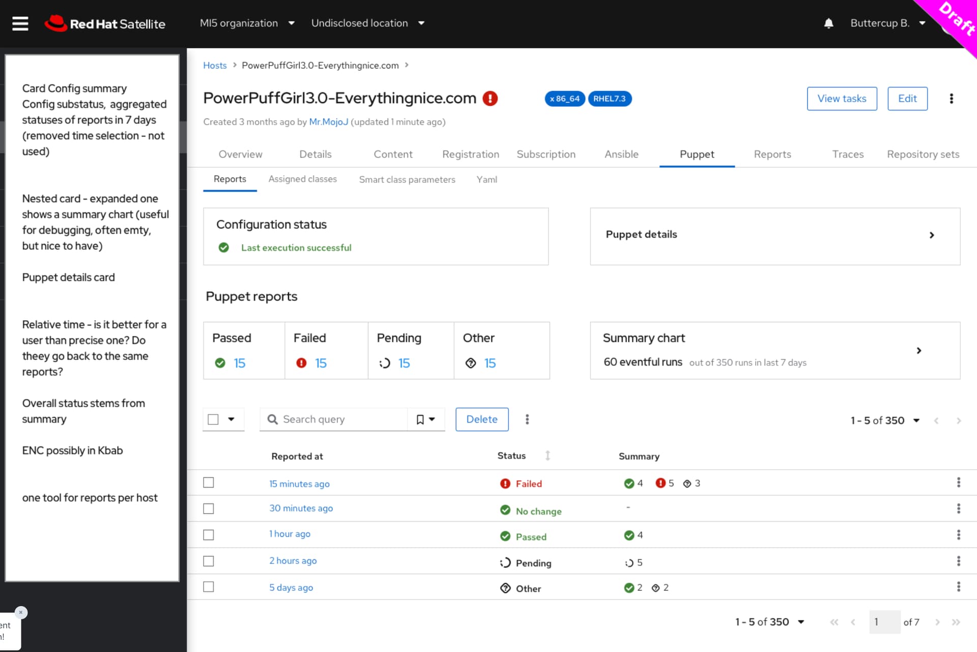
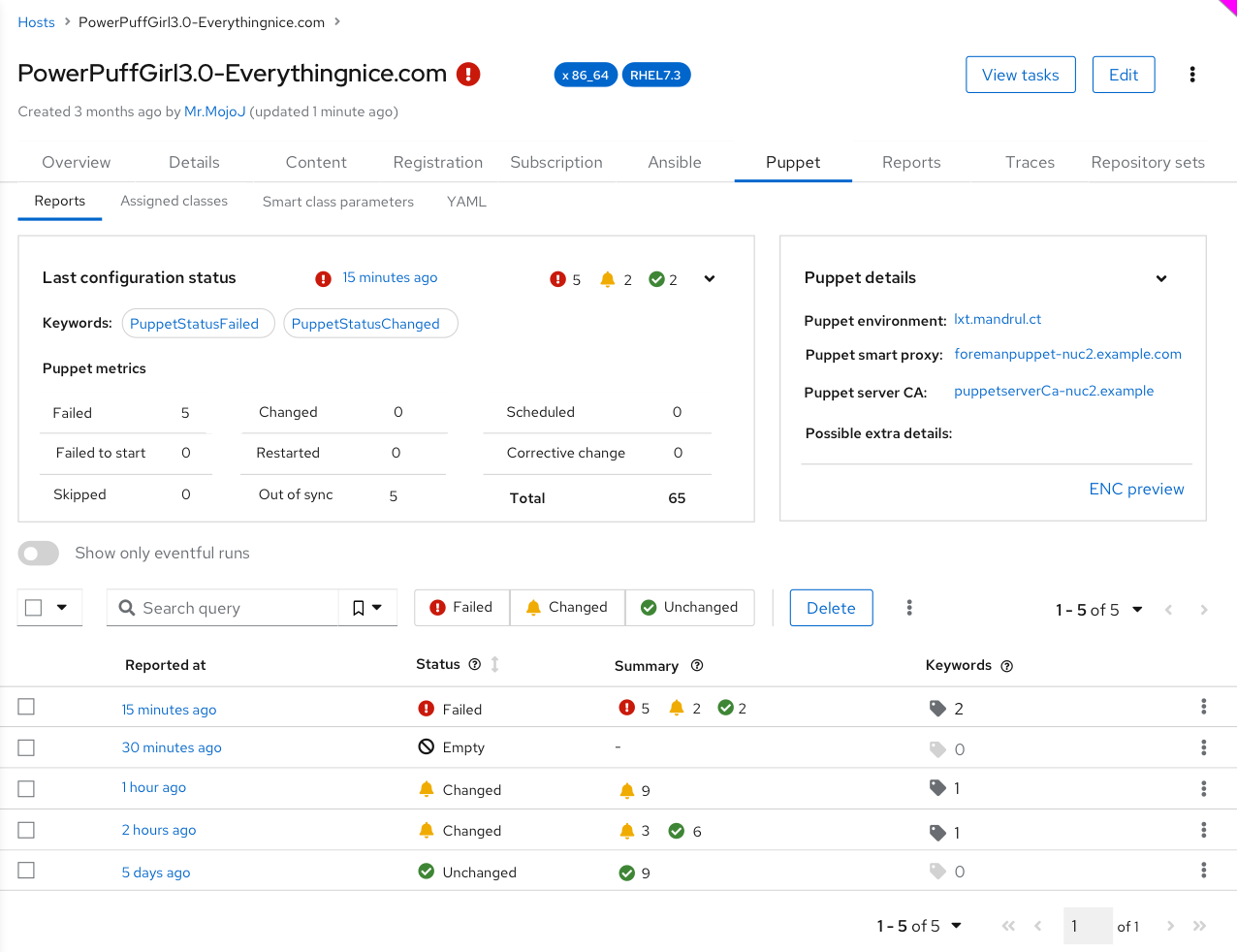
The open question is if we want to “translate” these four summary counters to something more meaningful on the detail page or not. On the index page, you can see these four summary counters has only icons, so when you open up Configuration Reports page, the data will be consistent even if you have multiple reports.

Then we have the Status column which is not stored in the database and it is just more elaborative overall status of the report. It is deduced ouf of the four summary counters:

  • Passed - when applied > 0 and failed = 0
  • Failed - when failed > 0
  • No change - everything is 0
  • Pending - when pending > 0
  • Other - when other > 0

The question is if we want to have common overall status for all report types, or we want to map overall status per type. We need a feedback here - I would really appreciate if experienced Puppet and Ansible ops could help us to identify the best mapping and terminology here.

I like that the page is not just a table and the four panes are I think reasonable, showing the last status makes sense, but I think for better consistency, we whould keep the same name as in the Status column. In this case the last report was Failed so it should simply read “Failed”.

Please help us to find the best mapping and overall status of a report, see above.

No change is a bit fuzzy to me in the current design, how a puppet user finds out when there was no change? I think we had an eventful “virtual” flag in the old design and I think it makes a lot of search queries slower, if that is an important flag to have, let’s define it and store it in a separate summary column so we can quickly get those.

Looks like this is really important then, can you help me to figure out what reports are eventful in the current mapping design for Puppet? I think we need a 5th summary column named “changed” and when greater than zero, than a report is considered eventful. This would replace the “HasChange” keyword, I had no idea that eventfulness is that important.

If others share this opinion, we can simply have the format implementations to have a term mapping - on the puppet report, the four summary fields would be presented with a different name than on an ansible report. Help me to find those terms then and we can implement this.

As I said, the overall Status can also be mapped per report type if that makes sense. But we really need the feedback.

Resources, I think a mouse hover could explain that, to me it looks pretty clear.

Noop should create a “Noop” keyword and that can be presented easily. How you would like this to be presented both for Puppet and Ansible?

Thanks for the feedback so far, both from the UX perspective and from the technical perspective. I would really appreciate if you could help me to decide:

  • Should we add 5th summary column “changed” so eventul queries would be faster?
  • Can you find me mapping of all Puppet report states to our 4/5 summary columns? I am sure it is incorrect at this point.
  • Can you review the same for Ansible? That one I am pretty confident we got right.
  • Do you prefer tool-native names for the 4/5 summary columns?
  • Do you prefer tool-native names for the overall status?
  • Which overall statuses are meaningful to you for Puppet?
  • Which overall statuses are meaningful to you for Ansible?
  • We want to simplify the detail page - which graphs can we delete and which one to keep?
  • Is there any feature you would like to see in the new reports?
  • Which graphs/widgets on the dashboard page to keep and which to delete?

Thanks all!

1 Like

Maria, we had a request to store and present puppet environment and puppet version with reports. We already do that, can you find some place where we would show such data? Perhaps Puppet details? Can you show examples of when these are expanded?

https://projects.theforeman.org/issues/31927

Initially I wrote a long reply, but there is:

Also, there’s a schema

From that documentation, I wonder why we don’t use the status field at the top level. That’s an enum failed, changed, unchanged. These are the 3 states I would expect to see in the UI.

The fact we do that today in our report processor is probably a historical reason to be compatible with ancient Puppet versions that didn’t have this. The schema was “only” added in 2013 and already includes it (Puppet report format 4). Our report processor is still compatible with report format 0, simply because nobody looked at it for ages. There’s no reason to copy our sins.

1 Like

Can you elaborate the proposal? So instead of the four summary counters, you would just have a state that can only be either: failed, changed, unchanged completely ignoring the metrics?

Well I am not against simplification at all, as long as it fits Ansible or other configuration management tools.

I was digging in the Ansible format and I actually realized we did not send all the data correctly, so I created a patch:

https://github.com/theforeman/foreman-ansible-modules/pull/1325

Ansible summary is the following:

"summary": {
    "changed": 1,
    "failures": 0,
    "ignored": 1,
    "ok": 3,
    "rescued": 0,
    "skipped": 1,
    "unreachable": 0
}

The example above would be:

  • changed
  • keyword: HasIgnores
  • keyword: HasSkips

This can be easily mapped either to the 4/5 summary fields or if we choose to go with your proposal. I always thought that ops need to see the numbers - how many resources have failed. But if not, then these are 4 colums we can delete with 4 indices, less updates for the SQL server.

I’m looking at the Reports screenshot in this post and there’s 2 places where I would indeed expect to see just those 3 states.

First (going from the top) we have Puppet reports with a small table under it. There I would expect only those 3 with counts of the reports. They now look like links and I would expect that if I click it the visible reports table is filtered or I’m redirected to another listing with only those reports.

Then there’s the table with the Status column. There I would expect the same. Only the summary would be based on the metrics.

I realize I was involved in this earlier, but being on PTO for 2 weeks has created the clarity to take a fresh look at this.

Thanks for the description of the background for this!

I think we should. It’s the single most important differentiator for reports, and a lot of puppet reports are going to be non-eventful, so I think it’s valuable. As a puppet op I interpret all 0’s as different than “successful changes with no errors”; it may be interesting that changes are happening when not expected, even if they’re happening successfully.

restarted should map to “applied” here I think, rather than “other”. Since restarts are the result of a successfully managed resource working as expected.
skipped I would argue belong to “failed” (since skips in puppet are usually caused by a dependent resource failure, puppet refuses to manage anything beyond it in the dependency graph).
out_of_sync - is this even reported on individual resources? We never used that, but we did noop only by exception and it was a bug if it was on too long. If it is there, it seems like it should be “pending”.
total we used to sum up and use for public presentations, mostly. It’s useful in situations where you have generated resources (or recursive file management), but in my mind doesn’t belong on the “front page” of the report, maybe in details.

My vote to replace “Passed” is “Changed”.

Yes, that is correct everything with a non zero value would be eventful. And perhaps it is not so important for everyone, but it should be as there is some error in your puppet code when there is always a change reported, you need multiple runs to finish without failure and so on. In many environments this is ignored which will then cover some important failure later on. I have seen this too many times. :frowning:

This would be great for complete noop runs (like executing the agent with --noop for testing), for resources which have the noop attribute set. The later is seldom done, but have seen it in some environments where someone wanted to be informed by puppet, but apply the change manually. With noop if a change would be applied, it will be marked as pending.

You could also argue for pending, as it has not failed as it was never tried.

Did we manage the same puppet environments? Because it feels like we managed the same puppet environments. :slight_smile:

Yeah, I could definitely see that line of reasoning.

2 Likes

Thanks guys for reviews, I think the mapping deserves more attention so I am creating a new thread with the mapping, please review and discuss there.

I will let Maria to continue on her UX work here, we might end up renaming Summary and Status fields so please consider these WIP. Thanks!

2 Likes

Thank you all who participated on mapping refinement in New config report summary columns

Here is the result:

  • We are dropping the “other” summary column.
  • The three summary columns are: changed, unchanged, failed.
  • Let’s add a new table column on the report index page (thus also host detail - table pane) next to the summary field named “Major keywords”. This column can show some keywords (user configurable via settings) that can be interesting. Typical keywords I would expect there: PuppetNoop, PuppetCorrectiveChanged, PuppetSkipped or PuppetRestarted. For Ansible these would include: AnsibleUnreachable, AnsibleIgnored or AnsibleSkipped. EDIT: After chat with Maria we thought it would be more intuitive just to show Keywords column with nothing when there are no keywoard or number with number of keywords with some interactivity.

Here is my further feedback on the UX design of the host detail pages:

  • On each of the detail page (Ansible/Puppet) we whould show the three summary counters as well as tool-native counters (aka metrics). Ansible has: ok, changed, failures, unreachable, rescued, ingored, skipped. Puppet has: corrective_change, skipped, restarted, failed_to_restart, scheduled and out_of_sync.
1 Like

Summarizing from the UX meeting today- I’m concerned that if a user doesn’t know what those 3 words mean intuitively (changed, unchanged, failed), the summary won’t be useful. The alternatives mentioned were (a) the user picks 3 important native metrics (from the Puppet list of corrective_change, skipped, restarted, failed_to_restart, scheduled and out_of_sync) and we show those; or (b) we keep the summary columns and add tooltips to show which native metrics they are composing. Now that I’ve written it out here, I feel like (b) is probably better.

1 Like

3 things we could consider adding to @jeremylenz 's direct mapping idea:

  • Why not add a horizontal overflow scroll and just show a compact view of all items
  • If this is meant to be a dashboard you could enable a slow auto-scroll back and forth (seen this done).
  • Don’t show items with a “0” value.
1 Like

The problem is, which one to pick? Can you define which one to pick for both Ansible and Puppet? See New config report summary columns for more details about the situation.

See, Puppet is 1:1 mapping, Ansible is a bit challenging that is 4:3 mapping when unreachable is actually treated like a failure which it is, but Ansible puts this into a separate bucket. This might look like we need 4th column, but we have been there - how to name this column? Other? Unreachable? How about Chef and Salt?

What I like about the current design is that we have three pretty much well defined counters: changed, unchanged and failed. And we present them in an intuitive way on the index page (icons), the name is shown only if you hover over it. It looks consistent. Of course, it is easy for us to show native labels, so instead of “Failured” for Ansible we can show “Failed or Unrechable”. The same we can show on the detail screen as well.

My takeaway:

  • Keep the three summary columns
  • Let’s name them changed, unchanged, failed in the database and models
  • Let’s use icons on all pages
  • Let’s use hover mechanism to show native names
  • Let’s also show the original metrics on the detail page - ideally presented them in the most familiar way users would exit, e.g. for Ansible:
ok=1    changed=1    unreachable=0    failed=0    skipped=0    rescued=0    ignored=1   

With these two essentials I’m +1 to this. :+1:

After a long discussion with community, we come up with this solution:
We are going to have summary statuses with values Failed/Changed/Unchanged, but also we will display Puppet metrics/Ansible metrics in an expandable card.
Thanks go to @lzap that has greatly driven the discussion.
Note: mocks are just for the Puppet type and they contain just a dummy data :wink:

So here it is:
Host detail puppet tab - expanded card (default)

Host detail puppet tab - closed cards

How is it going to look in general Reports page (not in the host details page)?

Reports - index page

Report detail page

Any comments/ concerns?

2 Likes

I like the current proposal, the filtering links Ansible/Puppet on the Reports index page are little bit big to my taste, but I am okay.

The ring notification icon, I don’t know. Feels weird, but on the other hand I am not sure what to pick: PatternFly 4 • Icons

Some candidates for changed icon other than bell:

  • pficon-on-running - representing that actions were running
  • pf-icon-orders - representing a checklist - something was checked
  • pf-icon-rebalance - representing that desired configuration state was achieved (rebalanced)
  • pf-sync (fa-sync-alt) - ditto (synced)

Just a reminder: mouse hover will explain what changed/unchanged/failed mean to the users, I think combination of icons and overall status (Empty/Failed/Changed/Unchaged) is the best from both worlds and I like this.

Thanks, it looks great now.

2 Likes