Hi, I was playing around trying to fix some small issues on the Task detail page, and I accidentally redesigned the whole thing (without talking to you). So here I am asking for:
Feedback for the proposed design (e.g., combining tabs, naming)
Any current pain points that come to your mind
Are you even checking tabs or are you going directly to the Dynflow console
When do you use locks?
Is it possible to create human-readable error notifications?
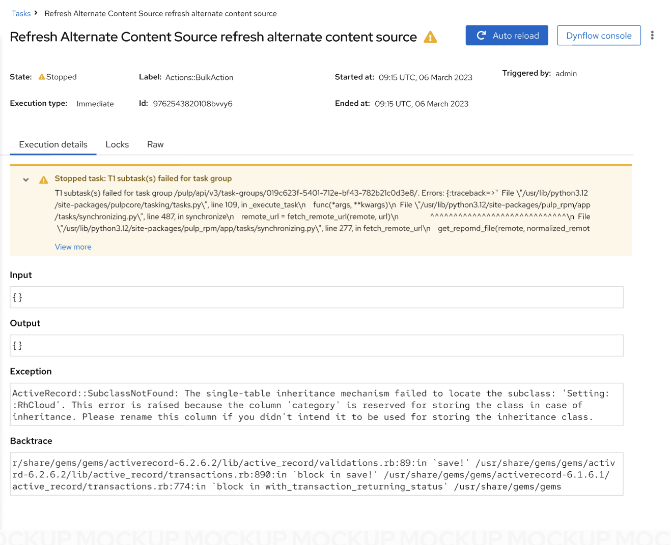
Using a short inline alert to display problematic issues
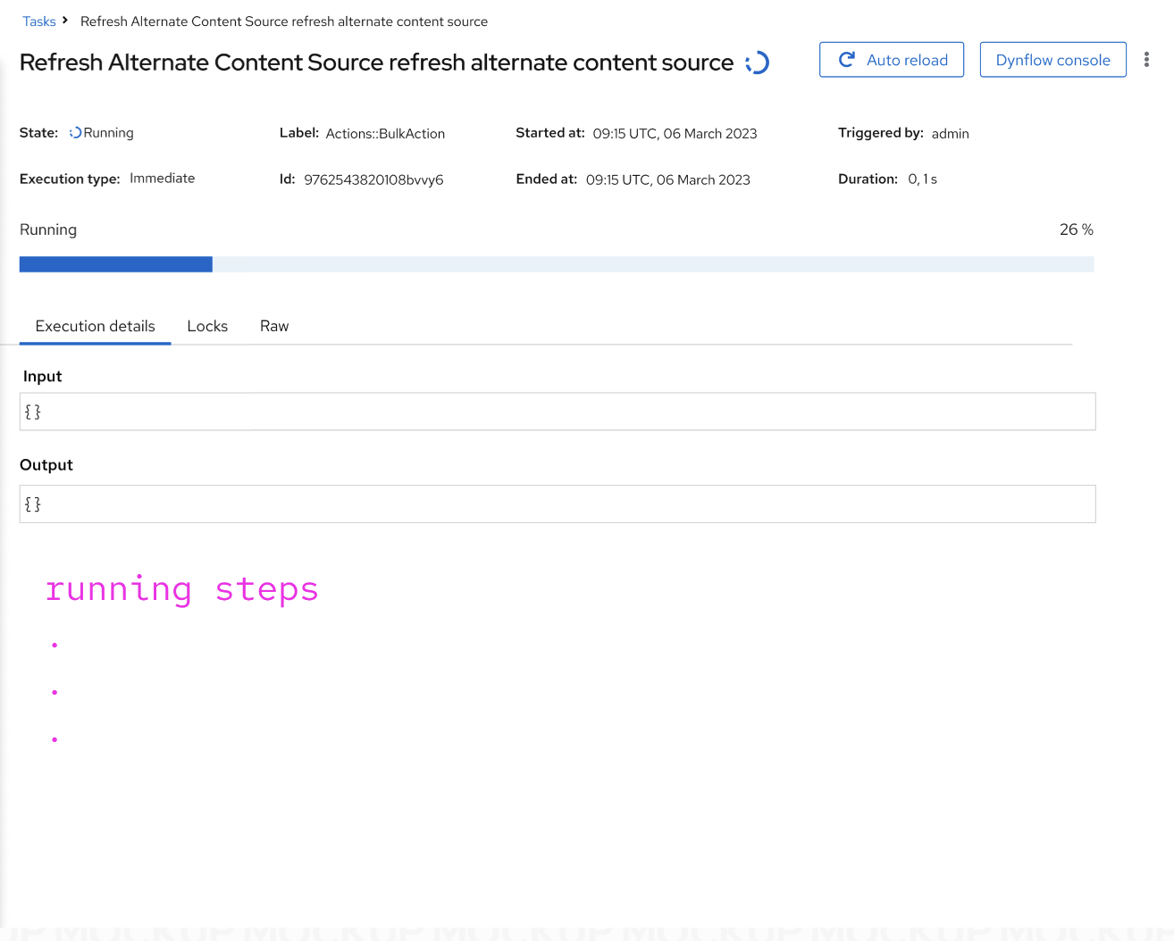
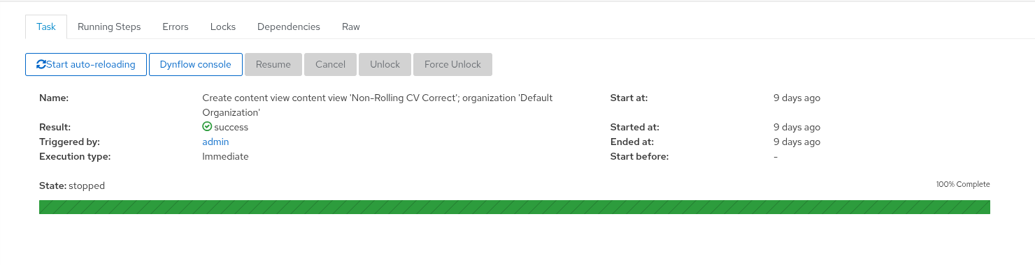
The progress bar was displayed just during the progress
Some buttons are hidden in the kebab
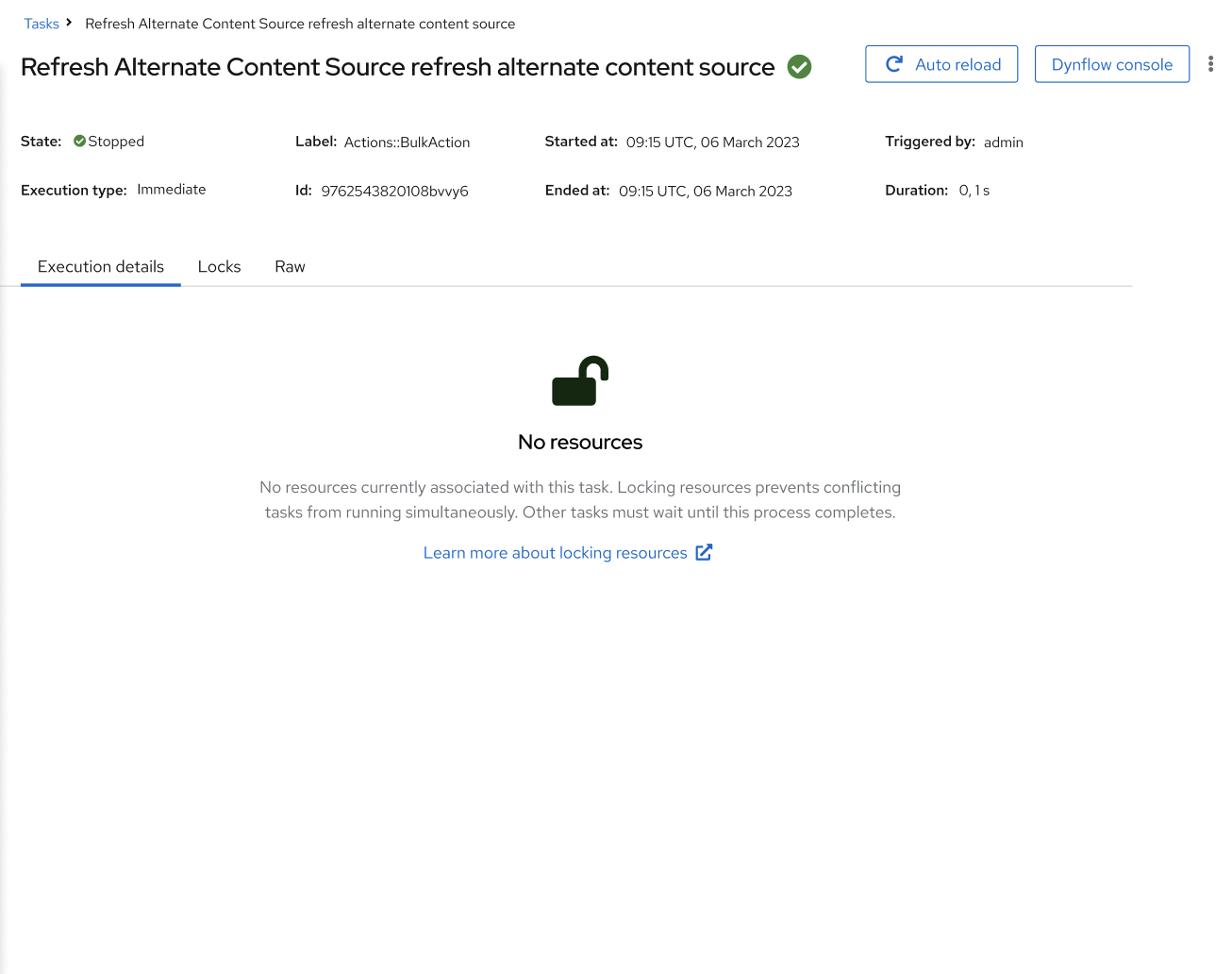
More informative empty states
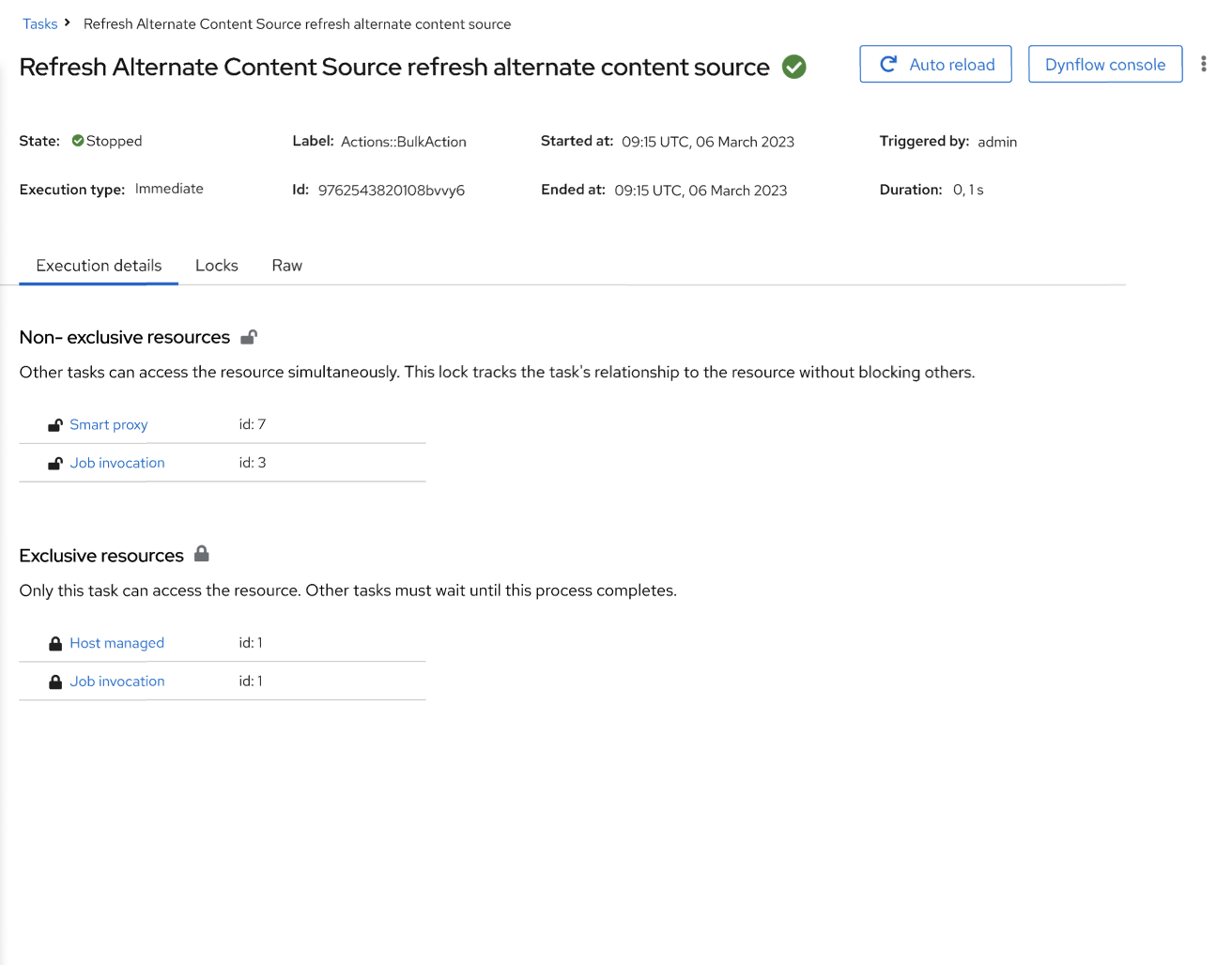
More informative Locks tab
PF5
Proposed designs
Bear in mind, this is not pixel-perfect; it’s a draft. Everything can be changed, microcopy still needs review. Dummy data, state terminology is not precise (I am aware). I am not sure about primary, secondary buttons - so u can see multiple alternatives here.
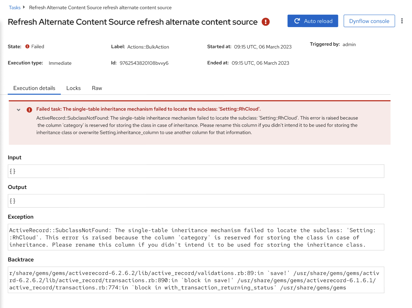
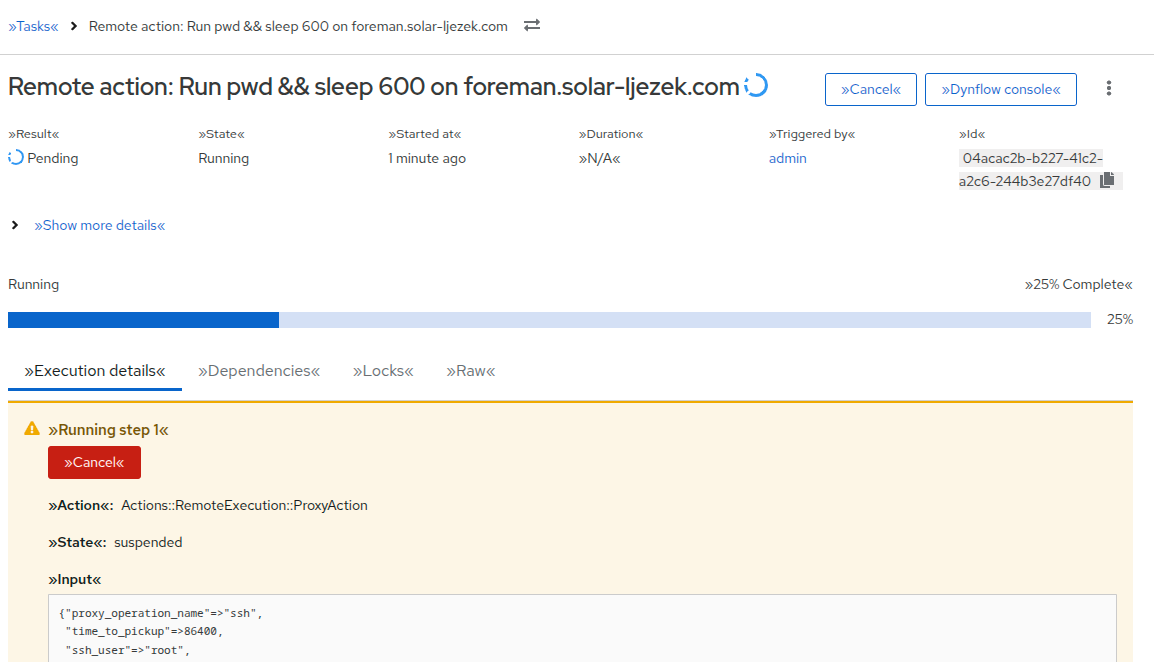
On this picture, is auto reload on or off? I would assume it is off, but I’m not sure.
I know this is personal preference, but the fields like state, label and so one were easier to read in the more table-like layout of the old design.
Also, the “Start at” field is a relatively important one for things which were scheduled for the future.
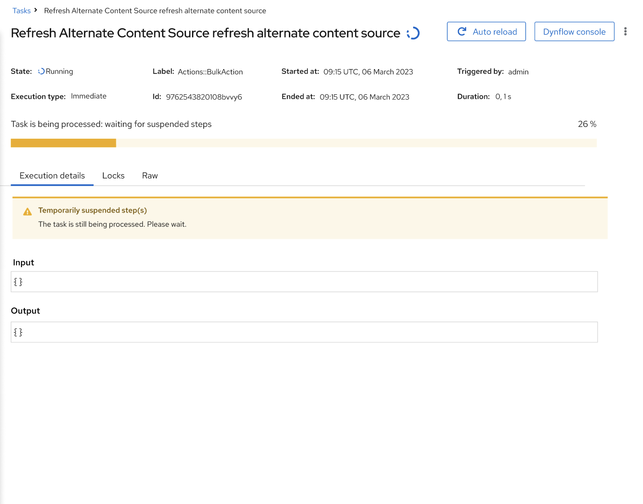
The “Temporarily suspended step(s)” makes it sound a bit as if it is an outcome of some user action while in reality (and in most cases) it is just the task waiting for some external action to finish. With that being said, I don’t really have any suggestions that would read better.
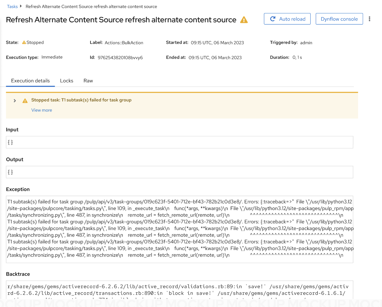
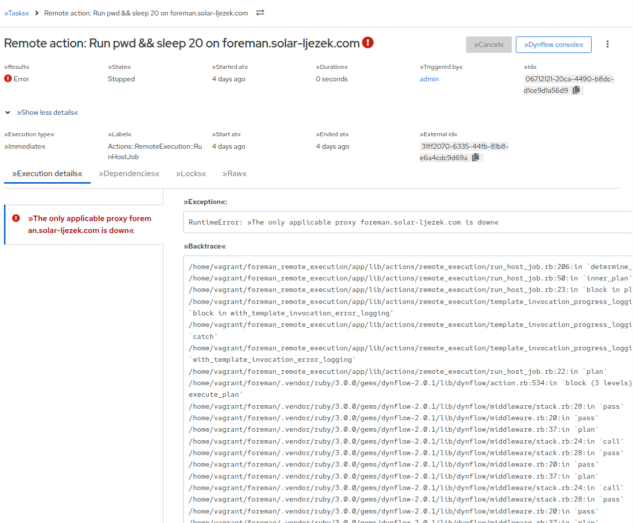
In theory, there can be multiple warnings, errors, inputs, outputs, exceptions and backtraces at the same time for example if multiple concurrent steps of a single task failed. How would this be displayed then?
Afaik there is no documentation on resource locking as that is a mostly internal thing that the user has little to no options to affect.
This is a from a very quick glance, and may be biased by looking at the old page for years, but I agree that the state and such on the old page feel easier to read quickly.
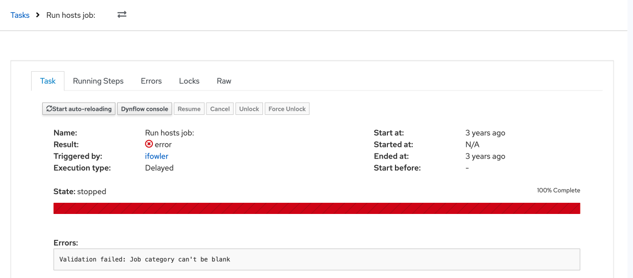
The result and state values both indicate the status of a task so it’d be good to retain the result field for task details.
On the success screen I like seeing the 100% complete green progress bar on the old UI. It tells you immediately that all is good. Same for the red progress bar for errors.
I very much appreciate the tabs being combined. I never really understood the seperation between “Task”, “Running Tabs” and “Errors”. The locks tab could very well just not exist in my opinion. As a user, I never found any value in that tab.
I would like all the important information being on the default page, which your proposed design seems to achieve.
Sometimes, but I primarily use the “Task” tab for a general overview of the tasks state and the “Raw” tab to recieve Task IDs when I need to manually do task cleanups because something broke.
Literally never. As a user, I believe that tab has absolutely zero value to me.
That would be great, but I would assume that primarily depends on backend services returning better readable error messages?
Get a general overview of a tasks status/error messages; Wait for the progessbar to fill; Try to fix broken Tasks (Resume, Cancle, get task ID from Raw to throw into a cleanup rake task); Click Dynflow console and hope it helps me any more than the error messages on the tasks page.
In general, I like the direction you took with the redesign.
Personally, I really dislike Kebab menus in general. In this specific case, the main reason I go to a task page at all is to troubleshoot broken tasks, which usually includes either the Resume or the Cancle button, which are both hidden behind the kebab menu in your proposed design. While the whole UI is moving more and more in this direction, I would argue that common tasks for a page should not be hidden behind a kebab menu.
What exactly do you mean by this? The buttons seem identical to me in all the pictures except “Auto reload” being blue sometimes.
Side-note: Is there any real reason to have a big, prominent button for toggling auto reload at all? I know it has been there forever, but I personally never found myself in a situation where I wanted to turn it of. Maybe I am overlooking something here, but having it as one of the two buttons that are not in the kebab just seems like wasted space to me. (Looping back to my “I don’t like kebabs point”).
I would also agree that this needs some better wording. Just from looking at it, I have no clue what that state is even supposed to be.
+1, please keep both fields
Some additional notes:
Why is the Name/description on the top of the page duplicated? Is this some intended effect of combining some fields or just random placeholder text?
Please keep/parse newlines in the Exception, Backtrace, etc fields and either make them expand to show the whole thing by default or at least have a “expand” element to make everything visible at once. This would make these fields way more readable by that more useful imho.
Regarding the progess bar: Would that still be present for tasks in paused state? I would be fine with the progress bar missing on finished tasks as long as that accurately represents a task being 100% finished. I believe a green checkmark or the yellow/red alert boxes should be enough visual feedback for a tasks state once one gets used to the new design.
Perhaps a minor detail, but should the status icon in the title be after the text? I’m talking about the one after Refresh Alternative Content Source refresh alternate content source. If you have it at the start of the line then it’s always in the same place. Visually it’ll be easier to find.
Then it is very close to the Result so that may feel a bit redundant. Perhaps Result and State should be combined? What are even the various combinations?
In the code I see some values:
But I think Result is only relevant for Stopped tasks so is it valid to never display Stopped but rather the result if it’s stopped?
Does the Started at value (relative time) have a hover with the absolute time? It may make less sense, but the Duration could also have a hover with the Ended at time. I’d still display them in the expanded tab because I’m unsure how well hover works on mobile interfaces but it may still help some users.
I also wonder how often people look at the task ID and if it should be moved to the expanded details section.
We look at it any time we need to kill a stuck job/task - with an average of 150k jobs a day, it happens. Then we need to go into foreman-rake and kill it with its ID, since the UI doesnt handle job aborting all that well.
@ekohl
Based on the previous feedback, I added ID and also state + result part since people were asking for it. (Of course, I can see the combination - scheduled, paused, running, success, warning, error, cancelled.)
@andreilakatos came up with these, pls let him know if they are incorrect
I do not know what results Paused state may have. Is it just an error?
Is it a problem if you need to expand the details?
Can you also elaborate on what foreman-rake task you exactly use? If we don’t expose that, perhaps that’s the bug we should be addressing rather than making a design that makes an internal detail a prominent feature.
We use it to clear out tasks that get stuck and wont cancel/abort. Generally this is due to a task that went missing, a proxy that had an issue, or some random host that thinks it still needs to run the job. But it ends up working that no matter how many times you click Cancel or Abort, no matter how long you wait, the job will sit stuck in a Running state forever.
This is the current process we have to run:
Removing Stuck Tasks (running/pending)
1. Open the Rails Console foreman-rake console
2. Identify Your Task Model
Most commonly used model: ForemanTasks::Task
For Salt-related tasks, it might be: ForemanTasks::Task::DynflowTask
Check the existing task states and results: ForemanTasks::Task.pluck(:state, :result).uniq
If you see [“planned”, “pending”] or [“running”, “pending”], these are likely stuck tasks.
Hi! I would like to give you an update on how the Task Details redesign is progressing.
Because the new design was implemented incrementally, the changes appear across several plugin releases. The full redesigned page ships in foreman-tasks v13.1.0; only one small icon consistency fix is still pending for v13.2.0 (#39525).
Based on feedback and consultations with the UX team, we made several refinements during development:
Error display
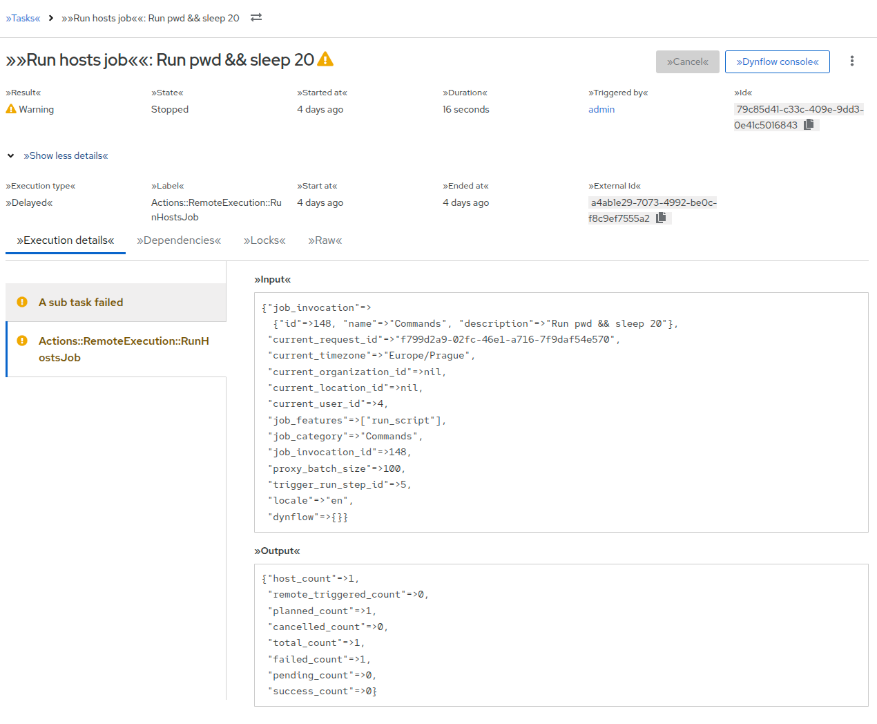
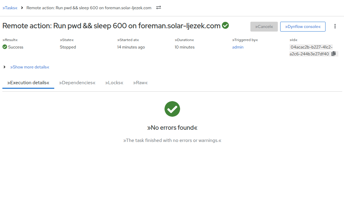
Instead of wrapping each error in an alert, multiple failed steps are now shown using vertical tabs. Users can switch between individual error messages and see all relevant debugging information in one place — exception, message, backtrace, input, and output. Skipped steps are visually distinguished from hard failures (warning vs. danger).
Actions and layout
Cancel and Dynflow console remain visible in the page header.
Secondary actions were moved into a kebab (overflow) menu: auto-reload, Resume, Parent task, Sub tasks, Unlock, and Force Unlock.
Action buttons are rendered in a dedicated page header alongside the task title and result icon.
Tabs structure
Previously separate tabs were consolidated:
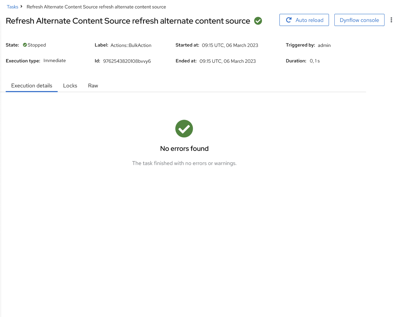
Execution details — combines Errors and Running steps tabs. While a task is running, pending, or paused, running steps are shown; once stopped, failed steps (or a “no errors” empty state) are displayed instead.
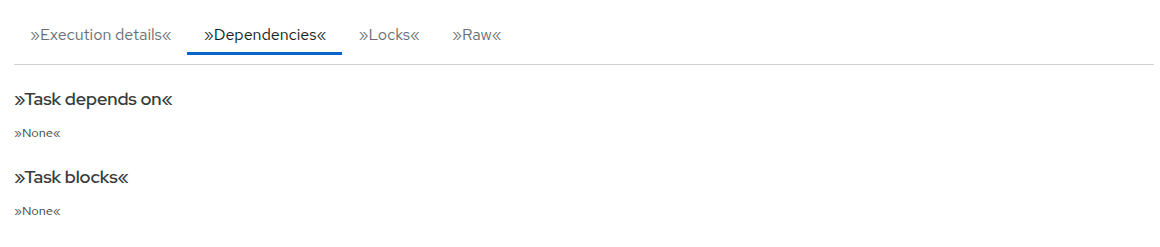
Dependencies — unchanged pose.
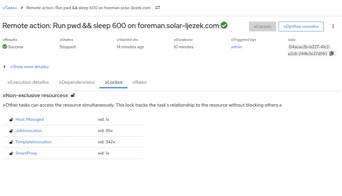
Locks — redesigned with separate sections for non-exclusive and exclusive resources, each with descriptive text and compact PF5 tables.
Raw — unchanged.
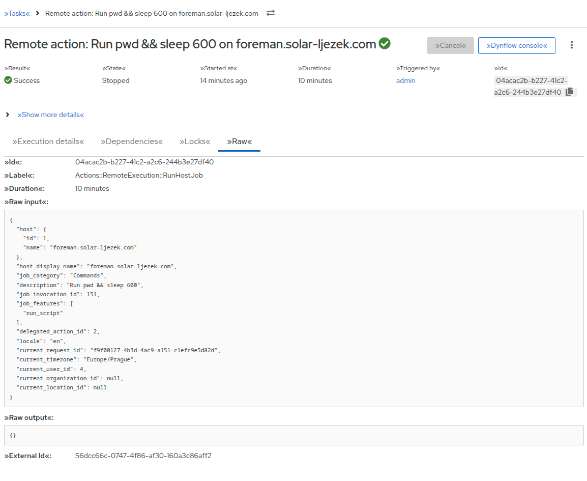
Task overview
The overview section uses a responsive metadata grid (Result, State, Started at, Duration, Triggered by, Id). Additional fields (Execution type, Label, Start at, Ended at, External Id, Troubleshooting) are hidden behind a “Show more details” expandable section. Running tasks also display a progress bar.
Technical notes
The page is now rendered entirely as a React component via PageLayout, replacing the old ERB template (#39339).
API and permission errors use the shared ResourceLoadFailedEmptyState component.
Breadcrumbs include a resource switcher for navigating between tasks.
Snapshot tests were replaced with React Testing Library tests throughout the affected components.
Here is a small overview of the new TaskDetailPage.