When working on some other issue, I ran across Bug #31600: Switching taxonomies is impossible on mobile displays - Foreman which prevents mobile users from switching taxonomies. Looking at older versions, it seems like this has likely been broken since at least 1.24, maybe even 1.23.
That made me wonder - do we have any users actually using foreman on a mobile platform? Should we be supporting it at all? Currently we don’t have any tests for mobile layouts and I don’t see us adding any in the future.
If we decide to drop mobile and require some minimum resolution, it will allow us to simplify a bunch of UI code and CSS styling.
There are 3 options going forward:
Keep the status as is - with a partially working application on mobile devices and “best effort” to try and fix any issues. This requires no effort but keeps some possibly useless code around and some components more complicated than they have to be
Officially drop any responsiveness claims and require a minimal monitor width (e.g. 768px or 1024px). Cleaning up some code used to support narrow screens will likely be possible in a few of days work, and going forward we could save some effort when working on new components or pages by not taking consideration small screens.
Work to make the whole application fully responsive. This will likely require several months of work. The returns on such effort would have to be significant to justify it, and we could probably invest our efforts into other usability issues that will have a much larger impact.
Although I agree it should not be our priority, the trend is going the mobile way and in the future I’d see applications that doesn’t support at least basic tasks from mobile devices as not fitting the modern application. I’m not sure about effort vs benefits, but I’d like us to be modern web app.
If we are about to compete with modern applications, I think we should comply with todays usability requirements.
That has been the argument since at least 6 years ago when I started working on Foreman, and probably even earlier. Yet it appears that despite trying to keep the app responsive for years, there are very few if any users using it on mobile devices. I tried searching redmine and the last time a user reported any issue with mobile browsing was Bug #6784: Parts of the menu are unsusable on mobile (tested with chrome on android) - Foreman which was over 6 years ago - yet we know that for the past year mobile users were not able to switch taxonomies with no reports of issues.
Perhaps we should include a question about it in this year’s survey?
I guess the question comes at the right time, @mcorr what you think can we include this in the upcoming survey?
Well, if you ask a senior software engineer this question, the response is pretty obvious…
One think that comes to my mind is, whatever we support we should be testing. I highly doubt anyone from the core team is actively testing our web UI on iPads or phones, at least I don’t see those items on our Test Week check list.
I was wondering if we could go just some “phone friendly” way, meaning the user interface would not have several versions (don’t know the proper term for this - when you open up a page oh phone it looks different), but rather we would focus on making the desktop-designed page browsing as less intrusive as possible on a phone. For example ability to hide menu completely via a switch or a setting, ability to make font smaller or whatever makes it little bit more useful. What I mean is not complete “switch to phone version” but just small options here and there to make it a tad useful.
I think we should explicitly say, we don’t focus on responsive UI and drop the support if we ever declared it. However the app should ideally be at least usable. If the current responsive UI is barely usable (not just because of this bug), can we drop it (meaning the version for phones) and ask for minimal size of the display? I don’t think there’s a big enough demand for using Foreman on phone or tablet devices.
I don’t think mobile browser support is prio 1, but it would be nice to have it responsive and I’m pretty sure we are not far away from it. Maybe it would make sense to find out which areas are currently not mobile-browser friendly. Then we can discuss if want to fix 10 issues or define that foreman is a desktop because of 500 found issues.
I did not have the need for Foreman on a mobile browser in the past and I would not expect it in the future. But from the Icinga Project I know there are always people who use also administrative websites on mobile devices. So I would say having it “useable” would be a good goal if it is fixable with an appropriate amount of men power, having it nice looking and fully supported is a nice to have and should not keep devs and ui/ux from more important things. But we should be so fair and communicate this then in exactly this way.
I think everyone would agree it would be a great thing to have and we would love to have our UI look great on a mobile device.
Like many nice-to-haves with Foreman/Katello it becomes about priorities. It definitely would be a significant effort to have everything look nice on a mobile browser. I think the strategy of mobile support being unsupported, but we’ll give our best effort to fix it is the way to go for now.
I noticed patternfly 4 has a lot of mobile support built-in, the table rows collapse into cards when you are on a small window. (I can upload screenshots later) So continuing our patternfly 4 effort will help mobile support, IMO this is where our effort is best spent.
I have to admit, I only tried Foreman on an phone once in the last 10 years or something like that. So today I felt like I want to see it. Here is a video of me browsing through some pages of Foreman 2.3 and Katello 3.18 on my iPhone and sharing some of my thoughts.
It’s not bad at all, almost everything works well except host edit page, a detail I thought I’d put it here because some might not actually tried this:
TL;DR - Foreman 2.3 is a mixed bag. Some pages renders nicely thanks to responsive design, but some (important) pages do not and content is “squeezed” and less usable. And some pages simply keeps minimum width so after slight zoom-out it’s possible to see a good overview and still use the page. In landscape mode, our menu renders wide eating precious horizontal space.
My conclusion: I’d ditch phone (vertical) position, Foreman is not Twitter. Responsive design needs quite amount of testing, I’d be fine with some fixed minimum width because almost all devices can be used in landscape when there’s decent amount of space usually. As long as our menu does not render on side, it should be good experience.
Officially drop any responsiveness claims and require a minimal monitor width (e.g. 768px or 1024px).
I’m for the second option, personally don’t see much value in having mobile Foreman. Plus it’s not just about Foreman, we need to think about all the plugins we have and their UI.
If we asks users in the survey, we should ask WHY they don’t use mobile version.
If the answer is “I don’t need it”, we can drop mobiles.
But if the answer is “I’d like to but it doesn’t work”, we need to do something with it.
For myself, I would be really happy to have full support for resolutions >= 960px (half of FullHD), so users (including me) can have on 1. half of the screen Foreman and on the 2. half of the screen terminal or any other app.
Seems that if we go for landscape mode, 960 is wide enough since iPhone 4, iPad 1, Samsung Galaxy S3, Nexus 4 and many more - basically any phone that came out in the last 8 years years should be able to display at least 960px width in landscape mode.
So I would say we can be pretty safe in requiring minimum 960px width and dropping support for smaller screens.


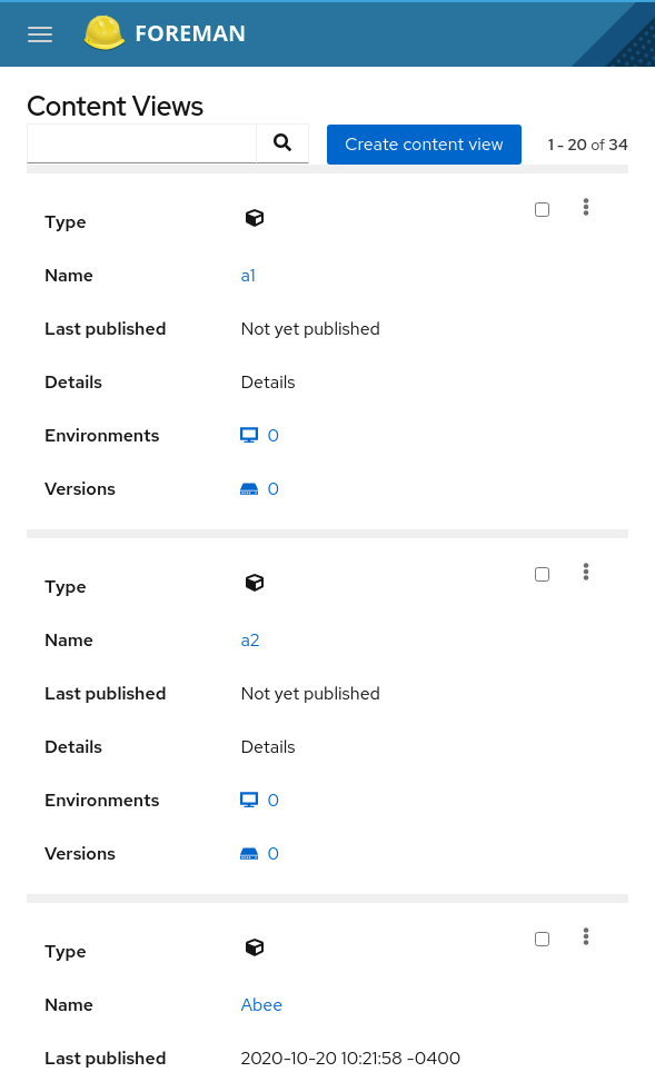
 I thought I’d put it here because some might not actually tried this: