Hello,
So as many of you already noticed, the @ui_ux team deprecated the two-pane view and introduced the new BreadcrumbBar to replace it.
We wrote a documentation and a migration guide to make the transition easier:
Cheers!

Hello,
So as many of you already noticed, the @ui_ux team deprecated the two-pane view and introduced the new BreadcrumbBar to replace it.
We wrote a documentation and a migration guide to make the transition easier:
Cheers!
Nice work!
I am kinda neutral on this one, but I was not aware this is coming until I saw a PR in discovery. Can we have more broad discussion prior UX changes? I think screenshot or two about final proposal is cool just to have a possibility of last minute comment. I really don’t need to see whole discussion, but I’d like to be part of the final “blessing”. Thanks.
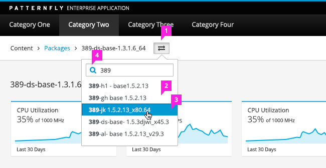
Thanks, this definitely looks like an improvement. Does the new breadcrumb bar support typeahead? How are the associated models loaded? How many models are loaded?
The gist says, that this was introduced in 1.18 and will be removed in 1.19. Don’t we usually grant devs two releases to change their code?
You’re right, we should have posted the mockups and started a discussion on
discourse prior to beginning development. We did a UX demo on this where
we discussed the changes but not everyone can make all the meetings so we
will default to starting a thread on large changes like this in the future.
Thanks for the feedback,
Walden
Is that UI final? In the screenshot the text Compute profiles is a different size compared to 1-Small and the switcher button has yet another size. This feels messy to me.
The back button also takes up a full line and not sure that adds any value if there is a bread crumb bar.
It should look like this:
See also
http://www.patternfly.org/pattern-library/navigation/breadcrumbs/#design
(scroll down).
That does look clean and how I’d expect it. I must admit I only went by the screenshot in @sharvit’s post and not the actual application.
This is not final. Some more visual adjustments are necessary indeed. It’s reported here:
http://projects.theforeman.org/issues/23251
The full list of issues related to the breadcrumb bar is in:
http://projects.theforeman.org/issues/22855
Latest from master. The textbox does autocomplete. I have found this style very useful in daily real usage and don’t miss 2pane at all, which I found surprising. Thanks for the hard work!
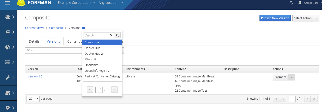
I will say that since the breadcrumb chooser is making an api call, it may be worth expanding the content displayed to be a littler richer in detail. On a page like “container image tags” where there can be multiple entries with the same name it is not possible to differentiate them in the currently displayed chooser. Is there any reason not to make the chooser be a full fledged list with all the headers and columns from the main index page?
Thanks, this definitely looks like an improvement. Does the new breadcrumb bar support typeahead? How are the associated models loaded? How many models are loaded?
I’ll defer to @amirfefer but in there is an ongoing PR that adds search / filtering based auto completion/type ahead at https://github.com/theforeman/foreman/pull/5477
What do you mean by associate models? currently the default page size defines the api response, but we were discussing if we should be opinionated and after adding search, we should just limit the response to about 10 entires or so that scrollbar can be avoided.
I suggest for anyone interested in this topic to join the deep dive Events - TheForeman
That’s actually what I meant. For what it’s worth I’d prefer to just load 10 entries or so. We have 4000 hosts in Foreman and without a search by name this doesn’t add a real benefit. But if that’s on the roadmap: Very nice.
Maybe we can even turn this into a global search like the search on github? By default it just searches in the current repo (or model in our case) but you can easily make it global. Just a thought. ![]()