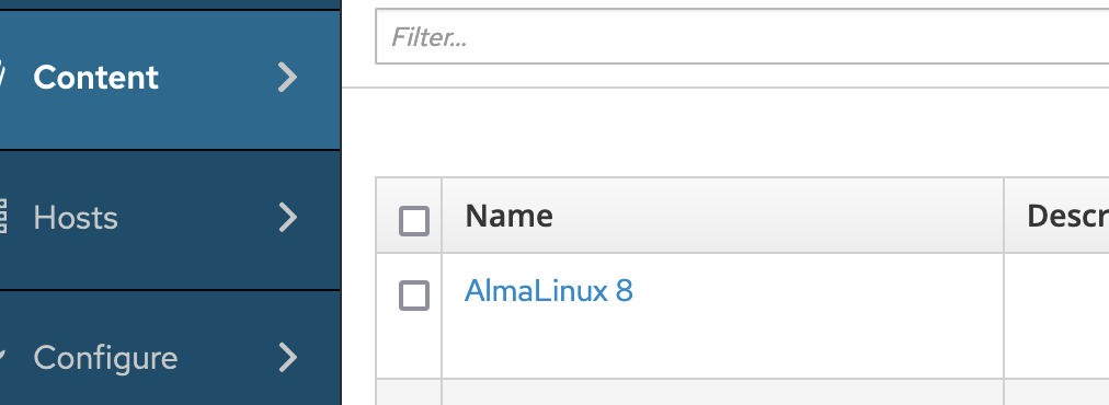
I have noticed that the main menu on the left (Monitor, Content, Hosts…) opens up very quickly when you hover over it. I find that actually quite annoying because on many pages there is only little distance between controls and the menu, e.g. here:
The checkboxes are quite close to the menu. Due to that I often accidentally move my mouse briefly over the menu when I want to check some of those boxes. Immediately, the menu expands covering the checkbox I want to set. So I have to move right again, wait until the menu goes away again and then carefully approach again.
I think it would be much better, if there was a delay of at least 1s before expanding that menu to allow for briefly crossing the menu area without expanding.
I’m by no means a UX person so take this with a grain of salt, but having always wait a second before the menu opens would probably drive me crazy. I wouldn’t mind if it would be like a half a second hover or click, but I’m afraid we’re inventing something non-standard here.
Would more padding around the actual content help?
O.K. Well the “at least 1s” was just a guess. But some larger delay than now, maybe configurable, depending how fast you are. I would have to try it to see how much I would be my preference.
But generally, I don’t see the problem even it is more than 1s. You can also click on the menu item if you want it faster.
Or even only open the menus if you click on the header. I could work with that, too. To be honest, that would be my preference. I don’t see many sites/apps which have an auto-opening menu…
These are all guidelines PF4 has for “flyout” navigation. The secondary part of the nav can appear either on hover (as in our case in Satellite) or on click.
A combination of click and delayed hover would make sense, I guess, and would eliminate the problem @gvde is talking on primary nav items (on the other hand, I wouldn’t delay tertiary items).
Also, padding should be 24 px from the edge of the navigation.
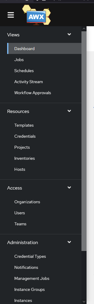
I got pretty used to the navigation pane of Ansible AWX (AAP) and Zabbix, which both have the expandable tree style instead of a fly-out, off course you can’t fully compare these 3 interfaces because AWX has a lot less items in the individual sections and Zabbix uses a lot smaller sidepane (including the 3rd layer clickable flyout), which keeps the overview pretty good:
But in comparison to the fly-over style I think it is a lot more usable, because you don’t accidentally trigger it, and also don’t have to wait until it disappears again.
It definitely happen to me more than once, that I triggered the fly-over while wanting to check one of the close boxes, or just reading while unintentionally moving the mouse out of the view to the left and suddenly having a pane over the content.
This should not be a push to change the whole behavioral structure of the sidepanel, but more I would like to share my experience working with the different interfaces.
I (and my colleagues) have the same issue, often the side panel opens when I don’t need it and obscures the underlying page. It is probably my biggest UI frustration with Foreman.
Also agree to rework the menu. It has always been something that bothered me. AWX style looks like the one in netbox and old Spacewalk and I like that much better to avoid accidental trigger of the menu, Maybe also be able o create some favorites on menu items you use often?
This is now quite calm thread so I’m sorry for reviving. I opened a poll about this Menu hiding delay poll after I spoke with @lumarel at FOSDEM. Please share your preference there.