Hello,
the new reports tab was supposed to be part of the new Host Reports plugin - which currently isn’t under active development ( you can read more about it here )
A new status mapping was discussed in New config report summary columns
but as you understand, we will still be using the original config reports summary statuses.
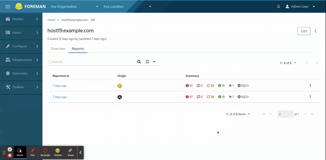
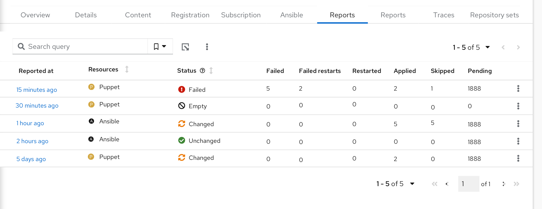
Here is what the new tab looks like, what do you think about the status icons?
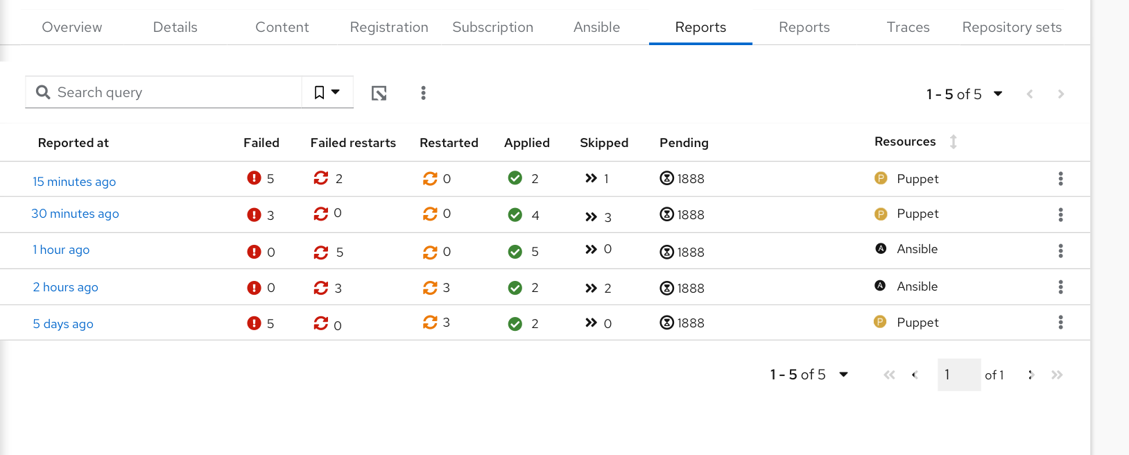
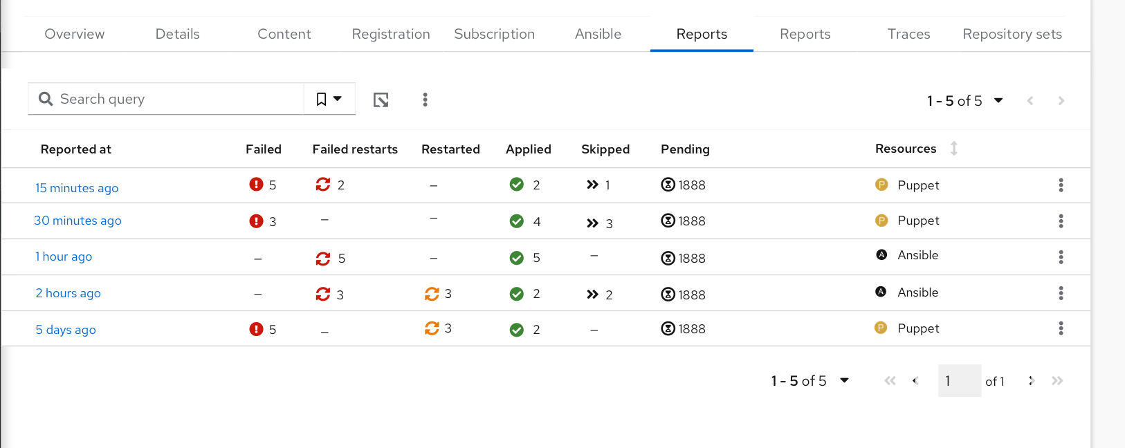
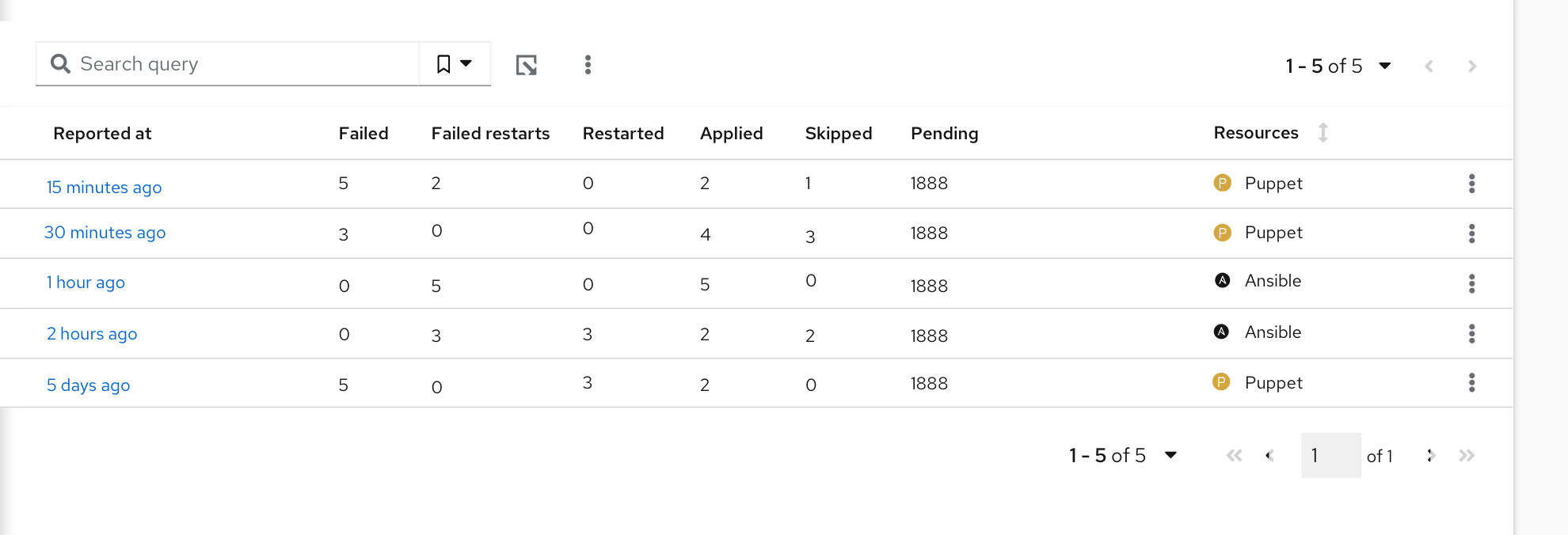
I would personally get back to the older design - column for each of those statuses with sticky headers (which we actually have in this implementation but without headers). The summary column works with a smaller number of statuses - which is not this case. As used icons aren’t intuitively recognizable, it would force users to be hovering over them a lot. I think we would be just adding confusion by removing column headers. (of course, we need to take into consideration statuses for Puppet AND for Ansible as well)
Pros:
•visually appealing and consistent Con:
•The overall status of the report is not visible straight away. Reports without failed run have Failed icon with zero value.
Personally, I would love to have one icon showing if actual state: was the last update good (green), yellow (some minor issues), and red (failures and the user should care about this).
So, option 3 + state icon.
the “resource” can be column 1, just before the “repoted at” and only the icon.
Iiuc, you are talking about a global status that will “summerize” all other statuses, right?
How about displaying the global status to the left of all other statuses? Would that be helpful?
Sounds good to me
@MariSvirik any chance we could add another mockup? And create another poll?
@Ron_Lavi
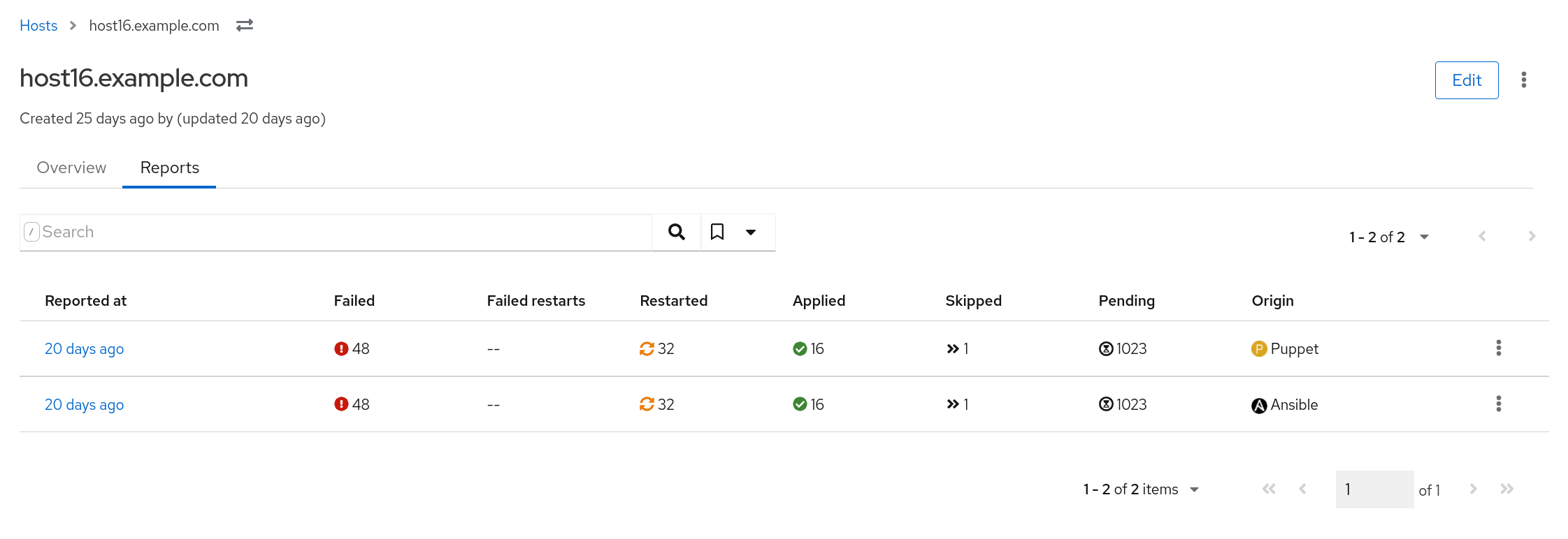
Numbers are illustrative. Not pixel perfect. I’ve used the “old” global status states.
It’s advised by PF4 to use icons with text. Also, it’s more accessible that way for people with eye/vision problems.
If I get the option 4 correctly, we’d have to implement the mapping with the old reports first, right? Calculating it may be easy, but it means we need to add it to the API, scoped_search definitions etc. Until we have it, I’m voting for Option 2, then I’d switch to the Option 4.
What icons would you expect in the column headers? Icons that @Ron_Lavi used in the beginning of this feed or just icons from the global status? E.g. Failed and Failed restarts would have the same icon if we use the global status approach, but a different icon if we use Ron’s mapping.
Personally, I would expect the icons in the Status column to match the one in the header of the recent report states. Then, you could directly match the icon in the status column with the column on the right where you have the different statuses. I guess that would be Ron’s mapping? Not sure if that makes sense for the global status, though.
@nadjaheitmann that proposed mapping wouldn’t make much sense for the global status - its main point was to reduce the number of statuses/icons involved and make the design/ experience cleaner. We wouldn’t be able to have just one icon per global status if we used a proposed mapping - would we, for example, use skipped icon or the pending icon if both are involved?
Anyway, other design has been selected. So no need to follow up on this discussion.
@MariSvirik I changed the name of the Resources column to Origin as origin can be used for searching, and users may be used to that already,
but as a follow-up, we can change that also in the search.