RFC: Job invocation detail page redesign

Hey Foreman Community!

I’m thrilled to share a proposed design for the “Job Detail Page” with you today.
We believe this design has the potential to enhance the user experience and usability of the page. But here’s where you come in - we need your help to make it even better! We value your opinions and encourage you to provide feedback through comments or by filling out an anonymous survey.

So, let’s dive into the highlights of the proposed design. Please, keep in mind that this is just one of the early design iterations with some developer feedback already incorporated. Here are some images to help visualize the changes.

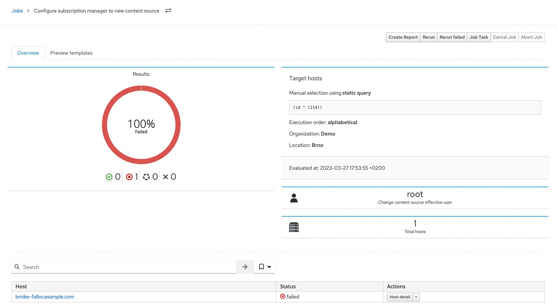
Current implementation
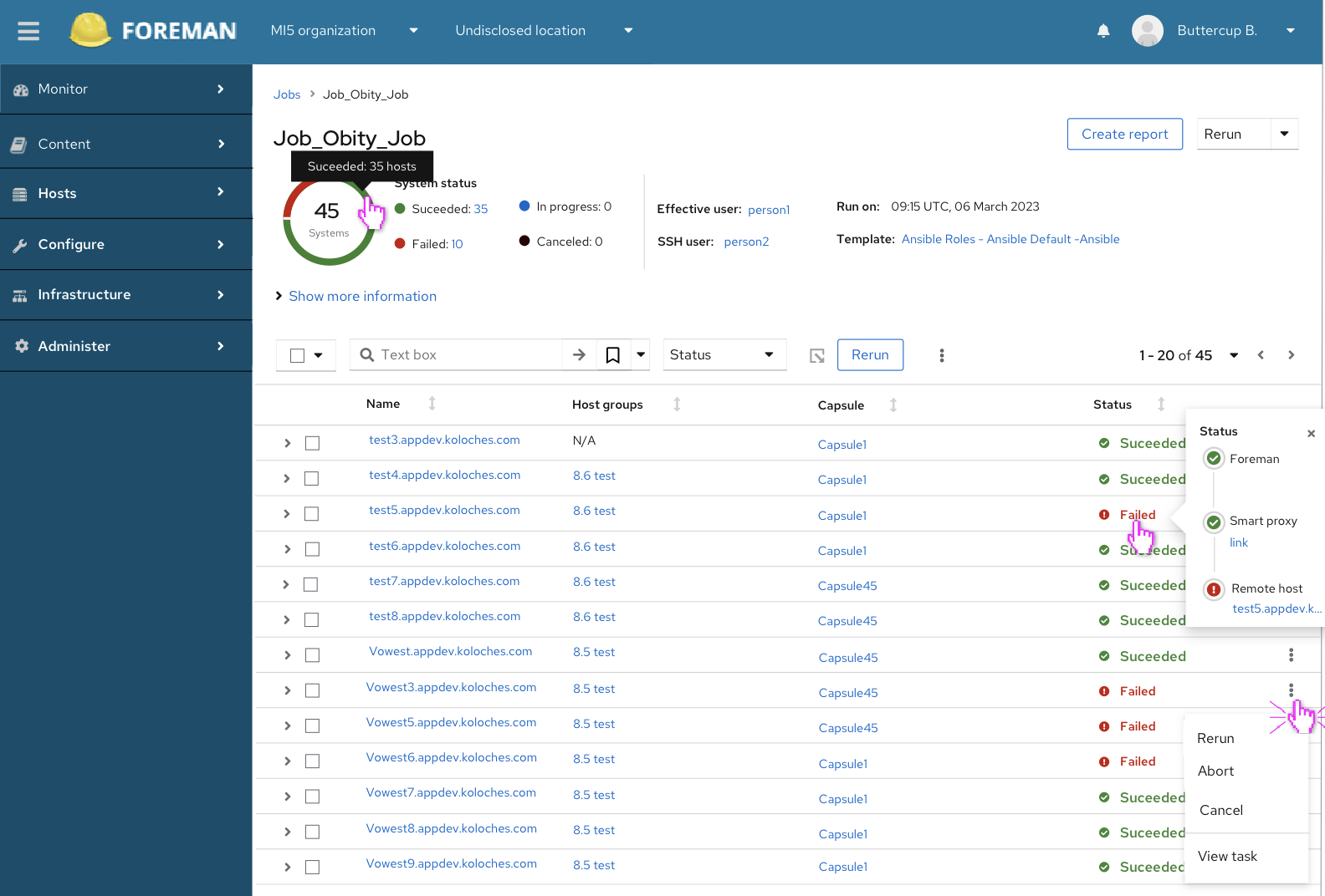
Our proposal

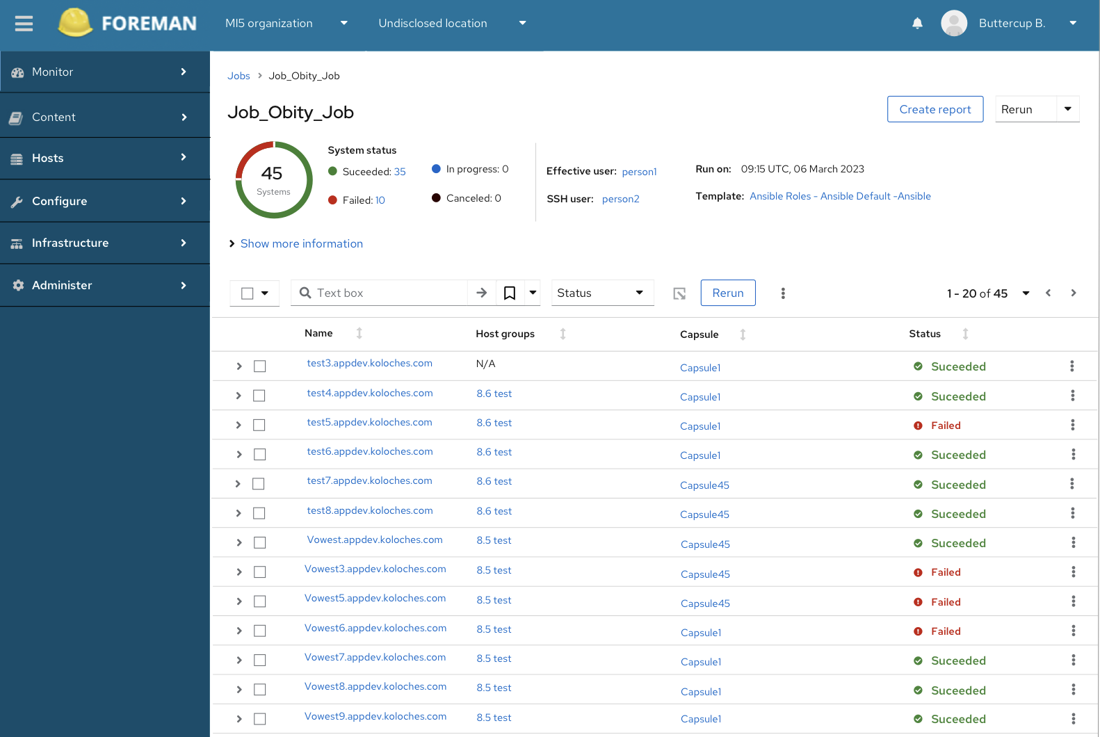
The top part of the page features the job overview, displaying information such as the number of hosts the job ran on, its status, and details about the job itself. By default, it shows involved users, time, and template (if applicable). Additional information, such as input, target host, schedule and much more, is hidden but expandable. We would like to know which information you consider most important to have visible by default.

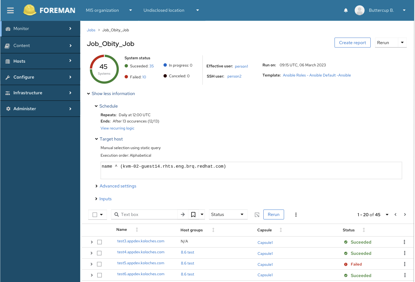
The main part of the page consists of a list of hosts in expandable rows. Clicking on a row expands it to provide more detailed information about the job that ran on that specific host.

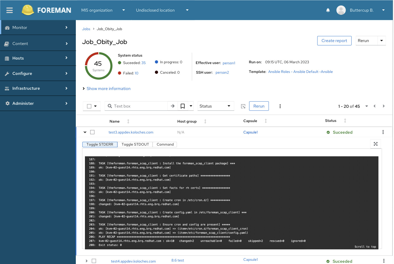
Furthermore, the design incorporates additional information and actions that we believe are valuable on the page.

Now, we would love to hear your thoughts on this redesign. Specifically, we’re interested in your feedback on the following points:

  1. How do you feel about this proposed redesign overall?
  2. What information do you consider the most important to view on this page when reviewing the ran job?
  3. Do you have any suggestions or feel that anything is missing or too hidden?

Please take a moment to share your feedback and help us improve this page. Your insights are incredibly valuable to us!

You can provide your feedback by commenting on this thread or by filling out the anonymous survey.
We appreciate your time and contribution to making Foreman even better.

6 Likes

Hi,

first off, thanks for the effort to make this page better :slight_smile: I really like the look of this new design and that it utilizes the available screen space way better. :+1:

Still, I have some concerns/questions/feedback about this:

  1. Will there be an option to get the job output in a new browser tab/window or only by expanding the row? We currently use the feature to open job output in is separate tab heavily when reviewing failed jobs and it would be very helpful to us if that stays. Currently this is via the Hostname link and I hope this stays the same, just want to be sure.
  2. I am missing the buttons for “Rerun failed”, “Cancle Job” and “Abort Job”, but I would assume those hide behind the “Rerun” dropdown? If so, another wording on that button would probably be helpful.
  3. I don’t think hostgroup and capsule are relevant information on the job page. I currently don’t have any good suggestions what to put there, except maybe a “run duration per host” (which would at least be interesting to me) or a “Started at” and “Ended at” per host.
  4. Why are “Effective User” and “SSH User” hyperlinks? Those should be local users on the hosts and not Foreman users. Where do those link to?
  5. I would like to see information about when the Job finished and who (Foreman User) started it placed on the page.
  6. Some feedback for the wording on the page:
    • “Run on” does not feel very clear to me, this should probably be “started at” or something alike?
    • “Capsule” is exclusively “Satellite speak”, I assume this would be changed in Foreman to “Smart Proxy”?
    • In the “expanded host” view, I assume “Command” refers to the rendered template? If so, this is probably not the best way to word it, since most remote execution tasks are usually not a single command but rather a script.
    • “In progess” in the status chart to me sounds like it would only include jobs that are currently running. Since jobs can also be in different planning stages (like scheduled for future execution or waiting the be started), this should be renamed back to “pending” in my opinion.
3 Likes

I like that the content I’m looking for (the actual failed jobs) is visible without scrolling. That looks like a big improvement. Other than what @areyus already said (especially about opening in new tabs) I have some further questions.

I’ve always wondered if a pie chart is the best view of job distribution. I know historically Foreman has used it in various places, but just because it’s been done that way in past doesn’t mean it’s the best way. Any thoughts on using a bar chart instead?

I also question if the status shouldn’t be the first column. It’s something I typically look at first, then the other columns. Filtering is technically an option, but if jobs are still running it’s nice to see them change over time and immediately open failed jobs (usually in a new tab).

3 Likes

Is it possible to scroll in the console output? If yes, it would be nice to have a checkbox button like “auto scroll to bottom”. If I want to see the last output, I would check this checkbox. If I want to scroll I would uncheck it.

@Bernhard_Suttner
So after the row is expanded, the console is always scrolled to the bottom by default - so the users can see the live job or the error. The console is scrollable and basically works the same way as right now.

I’m currently iterating on the interaction for opening a full screen/ new tab for the detail of the log and comparing the logs easily.

3 Likes

Overall, it looks great!

When running jobs on hundreds of hosts, it is always the ones with failed status that always should be easiest to see and access. Can the list be dynamically sorted during a run so they pop up at the beginning of the host list?

I wanted to have hosts filtered by default on failed - when the job is done. Not sure how technically possible (heavy) it would be during the running job @MariaAga @Marek_Hulan

I think that should be possible, but @aruzicka would be the best person to ask. Filtering may be actual easier than sorting failed first. But OTOH I’d probably expect to see all hosts before I start looking at the failures. If we’d filtered only for failed in the beginning, we’d see empty table at first. Items would start appearing only when job finished unsuccessfully. If all went well, we’d see nothing. The feels weird.

I raised the same issue with @MariSvirik in person, but didn’t end up writing it down here. As @Marek_Hulan said, the UX can be confusing. I’ve been wondering if you want to filter on status != succeeded so you see both Pending and Failed. Once they complete successfully they’ll disappear from the overview. One downside of that is that items will “jump”. If you over job X and job X-1 succeeds then you may end up accidentally opening job X+1. I think this is a terribly difficult thing to do well. In some places I’ve seen labels “Click here to refresh results”. It’s not a full page refresh since it already has the data (making it fast), but gives control to the user to avoid jumping (which I hate with a passion).

1 Like

It should be doable from the technical point of view, but as others pointed out, it would be difficult to do right.

Agreed

Some new additions RFC: Job invocation detail - new updates

1 Like

I’m adding those buttons in the dropdown, as you mentioned. Also, probably the “Job Task” and “End (disable) recurring job invocation” ones? @MariSvirik, do you agree? My other thought is if the “Rerun” button (on top of the table) is clear - maybe it might be confusing that we have it twice on the page. Couldn’t it be “Rerun selected hosts” or something like that (although this is too long)?

Solved at f2f conversation.
A toolbar’s “rerun” button should be enabled just in case at least one host is selected. The upper “rerun” is a rather global action connected to the whole Job.

1 Like