Hi,
sometimes I have really difficult time to find in menu what I’m looking for,
so I’ve been thinking that it would be nice to have a component that can search in the menu items, filter them & redirect user to the page.
Full keyboard shortcuts support, no need for mouse.
I know that there have been already some RFCs & discussion about this topic [0],
but I’d like to open it again, I believe that users would benefit from it.
I created POC <SearchMenu /> component [1], see the showcase:
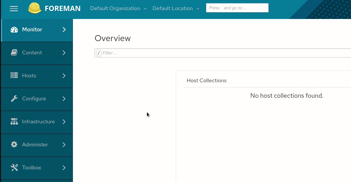
In the showcase the component is next to Taxonomy dropdowns,
which can be confusing for pages where we have search bar for the currant page.
Probably the better place would be as last item under the Toolbox item in the left menu.
Notes to POC component: confirmation of filtered items works only with tab key for now, enter works only when selecting item from menu.
I really love that and this is functionality I have missed since day one. What is still missing is actually jumping to a particular host. As a user I’d love to just type the first few letters of the hostname to jump to the particular host detail page. Basically similar to the github or gitlab search bars.
Would that be something that could be added easily?
I think that we could start with hosts. If we want to do more we could add a registry where a developer can register models and a field that enabled search by name (and maybe define an icon for UI purposes). Then we’d just need an API that allows searching across all models or menu items.
WDYT?
I’d also start with hosts. If we want to have cross resource search, I’m afraid we’d need some indexer. However for hosts, that seems reasonably quick even with a bigger count. And I would say that’s the most useful resource to search by. I as a user would also appreciate params and ansible variables, but that’s something that can be added later if ever. I’d even say just the menu items is a great first step.
Present just a magnifying glass icon button on the right side of the masthead. This interaction keeps out the confusion between this search field and the potential on-page search field.
Upon a click, it displays a search field with placeholder ‘Search’ (no cursive) and X on the right side from the field. The position of the magnifying glass can be disputed as we normally put it on the right side of the field - the same in cloud.redhat.com. So I would keep it on the right side within the field.
And maybe let’s find a better keyboard shortcut if that’s possible so we don’t need to write it there.
@MariSvirik I think your design implies a search function. What @lstejska has built is really a quick navigation. As a user it’s very confusing for the search element and the navigation element to be literally on the opposite sides.
Shouldn’t it be above the top most navigation item in the left menu? So an item above Monitor in this case? Not sure how that interacts with a collapsed menu though.
@lstejska I didn’t check the code, but how does this interact with translations? Does the user type the translated text?
Let me explain, I do encourage you to improve things and being a UNIX terminal guy, I do more typing than clicking so this should align with me. But I feel like this is a “patch” and we should be fixing the root cause: our menu structure is terrible.
I constantly look for Operating system/Architecture/Templates in Infrastructure, I am always clicking on “Sync Plan” instead “Sync Status”, I need to think twice before I start navigating thinking “oh yeah this one is in the huge Host menu”.
I tried to pursue some change but I quickly dropped the ball. It was just a huge bite for me, this definitely needs a proper UX research and better planning. The change would also involve changing our documentation, we have so many menu references in there!
Also, I am not a UX expert by any means, but when we present two text boxes on a page (e.g. on a host page), users will be accidentally typing search terms into this new text box and vice versa. We might make things actually even worse.
However I do believe that “global search” would be a great idea. One search box to rule them all, this is the dream design and if we had that, that could work pretty well. Type “m templa” to search in the menu, type “h qa123” to search in hosts or just start typing to search for everything. But we would need to merge searching from all pages, I am not sure how feasible this is. Considering plugins support, this might be a huge bite.
Yes indeed, search icon would suggest that it is search through whole application, no only the menu.
Shouldn’t it be above the top most navigation item in the left menu
Yes that would be better place, I just put it to the top because it was easier for the POC
@lstejska I didn’t check the code, but how does this interact with translations?
Does the user type the translated text?
Yes. What is in the left menu is in the searchable list in the component.
I tried to pursue some change but I quickly dropped the ball. It was just a huge bite for me, this definitely needs a proper UX research and better planning.
Yeah, but I don’t want to go with approach “it’s too much work to make it better so let’s do nothing”.
If the search box would be in the left menu, with placeholder “search the menu” there is minimal chance for users to mix it with search box in the pages.
Also it can be enabled from start as experimental feature.
However I do believe that “global search” would be a great idea. One search box to rule them all, this is the dream design and if we had that, that could work pretty well.
That would be great feature, but TBH I have absolutely no idea how to do it
Hi,
Excuse me for refloating a such old topic but I’m really interested on it. I find myself a lot of times searching through all of these menu entries.
I’ve read all comments carefully and there are really good ideas. I know that create a global search is very cool and it is also a hugh challenge. So, I’d focus on menu filtering by now.
Most of the implementation ideas are already within the comments, but mainly I agree with latest @lstejska statements about position and search scope. Putting it over the menu with a caption similar to “Menu filter” is clear enough to not confuse users. Adittional search features could be added in the future but why not start making it simple?