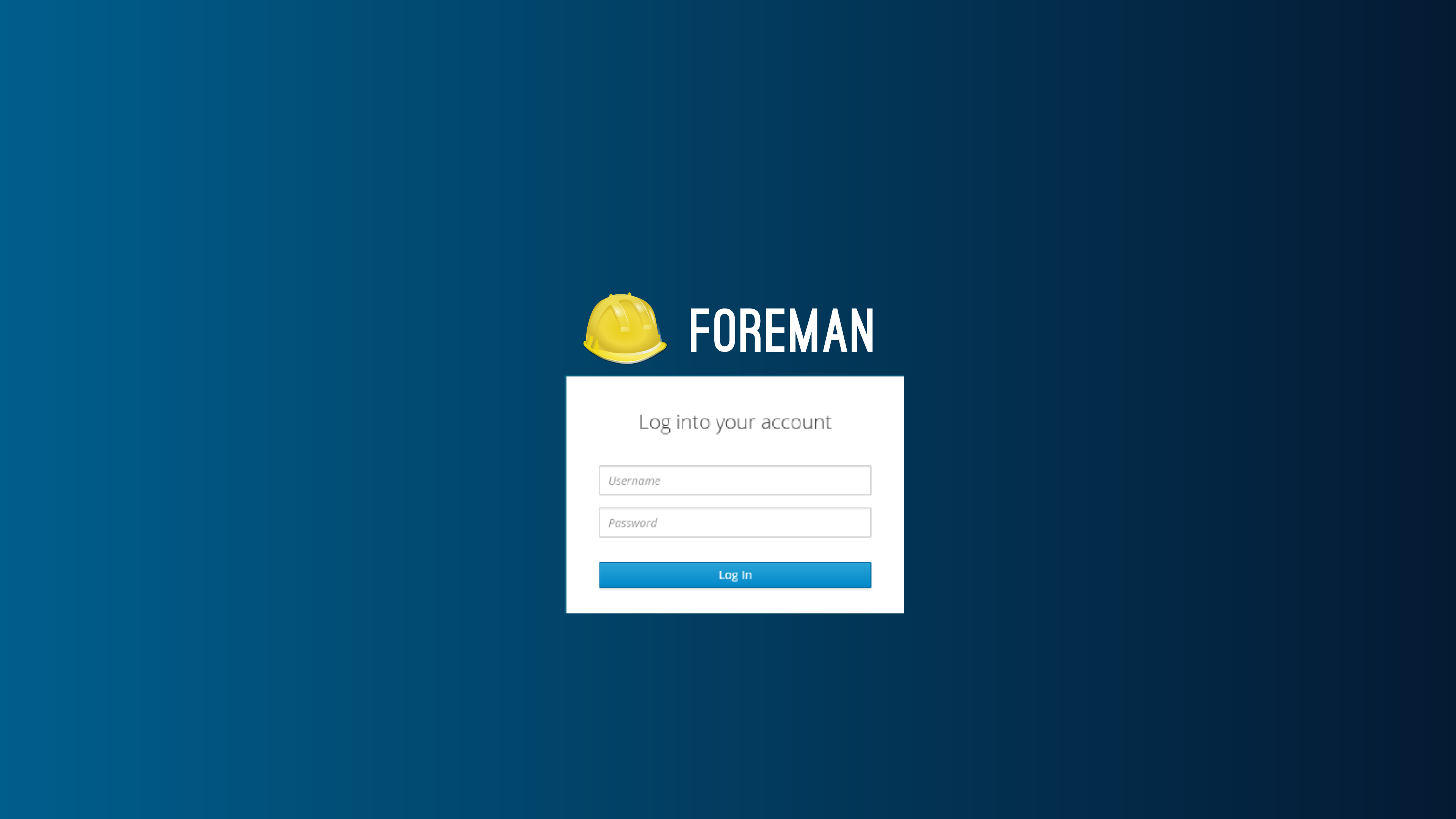
Design1
Design2

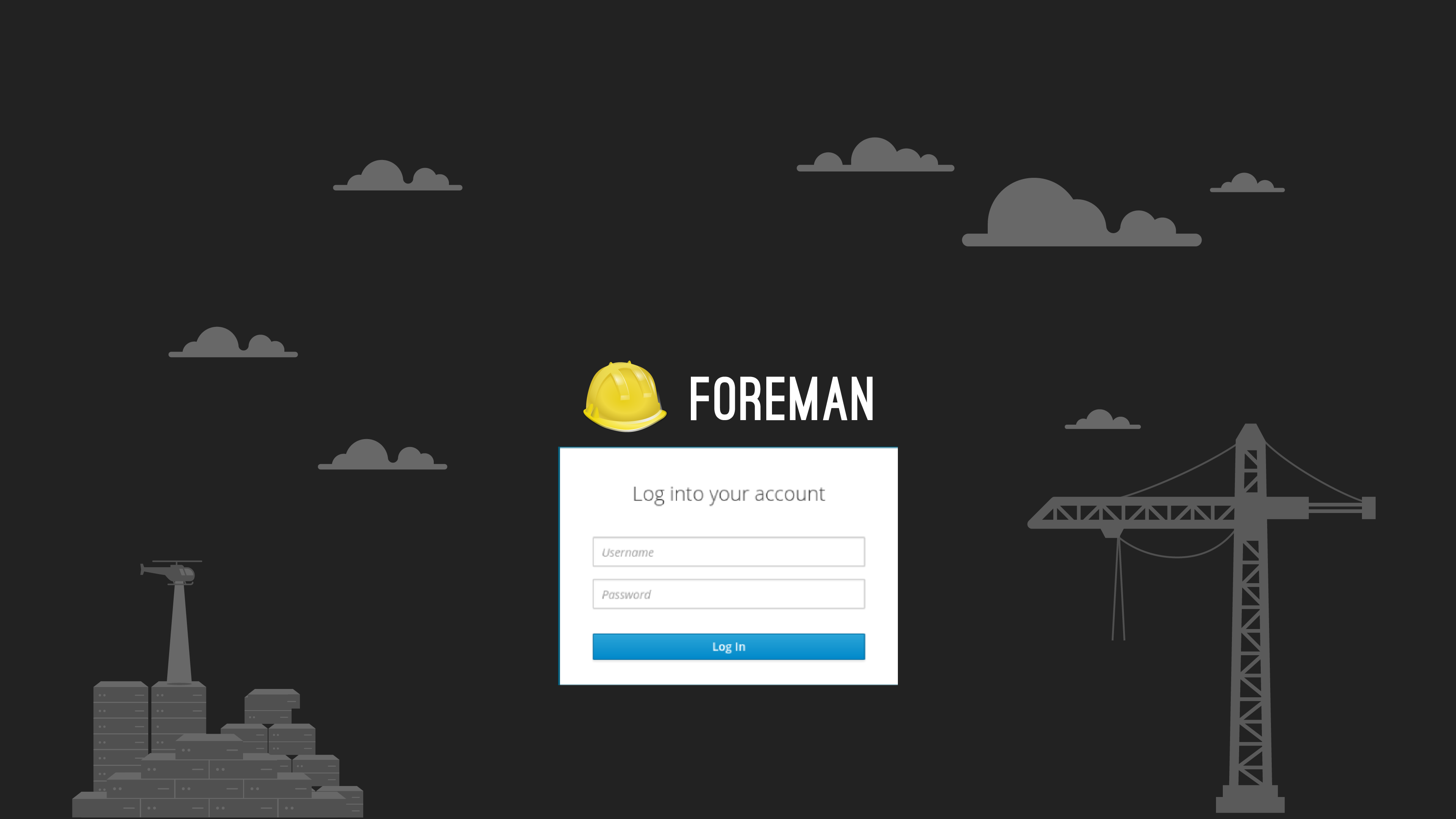
Design3
Design4
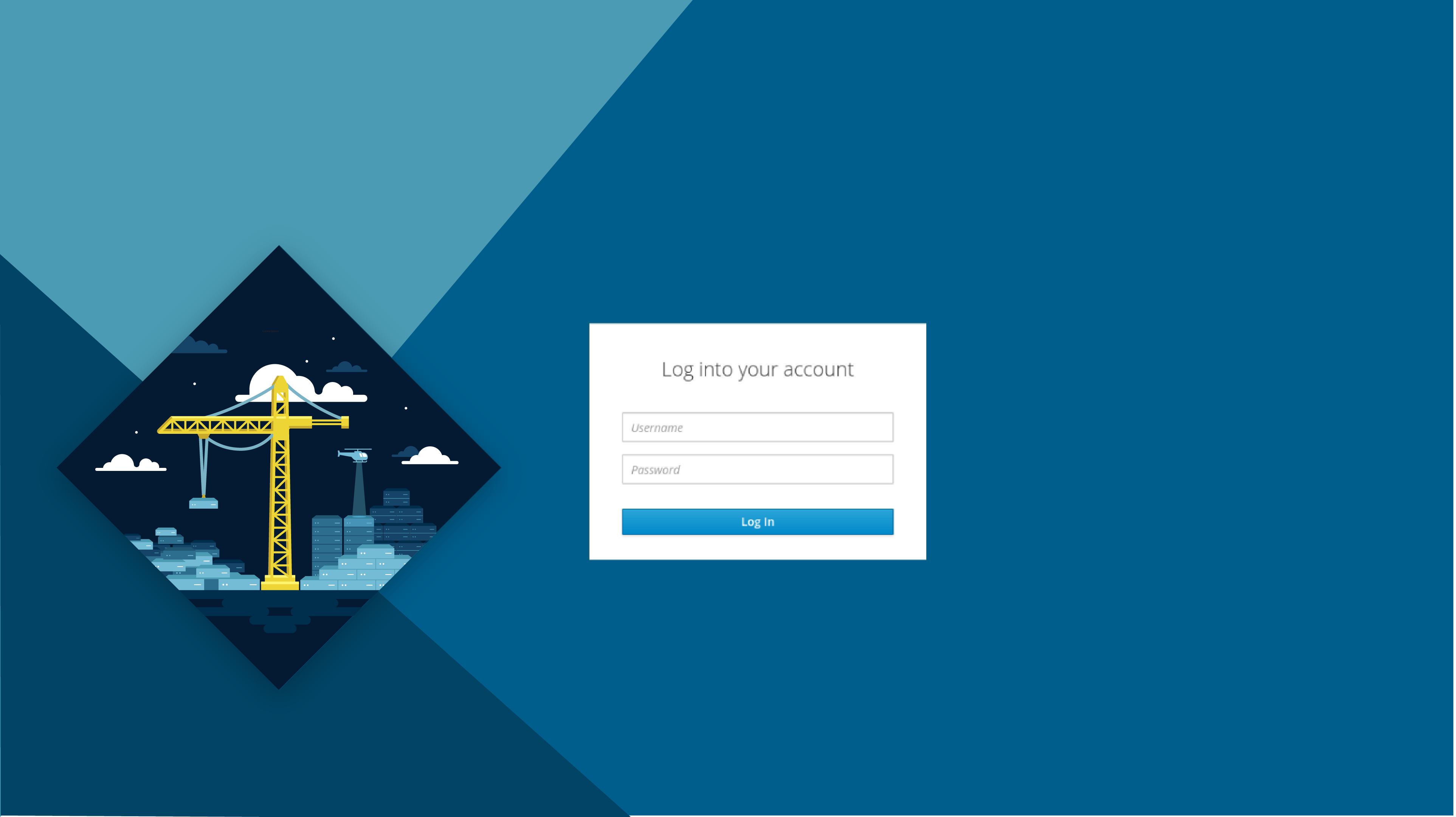
Design5

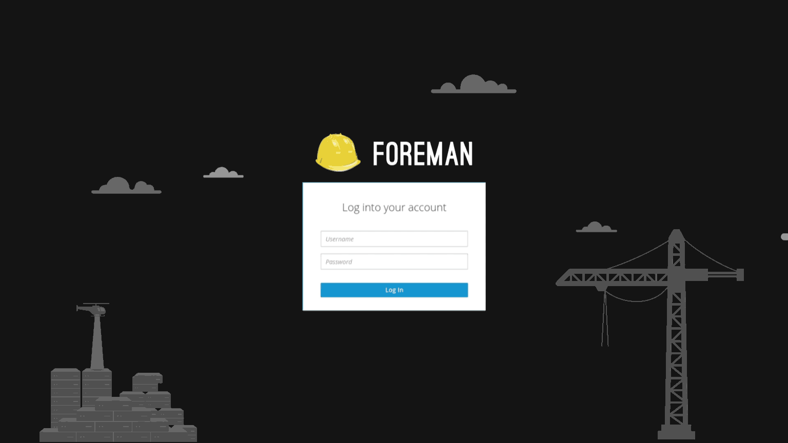
Design6
- Design 1
- Design 2
- Design 3
- Design 4
- Design 5
- Design 6
0
voters
Thank you all for participating!
Looking forward to hearing more feedback:)

Design1
Design2
Design3
Design4
Design5
Design6
Thank you all for participating!
Looking forward to hearing more feedback:)