
Well done, I like the first proposal the most. It looks nice and dynamic. There are two things worth considering -the greenish tint as some mentioned before and the indistinct Foreman logo which is drowned in the background. Would more background opacity or dark halo around the logo help it to step out?
1 Like
Thanks, I will continue to work on it and discuss with designers, updates will be next week 
I’m afk today, but I can put you in touch with the people who’ve done the previous designs (t-shirts, banners, stickers) etc on Monday
1 Like
Hey @Roxanne_Hoover can you find the original designer?
@iNecas As for the branding, I think that component wrapping and resolver should give us enough flexibility from plugability perspective in general and branding perspective in this specific case.
As for @brian’s security aspect, it will require not sending it from server at all. We were talking with @Ron_Lavi to use rails helper to generate the version string. In case we want to remove this information from the response, we will need to “overload” that helper.
In general  from me. the screen look much more modern this way. I wonder if we can get some performance benefit from this too, like preloading static CSS/JS/whatever in parallel to presenting this page.
1 Like
NEW UPDATE !
The next gif is showing the process of:
-
Disable form submit when fields are empty and show errors.
-
Show caps lock warning on password field.
-
Entering wrong credentials will return
a server error and a new token by an ajax request
so no need to refresh the whole page. -
Valid credentials should process the request,
the submit button will turn disabled and show a loading spinner
until the page will redirect.

2 Likes
I’m not a big fan of the box resizing. Perhaps it should be slightly bigger so it has space for the errors/warnings.
Also do consider we have some protection around incorrect passwords with back offs. Not sure how it would integrate here.
2 Likes
Thanks, the component was approved by Patternfly UX and Design team, I also didn’t like the jumping errors instead of stable ones…
We can stick to the original design or add are own,
Lets vote on it later.
I’d be inclined to stick with the patternfly recommendations and potentially ask them why they chose to do things this way. I do agree that it’s a little jarring but I also think that consistency with other projects that use patternfly is a good thing.
1 Like
I agree we should take it up with them, but IMHO they made a bad choice and we shouldn’t copy bad behavior.
I’m also wondering about placeholders instead of labels. AFAIK it’s a bad practice. https://www.nngroup.com/articles/form-design-placeholders/ lists a few reasons, among which is accessibility. Perhaps it’s less of an issue in a login field.
Here is my take… UX prefs are like opinions (and other things), everyone has one. Let patternfly team make the decisions so we can free up effort working on other features.
1 Like
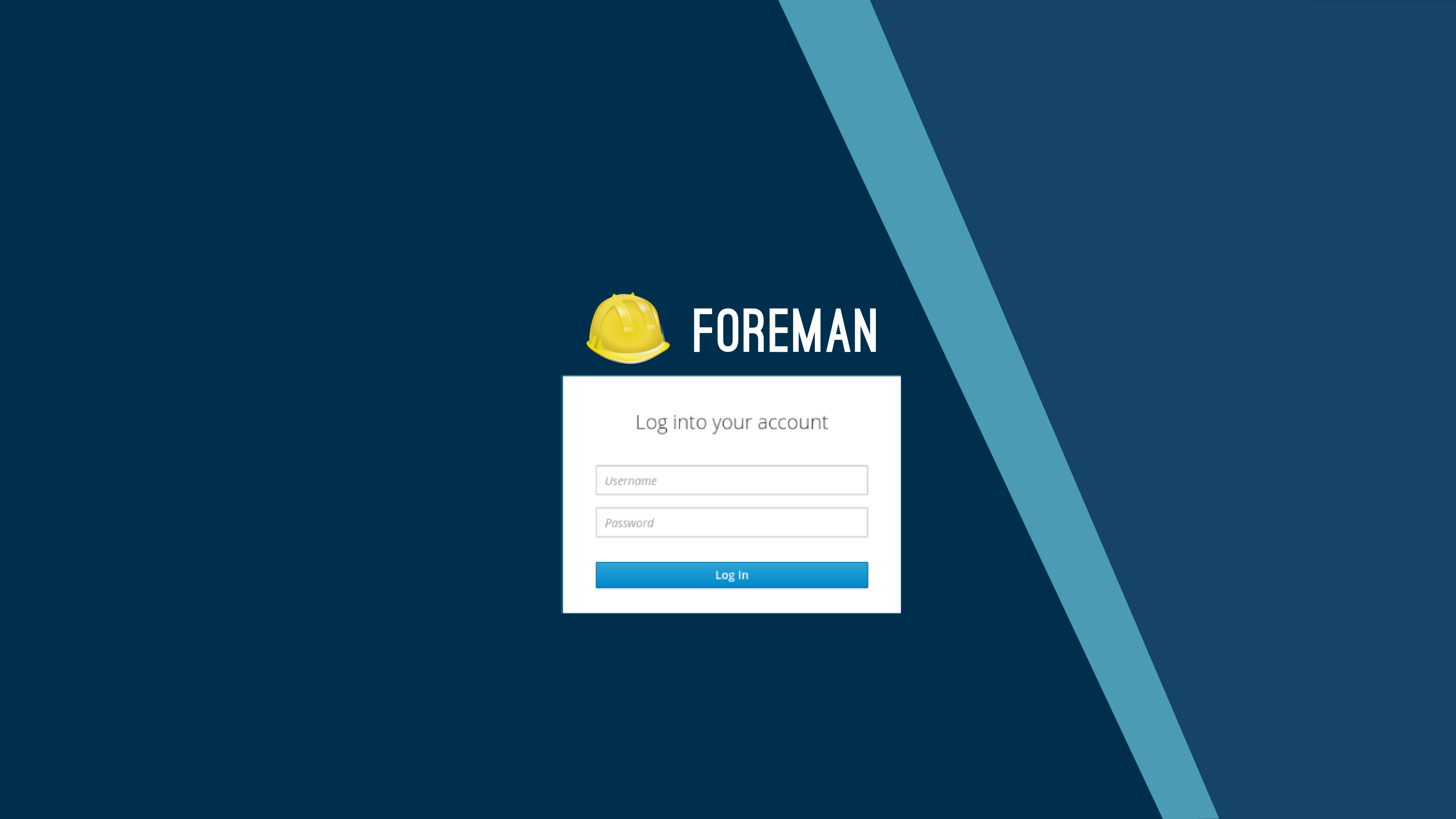
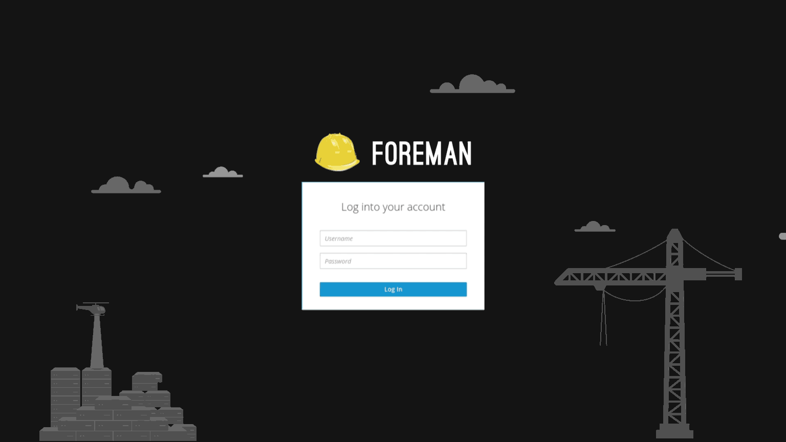
I have a different view on this. The way I try to see frameworks like patternfly, bootstrap or material ui is as frameworks. They offer a library of patterns to choose from so you don’t have to reinvent the wheel and start from scratch for every project. But you don’t have to stick to it if it does not make sense. The challenge is to use those uniform lego blocks to build something with higher value. In my opinion the current login screen looks like Foreman. I immediately recognize the app. The new login screen (especially with the green sci-fi background) does not look like Foreman to me. It does not fit.
What do we want to achieve here? Why are we changing something that was quite good in the first place. What is the strategy behind this? I have trouble understanding the long term goal. Maybe we need to reconsider patternfly if it does not suit our needs? But what are our needs? I think we should decide that as “the Foreman project” and not outsource decisions that directly affect users and acceptance of the product.
I think the UX discussions won’t stop until we as a project have answered what we want to achieve with effort. The current approach just feels weird. Just my two cents. No harm intented.
So, I agree with the logo. It should look like more like foreman. However the comments about how the widgets behave seems more like something we should defer to Pattrnfly.
What I would like to get out of using patternfly:
- avoid bikeshedding conversations about how $x should look like since there are always people who prefer $a and those who prefer $b
- don’t reinvent the designs for things that fit Foreman project such as list views, cards etc
- reuse components that were implemented in patternfly-react so we don’t have to build them from scratch
My hope is that people working on patternfly did the research and have good reasons for some decisions. When there’s something I disagree with, I open issue for patternfly like here or here. If they reject and I still disagree, I think it’s OK to start discussion in Foreman community and if it seems most would prefer the change, we can always adjust the pattern. Like we did with vertical nav, there’s now no delay for menu.
Regarding the login page specifically, I like the new layout. We just need to make it look like Foreman. For that I think we need to change the background (already in progress I think). I also don’t like the dynamic height of the form if there’s validation error or capslock warning, there may be good reasons for that but I’d start with opening issue against patternfly to see the reasoning behind it.
2 Likes
It’s really amazing to see how many from the community truly care about the product,
my thoughts are to keep the original background for this PR
because it isn’t really the issue here,
and later maybe with the help of designers replace it.
As for the margin in the form, for errors not to jump and push everything down,
I had a long discussion about it with Patternfly designers when I built this component for Patternfly,
but now, backed by you guys,
the design can change…
So I am going to open an issue soon to PF, attaching a link into this discussion and try to fix it there,
so the errors won’t be jumpy.
3 Likes
small update.
here’s the original discussion about the space
around inline form errors: https://github.com/patternfly/patternfly-design/issues/671
you can see the two versions, with and without the margins.
Here’s the issue I’ve opened to Patternfly: https://github.com/patternfly/patternfly-react/issues/996
Hey @Roxanne_Hoover can you find the original designer?
The designer who did the Foreman poster (and most likely has source files for the logo) is Jessica Cox. I’ve reached out to her to get said file. We can leverage this for the background.
I’d be inclined to stick with the patternfly recommendations and potentially ask them why they chose to do things this way. I do agree that it’s a little jarring but I also think that consistency with other projects that use patternfly is a good thing.
I agree with this sentiment. There were multiple reasons both for and against a static layout. The good part is that we can have discussions with PF about issues we’re seeing and try to influence the design. Overall I think PatternFly has had a positive influence on the product in terms of consistency.
1 Like
Good news everyone !
Our designer @terezanovotna is starting to work on our background
and after we’ll have few examples to decide from, we’ll make a vote
3 Likes
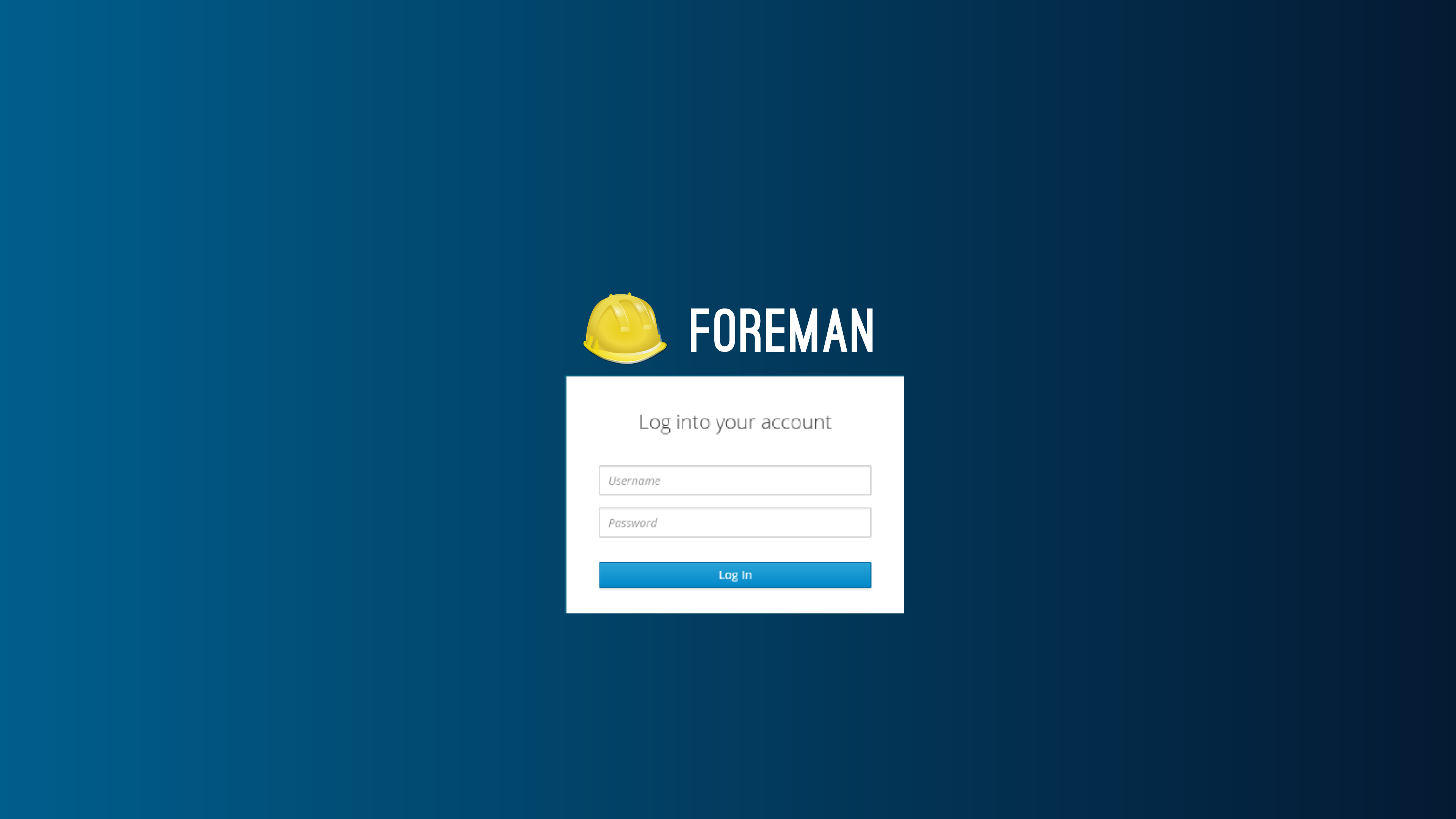
Design1
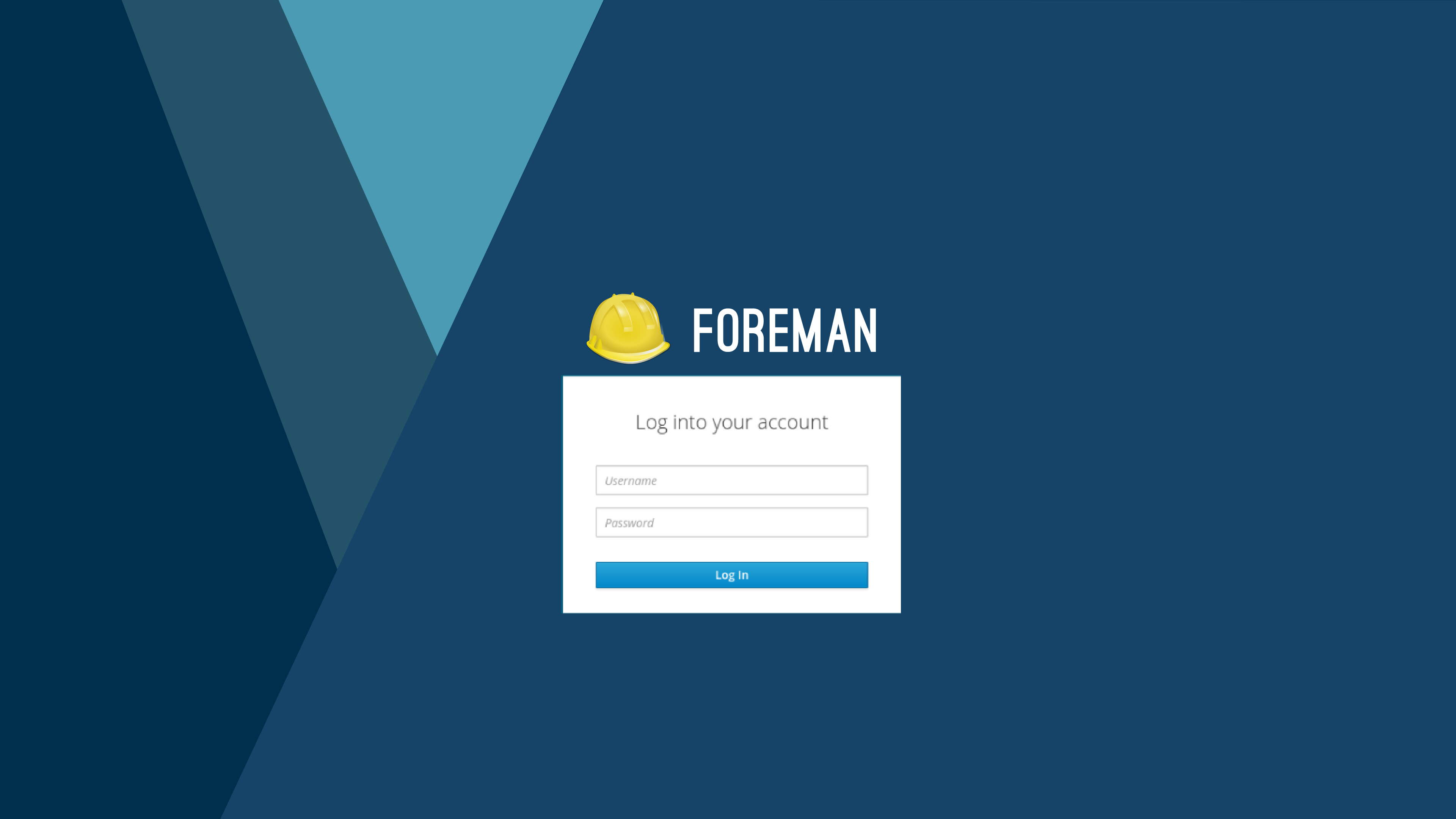
Design2
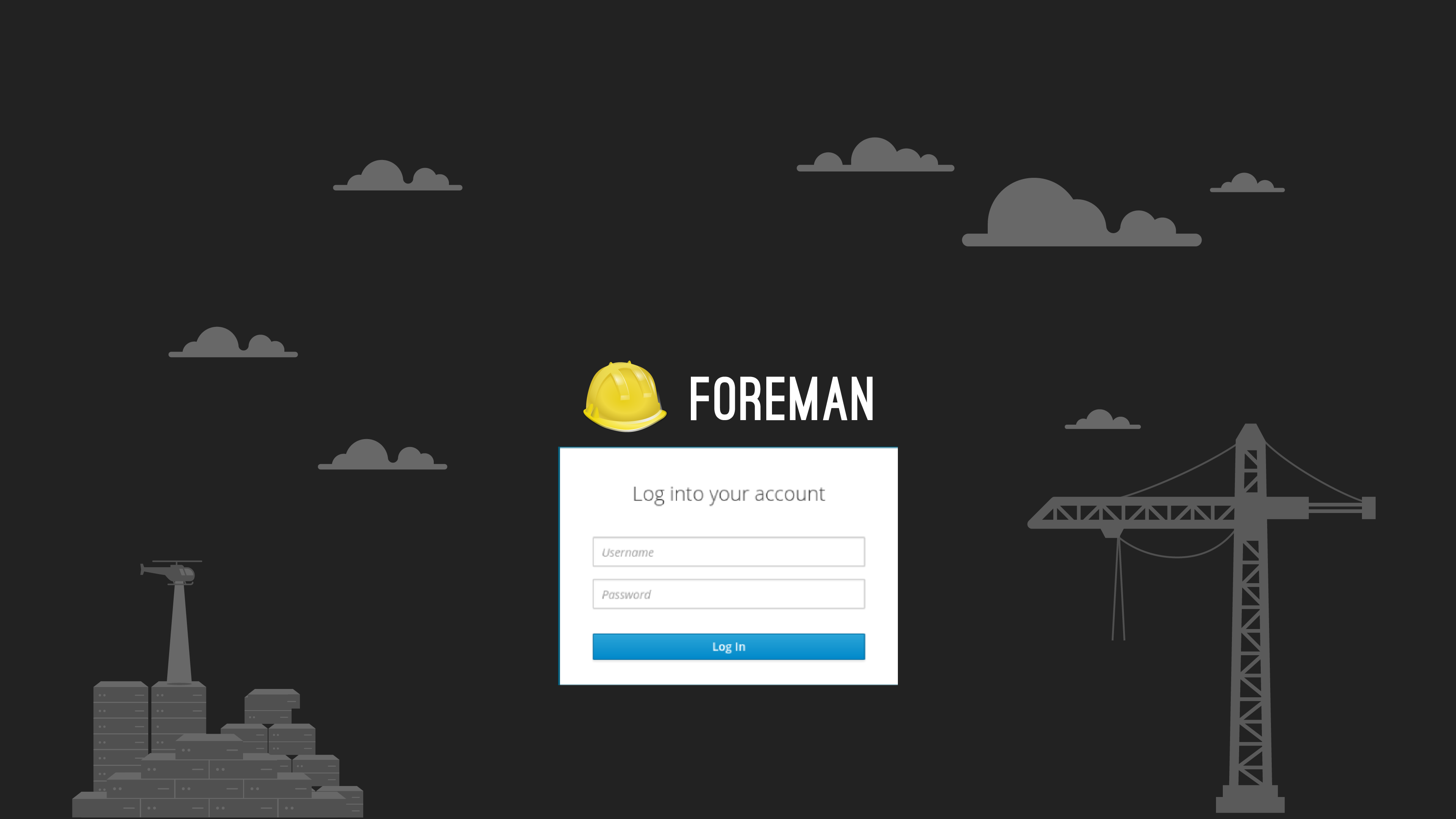
Design3
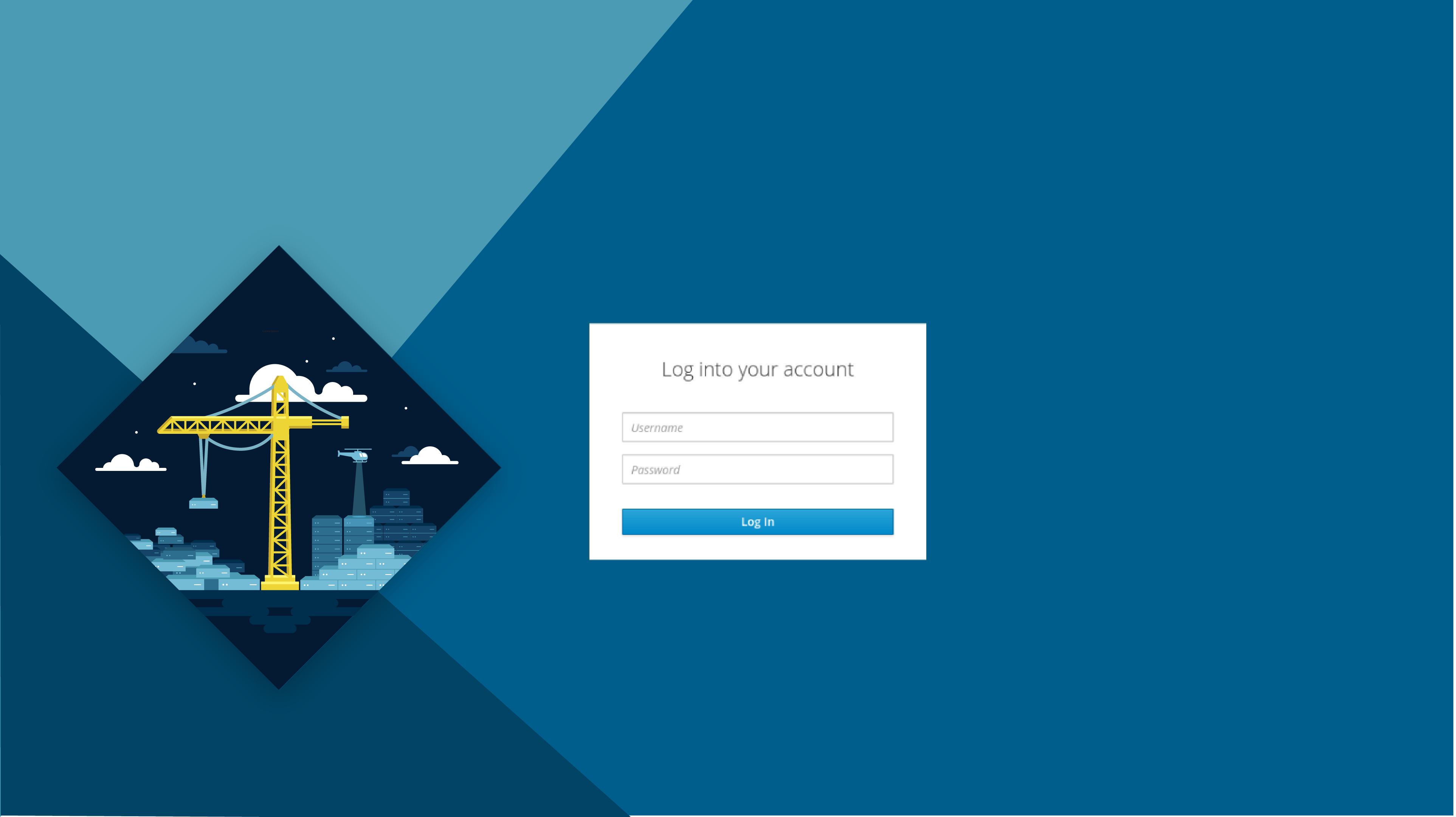
Design4
Design5
Design6
- Design 1
- Design 2
- Design 3
- Design 4
- Design 5
- Design 6
0
voters
Thank you all for participating!
Looking forward to hearing more feedback:)
2 Likes
Nice. I think you might get more feedback if you open a new thread. Also @Gwmngilfen or @tbrisker could create a poll in here, so we can have poll and discussion at one place.