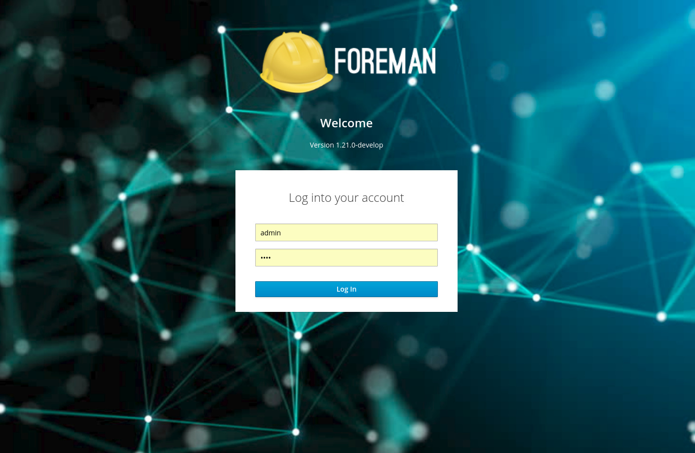
I’ve started to create our new Login Page based on Patternfly-React’s Login Page,
and I’d like to brainstorm with you to get the best results we can get.
Please tell me what are your feeling about this change?
What do you think about the background, does it suit Foreman?
Some improvements we’ll benefit from this change:
client side validation for empty fields,
there’s also an option to validate email address / password length but we aren’t going to use it.
There’s an option to add a language selector ( part of the original design )
so we can pass in all the languages that foreman currently supports.
There’s an optional footer links we can add, please tell me what would you like to link to.
I am thinking to add a loading indication. It takes some time to log into the app,
so in my opinion it would be great to have some indication other than seeing the browser loading,
such as the Log In button transform into a loading circle? anything is possible, please tell me if you have any cool idea.
Anything important to consider?
I got some feedback in the PR to keep in mind some related tests or usage of Login Page,
such as: CI pipeline and Installer acceptance testing,
if you know of any usage please feel free to mention it.
I kinda like it, I’d just tweak the hue of the background to have more of the “foreman-y light blue”, instead of having the greenish tint.
One thing to consider, there are currently (at least) two projects using Foreman with custom theme/branding. How would one go about theming the new login screen?
I like it! The language switcher is a nice idea but it can easily be added in next step.
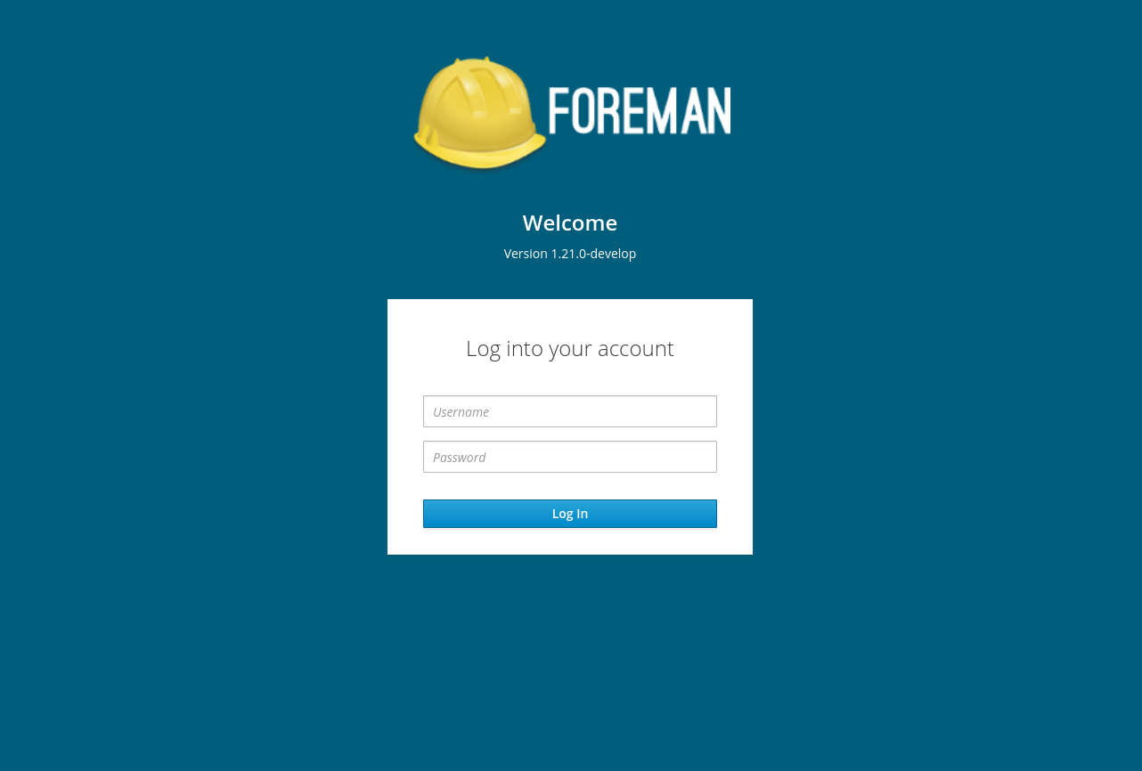
Where does the current “Login page footer text” (that’s how we call it in settings) go in this design?
Theme customization is an important point. Thank you for taking it into account!
The logo seems to be a bit drown in the colorful background. But it could be just me
Thanks Tomas,
the “Login page footer text” which from my understanding was in the bottom-right of the screen,
would move to the bottom of the caption, under the version specification, above the card
I like it, it looks more contemporary and similar to other applications I use. Also, it has the benefit of being based on a patternfly pattern that has been user tested.
Nice work!
+1 to this, is there any example for this in patternfly? I could see something like the entire login pane being replaced by a spinner with text underneath it saying “Logging you in” or something like that. @Roxanne_Hoover do you know if there is already a design for this?
To be honest with you, when I first heard about the plan, I was not very happy (being somewhere between “what’s wrong with the current login screen” and “is it worth it the changes required on the branding side”).
On the other hand, seeing it in action, I must admit that it has some positive impact on how the project is perceived. Perhaps probably for long-term users, it might be a nice change, just to indicate that the project is still alive and innovating :).
So as long as there is a good answer for the branding options (seems like you’re on top of it as well), +1 from me.
Hi. This looks great! Would it be possible to have an option to not display the version information on the login screen? Government and other security sensitive users want to be able to hide version information from unauthenticated users.
It’s nice to make it configurable. I’ve also seen someone who modified it on a dev instance to show it was maintained by him and how to contact him. That was very useful when the hostnames are just randomly generated strings.
Thanks for mentioning that,
The version is passed from the server as a prop to the component, whenever this prop wouldn’t exist, I will make sure that the version paragraph disapear.
I guess you are talking about the “login page footer text” which was mentioned above ? Yes, it is going to be configurable and be added under the version ( if exists )
I like this, looks good. However I’d change the color a bit as well. The background looks too green.
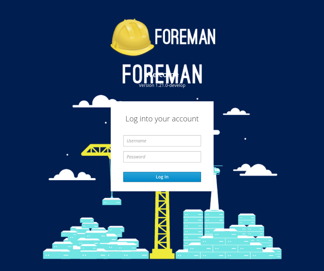
I am wondering if we can use the graphic from the T-Shirts as a background image. That would fit the construction theme better.