I would not call it my Xmas present, but we have finally found some time. What do you think of this text for the Github profile? I used the text from the homepage but added to it where needed. Marketing convinced my to go not to deep into details.
Description
Foreman is a complete lifecycle management tool for physical and virtual servers. We give system administrators the power to easily automate repetitive tasks, quickly deploy applications, and proactively manage servers, on-premise or in the cloud.
Features
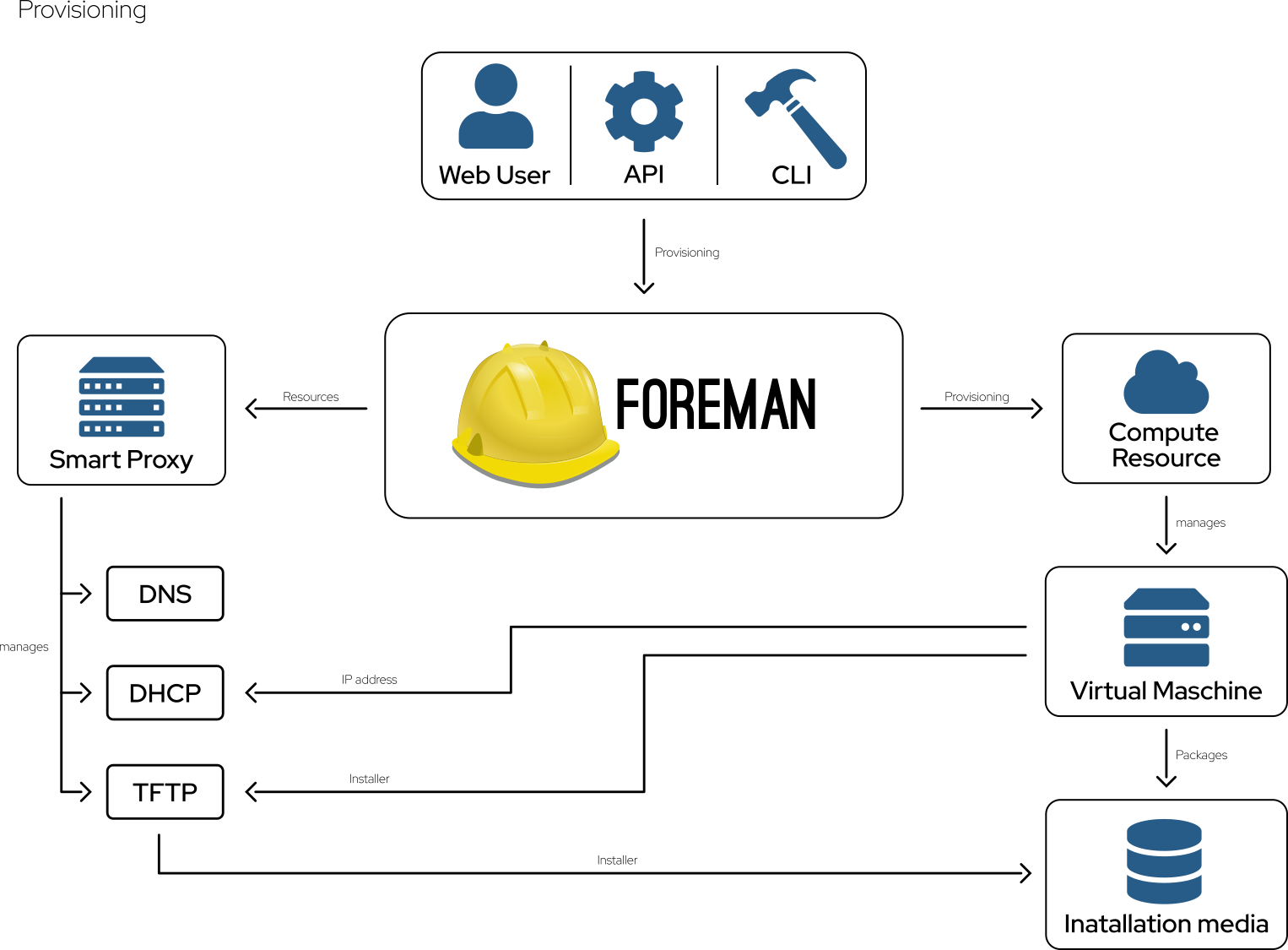
Provisioning
Provision on bare-metal (MaaS) & public or private clouds all from one place with one simple process.
Configuration
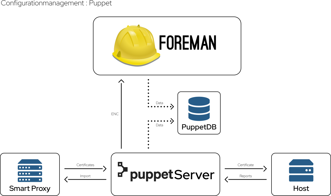
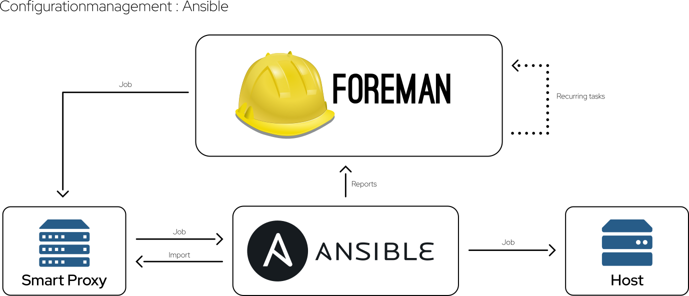
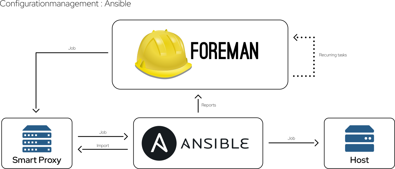
A complete configuration management solution including an ENC for Puppet and Salt, built-in support for parameterized classes and hierarchical parameter storage. Or integrate Ansible by assigning roles and variables.
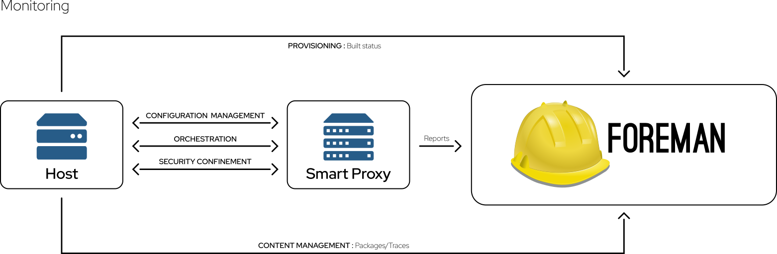
Monitoring
Collect Puppet, Salt, and Ansible reports and facts. Monitor host configuration, report status, distribution, and trends.
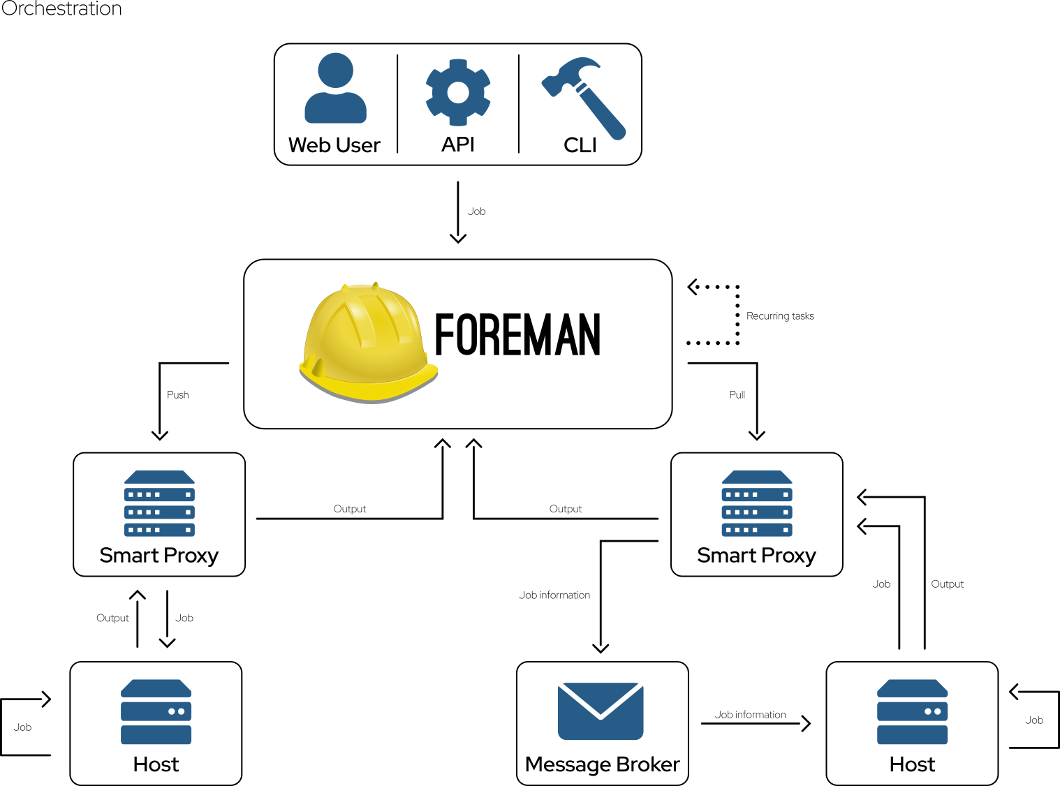
Orchestration
Utilize Scripts or Ansible playbooks for remote execution or pull them using MQTT.
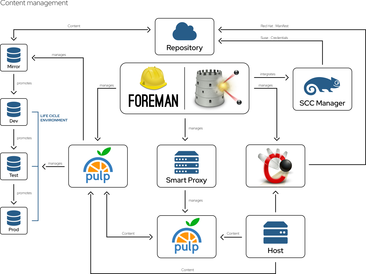
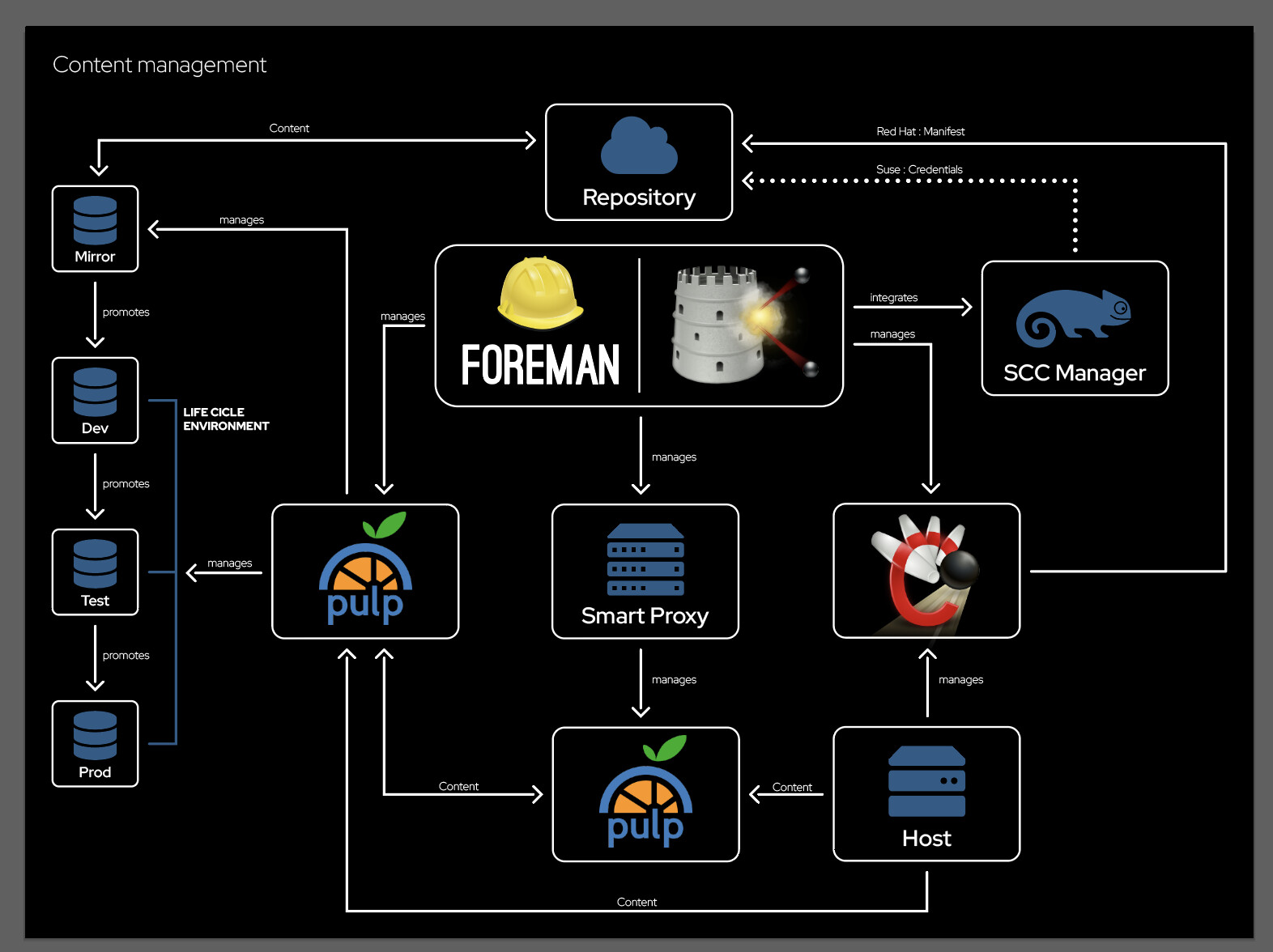
Content Management
To mirror and stage content like RPM and DEB packages, Container images, or any type of file have a look at Katello, a fixed set of plugins for Foreman.
With a wide range of plugins, you can add even more features, not all of them can be found at this organization, so have a look at the plugin overview.
Issue tracking
Not all parts of the project track issues here at GitHub! So, if you are missing the issues here, check out the issue tracker.
Getting help
For getting easily started check out the documentation and the Community support. There are also regular demos on the YouTube channel.
There is also an overview of trainings provided by other companies.
If you prefer assistance, benefit by companies providing professional services or even consider one of the downstream products: Red Hat Network Satellite or orcharhino.
They also convinced me to use only a header graphic for the profile. So any preference?
I like number 4 as the solid background is a bit boring and putting the hard hat on the logo looks nice, but not sure about it so 5 is perhaps better.
Header
- Number 1 (Solid background, Hard Hat on top)
- Number 2 (Solid background, Hard Hat over the top)
- Number 3 (Solid background, Hard Hat on left)
- Number 4 (Non-solid background, Hard Hat on top)
- Number 5 (Non-solid background, Hard Hat over the top)
- Number 6 (Non-solid background, Hard Hat on left)
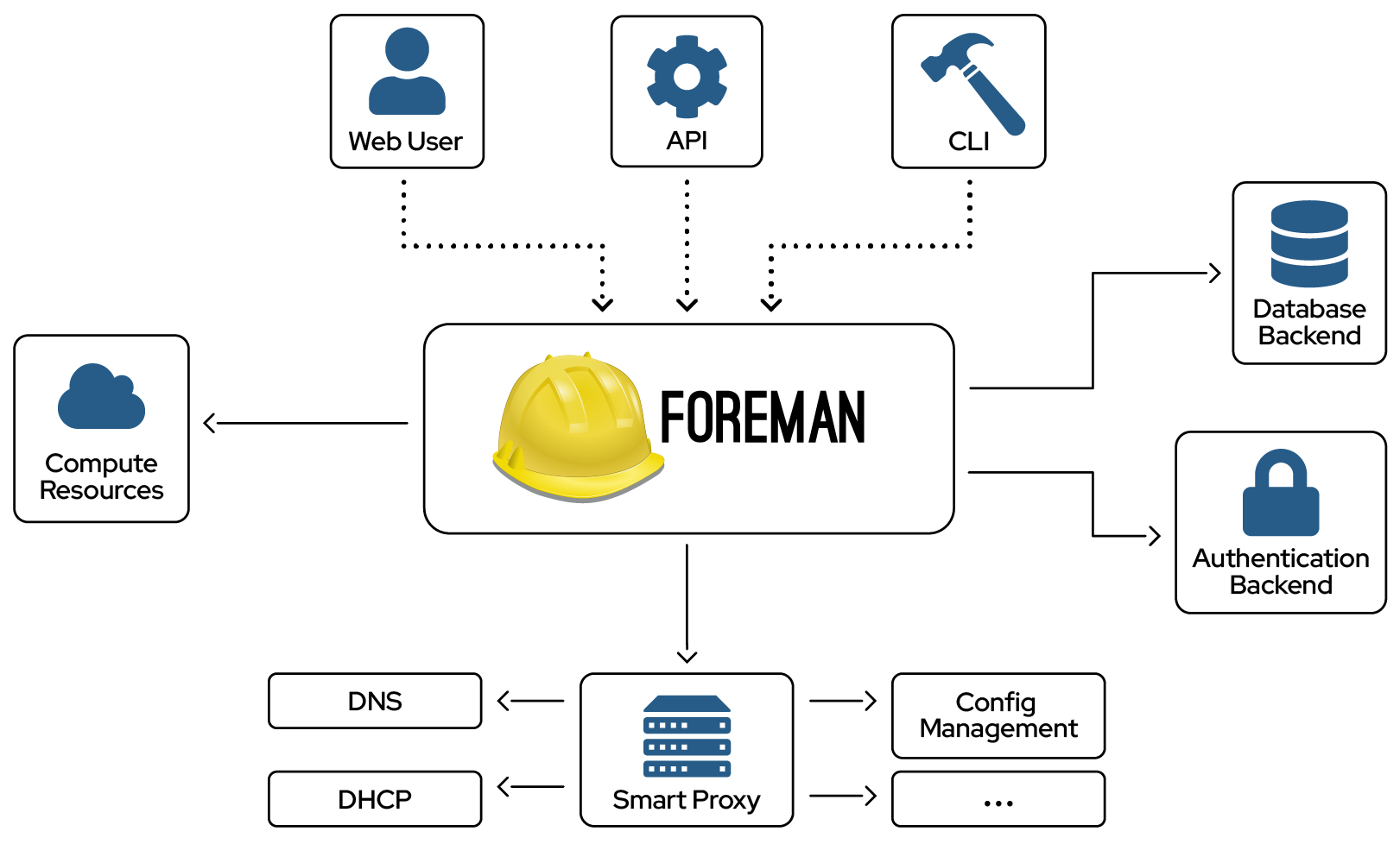
Still I wanted a new version of the architecture graphic. My idea was to reduce the details and if you like the style than add additional ones going into detail for each feature. Any opinions on this?
My plan would be collecting feedback here, adjust where needed and then create the pull request so they can hopefully be merged in time to show this on cfgmgmtcamp.


