Let’s vote for a design pattern for future vertical navigation. We are also discussing the addition of the search bar that would improve the discoverability until the content redesign.
(Note: Please ignore colors and nav items from the masthead in the examples.)
I’d like to add another pain point for me…
The menu system (under 3.3.1, may have changed in later revs) does no honor “ctrl/command + click” to open items in a new tab. There are a number of times where I’m part way through updates, monitoring a host, etc and need to open another section. To open something from the menu in a new tab, it requires right clicking and selecting open in a new tab. Holding the control or command key (win/mac) does not affect the links from the menu.
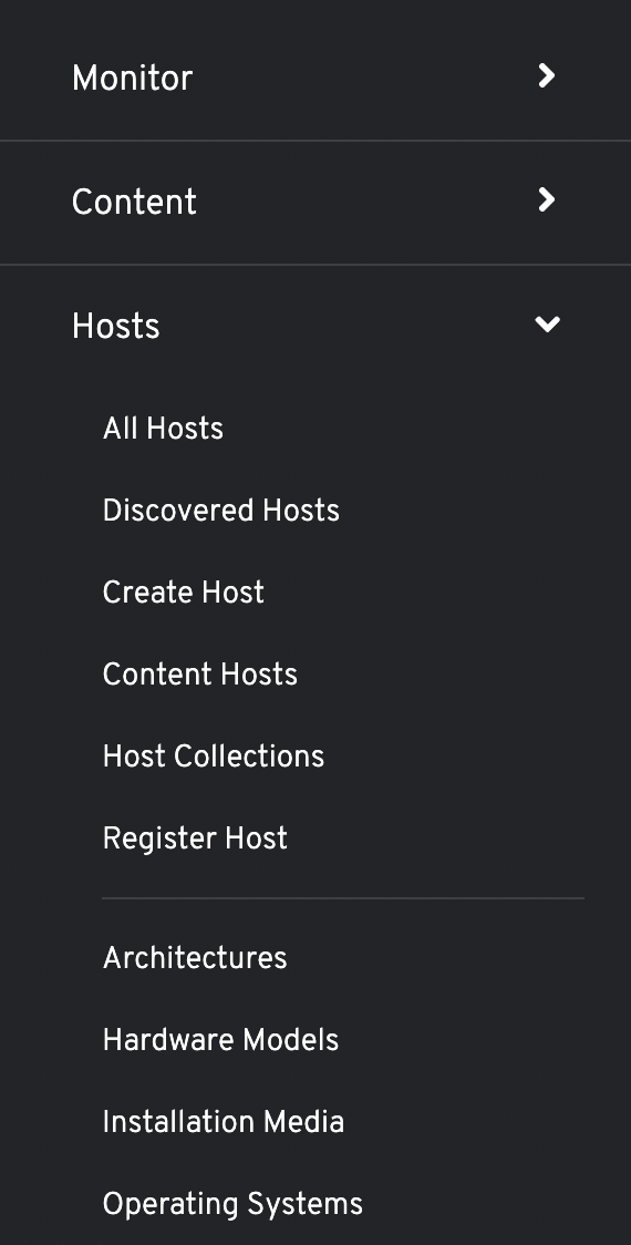
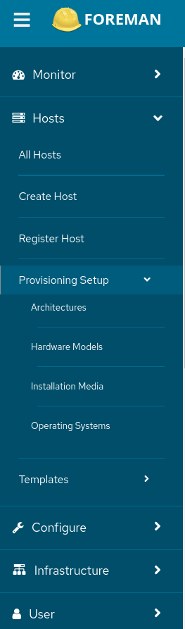
=> The list can be very HUGE. If you e.g. click on Configure, and you scroll down the list, it would even display a browser scrollbar so that it can show the full list of entries. In case you are just searching for a specific menu item and you recognize, that the item is not in Configure, you need to scroll up again, “hide” Configure and then click on e.g. Hosts and you do the same again. I don’t think this make sense.
Maybe this is the case but I think its not a good reason to change the navigation. If you want to switch from one menu item to another, its OK that a lot space is used. Then you select what you want and the navigation is gone again.
In my point of view, clarify is on of the most important reasons. A user should see all possible menu items asap without scrolling years.
If we would change the navigation, we should also think about how the navigation would look like on mobile devices.
The menu as it is right now is pain in the ass (it covers things, sometimes it is not reacting, opening it by accident is annoying, … all of this was already mentioned). Also closing them by clicking into the wild is very annoying.
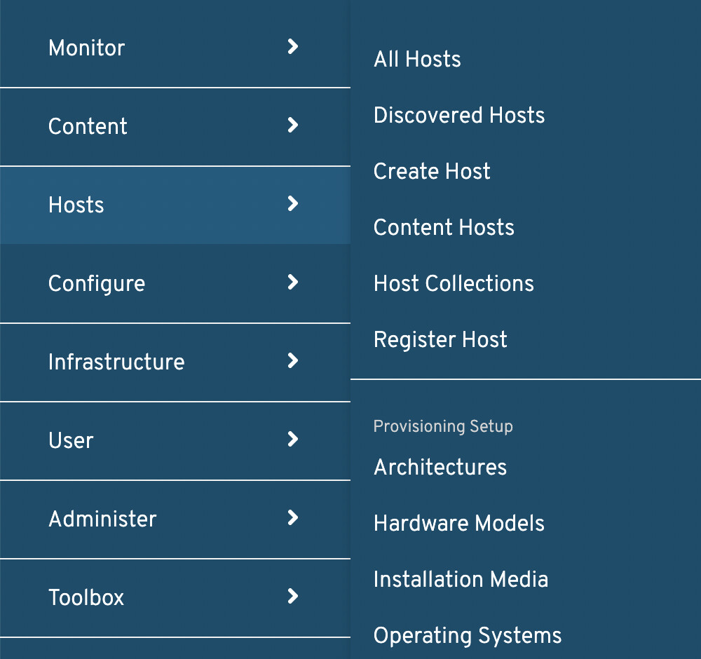
Expandable navigation looks promising, also scrolling in a long menu frame feels good as long as you have a scroll wheel (introduced late '90s) or use two fingers on touchpad.
However, the following comes to my mind when using expandable menu:
introducing unfold/collapse buttons to unfold/collapse all options (would be interesting for search an option via search (strg+f))
increase optical difference between menu points (Monitor, Content, …) and submenus for faster identifying different sections when having multiple submenus open
I don’t mind the current behavior, IF there was a configurable delay from mousein to menu pop-out… As one of the original complaints stated, I just get wild with the mouse and I’d not mind in the least if I had to wait a second or two for the menu to pop-out, especially if I could tune it…
I too like the current menu very much. If the ctrl+click issue could be solved, which has been a pain point for some of my co-workers in the past, I would very much like to see the current behavior kept.
As a user with a lot of plugin installed, I am absolutely against the first option (expandable menu). I absolutely dislike having to scroll in menus, plus it adds a lot of additional clicking around, especially if you are looking for a certain feature and can’t remember exactly where in the menu it was placed.
After test-driving the proposed alternatives, I’m sure I like what we currently have as much - perhaps more; though, the ability to adjust how long it takes an expanded fly-out to hide would be welcome. I’m pretty happy with the current mouse-over delay that activates the fly-out, but having that as a configurable option would be okay as well. Not too fond of clicking to activate the fly-out. Just sharing my thoughts. Thank you to all for your hard work on a great product.
You’re welcome to check the Foreman nightly version once these changes have been merged to see them in action.
If you encounter any unexpected issues or have any concerns, please let us know.
A little improvement I could see, this is how it looks in AWX:
Looks a lot cleaner if the padding is all part of the button:
Beside that, maybe the new borders :
Oh and I’m not sure if my stable Forklift build is just broken or if it is not working, but Ctrl + Click as well as Middle-click are not working for me.
I’m not sure that we want to add more user configurability around this as it will be a large technical project to build and maintain and we dont have a lot of capacity.